Real applications
Over a hundred figures built from the data a working measurement actually produces – an instrument sweep, a simulation grid, a production log, a market tape – grouped by the field they come from.
These are not plot-type demonstrations. Each one starts from the measurement and lets the figure follow from it: what the sign of the quantity means, how many decades it spans, which samples are missing, whether the sampling grid is rectilinear at all, and which of the axis, scale and colour choices are forced by the data rather than picked for looks. The plotting call is usually the short part; the reasoning above it is the example.
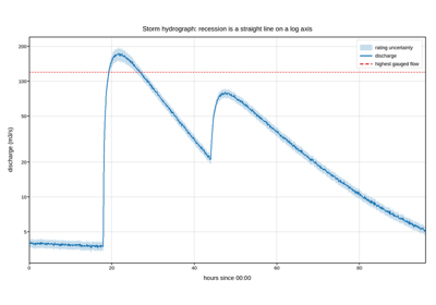
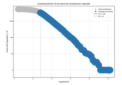
Between them they exercise most of the library – lines, steps, stems, bars, error bars, histograms, box plots, event rasters, filled bands, stacks, meshes, images, contours, quiver fields, hexbins, twin and shared axes, inverted and categorical axes, log scales, logarithmic colour norms, polar projections, colorbars and figure legends – which is the other reason they exist: a gallery this broad is a regression suite that happens to be readable.
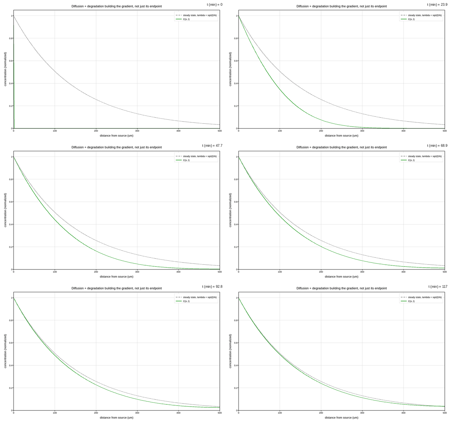
Every figure below is also live. Pick a tool on the embedded copy and zoom, pan, point-pick or annotate it; nothing is active until a tool is selected.
Earth, ocean and atmosphere
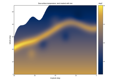
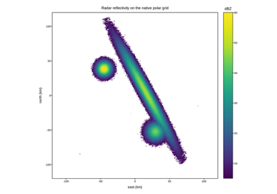
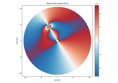
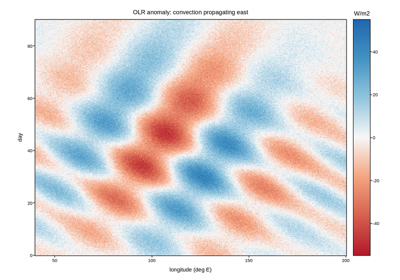
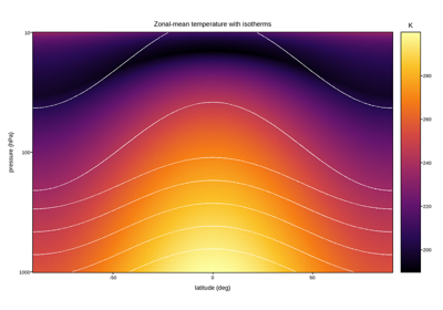
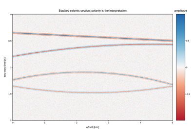
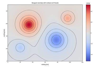
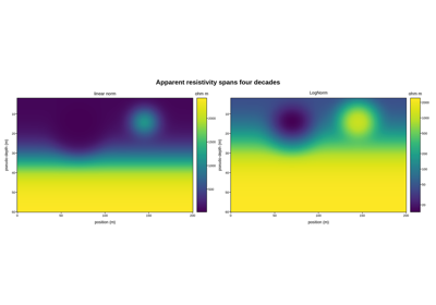
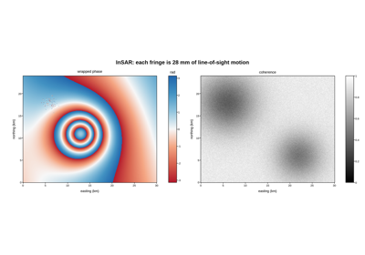
Remote sensing, weather radar, climate records and subsurface geophysics. The recurring problems here are incomplete coverage (land under an ocean sensor, a radar’s unfilled corners), quantities whose sign carries the meaning (radial velocity toward or away, an anomaly above or below a reference), and grids that are polar, curvilinear or unevenly spaced before they ever reach the plotting call.
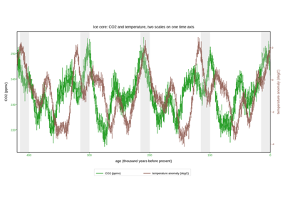
Ice-core CO2 and temperature over four glacial cycles
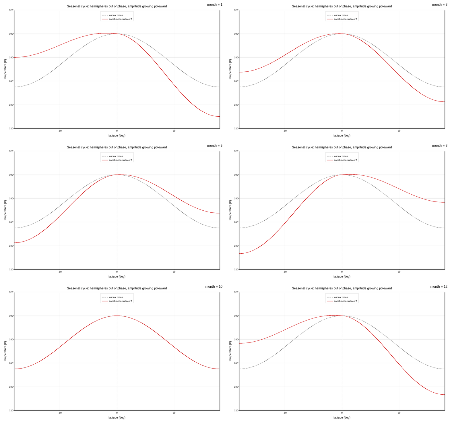
The zonal-mean seasonal cycle, animated month by month
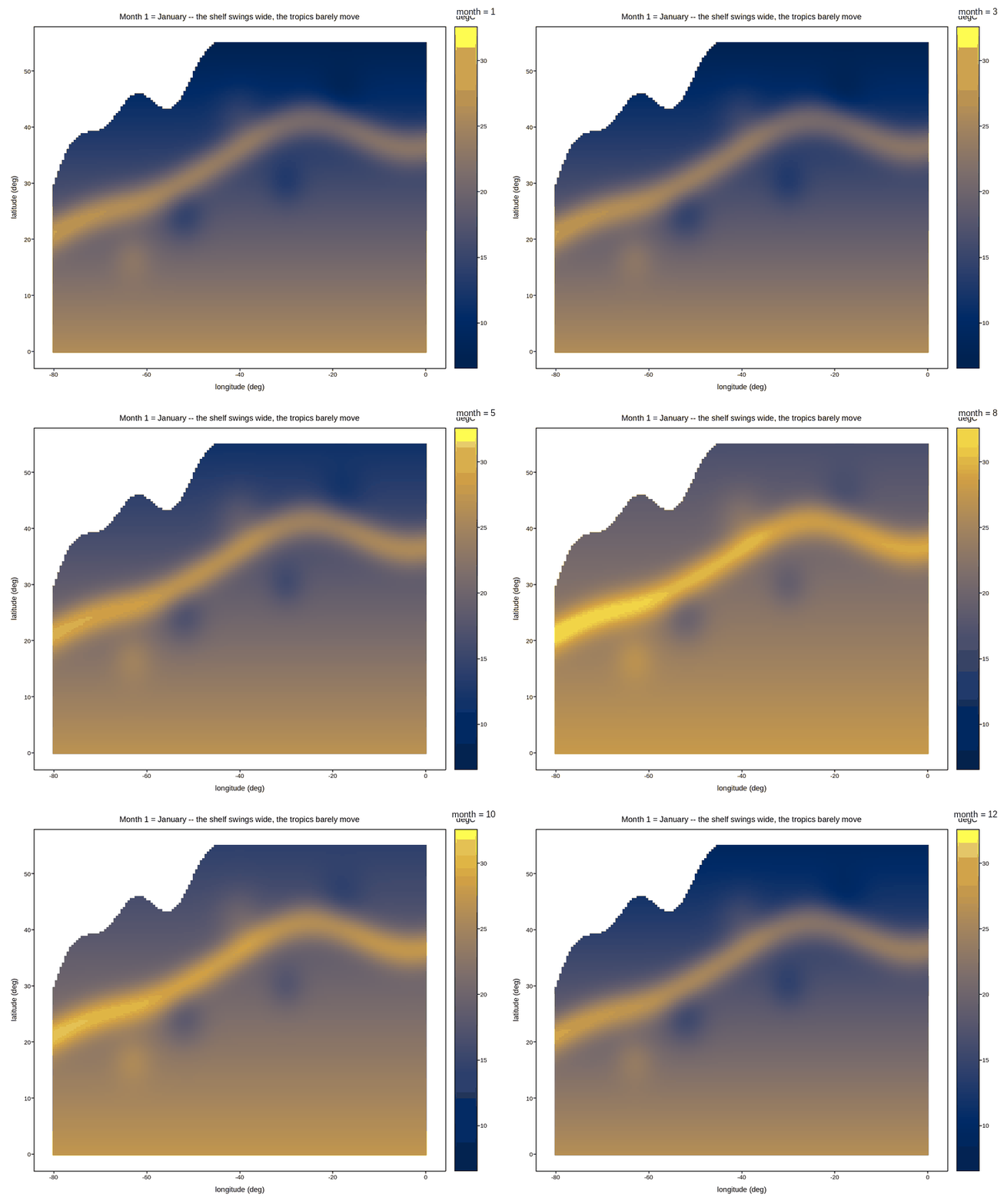
Sea-surface temperature through the seasonal cycle, animated
Astronomy and space science
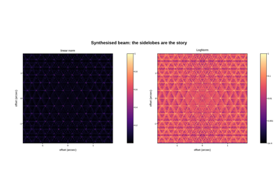
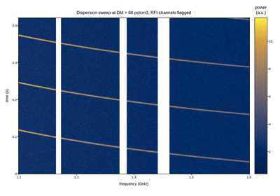
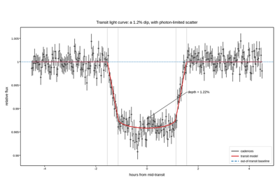
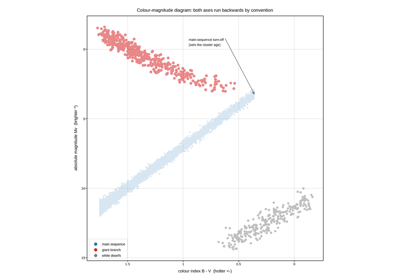
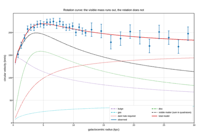
Photometry, radio dynamic spectra, aperture-synthesis beams and rotation curves. Astronomical quantities routinely span many decades, are quoted in magnitudes that run backwards, and arrive with per-point uncertainties that are the whole argument – so log axes, inverted axes and error bars are the defaults rather than the decorations.
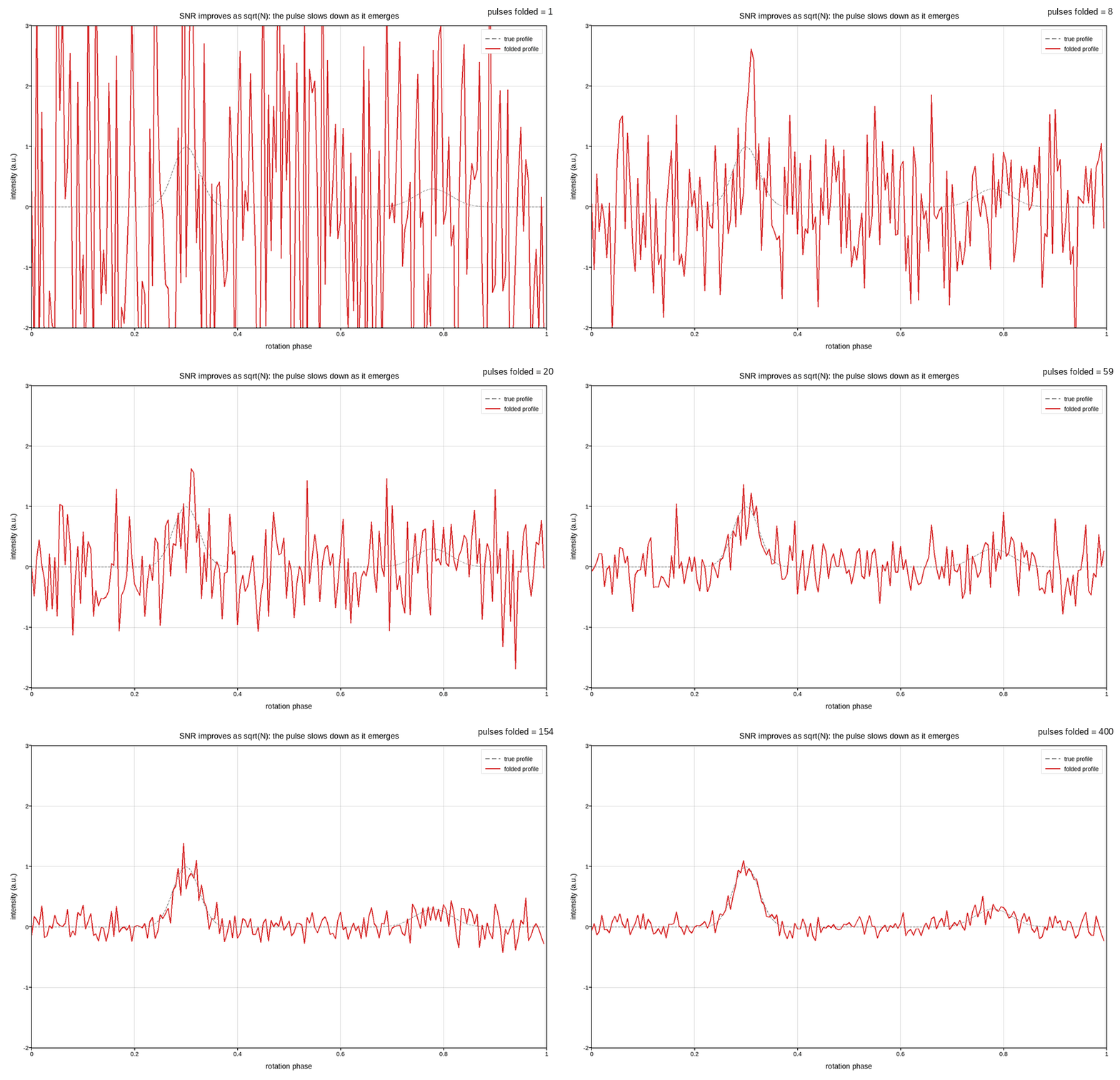
Folding a pulsar: signal-to-noise improving pulse by pulse
Medical imaging and clinical data
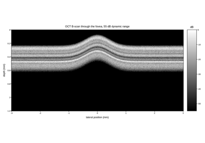
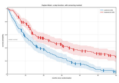
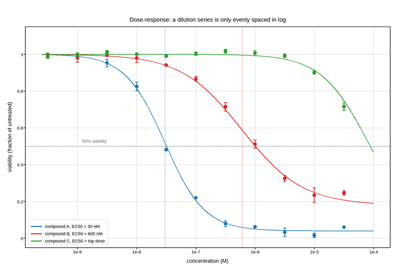
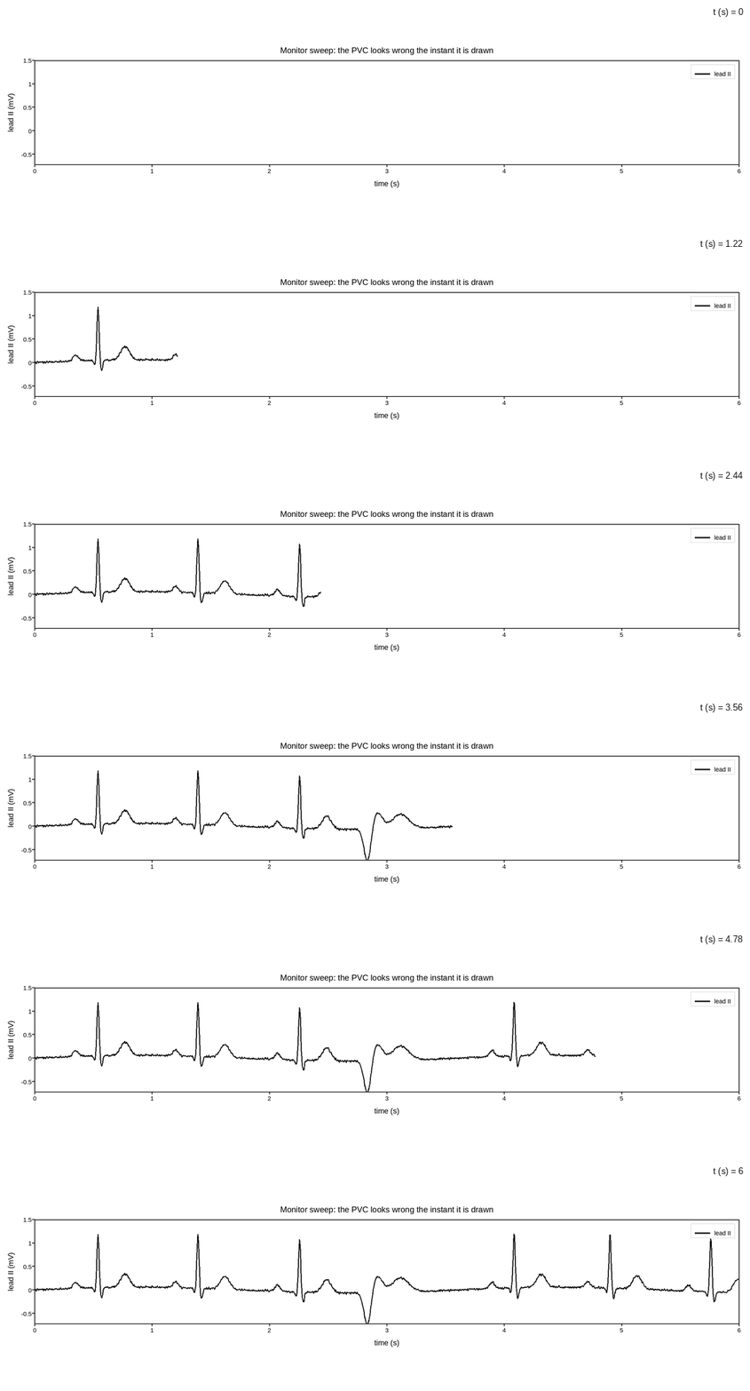
Reconstruction-domain data (k-space, sinograms), depth-resolved imaging, and the time series and survival curves that clinical work is actually decided on. Several of these are the raw domain rather than the picture a clinician sees, which is exactly why they need a log-compressed or high-dynamic-range colour treatment to be readable at all.
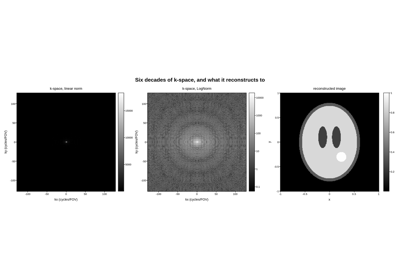
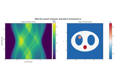
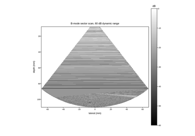
Biology, genomics and epidemiology
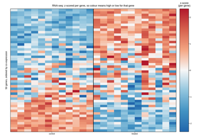
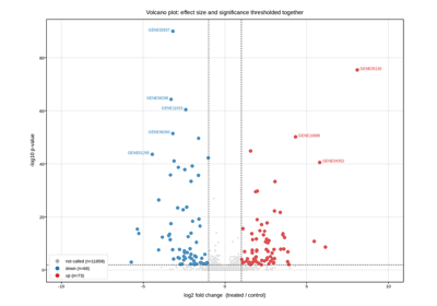
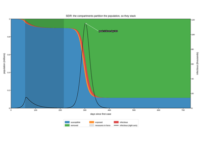
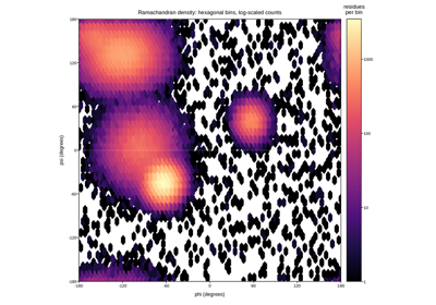
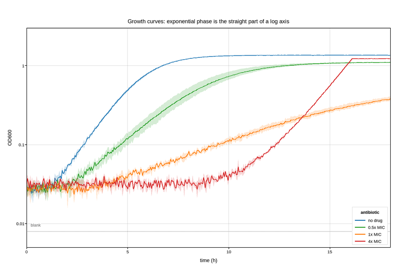
Expression matrices, differential-expression statistics, structural biology scatter densities, growth kinetics and compartment models. These bring a different set of plotting problems from instrument data: thousands of points that must not be drawn one by one, significance thresholds that belong on the figure as reference lines, and quantities that only behave linearly once they are logged.
Chemistry and spectroscopy
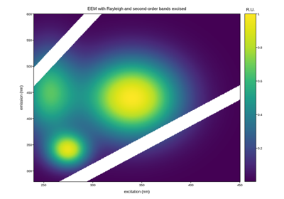
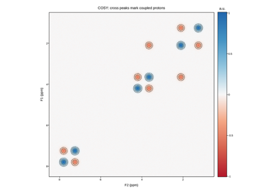
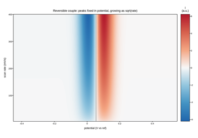
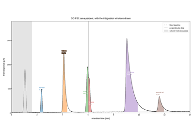
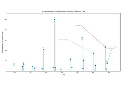
Separations, spectra, correlation maps and electrochemistry. Spectroscopy has strong plotting conventions that are worth honouring even though they look backwards – infrared runs right to left in wavenumber, NMR runs backwards in ppm, transmittance is read downward – and the examples show how to get them with axis inversion rather than by pre-flipping the data.
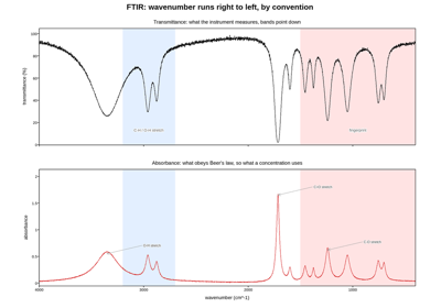
Infrared spectrum with the conventional reversed axes
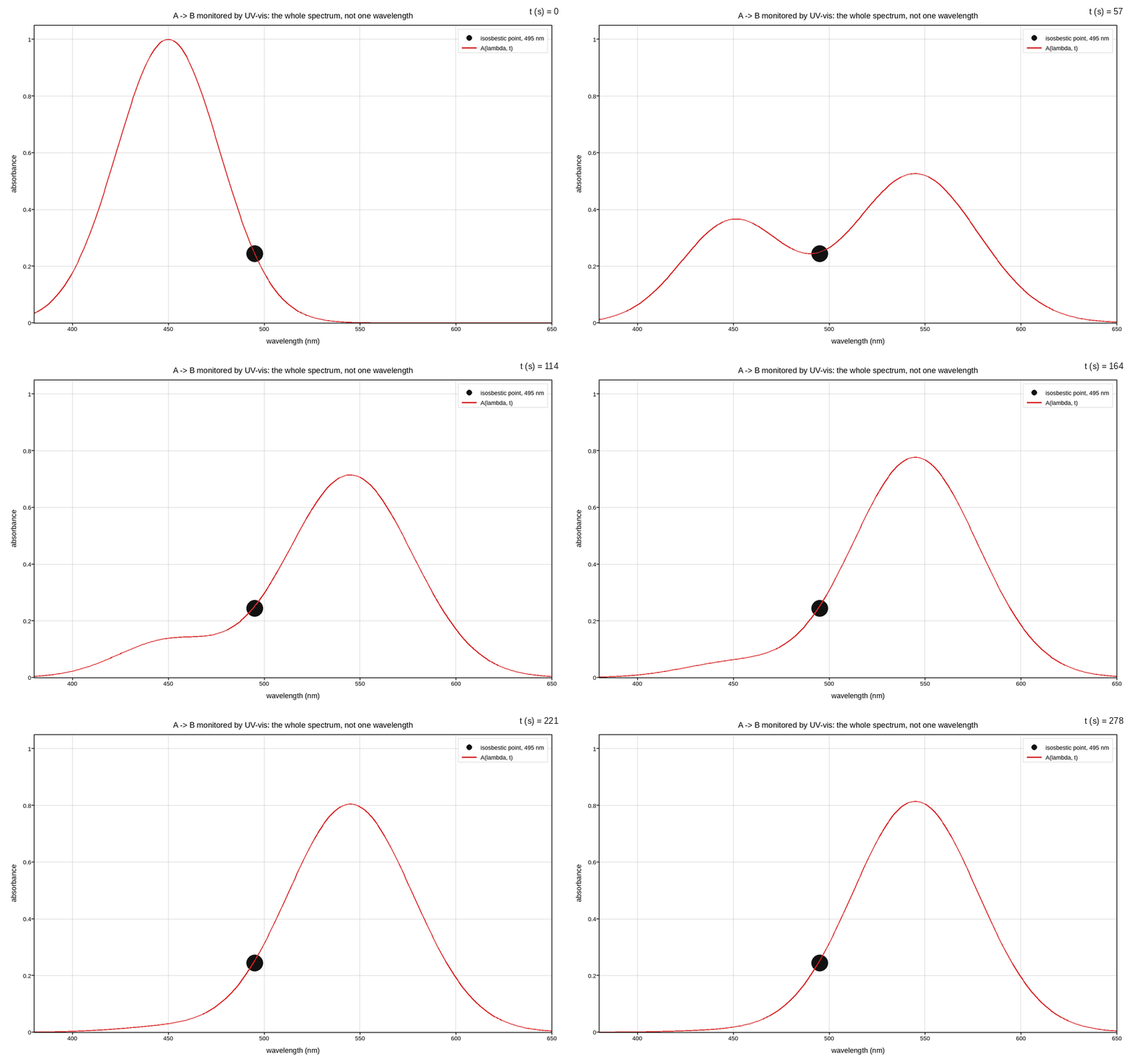
UV-vis spectrum through a first-order reaction, animated
Materials, surfaces and microscopy
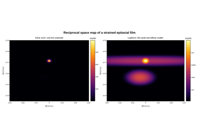
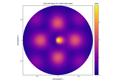
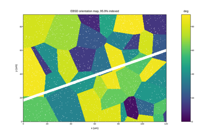
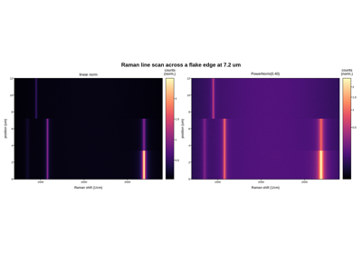
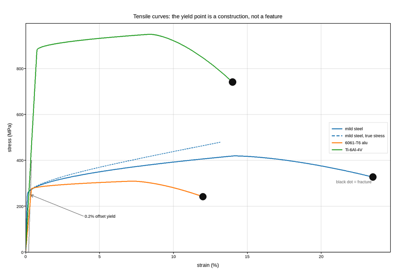
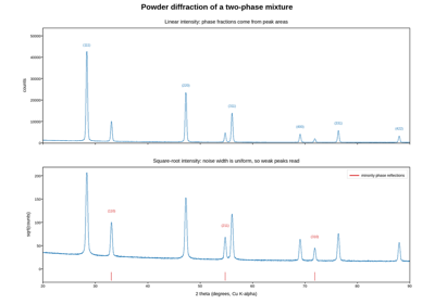
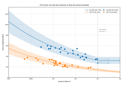
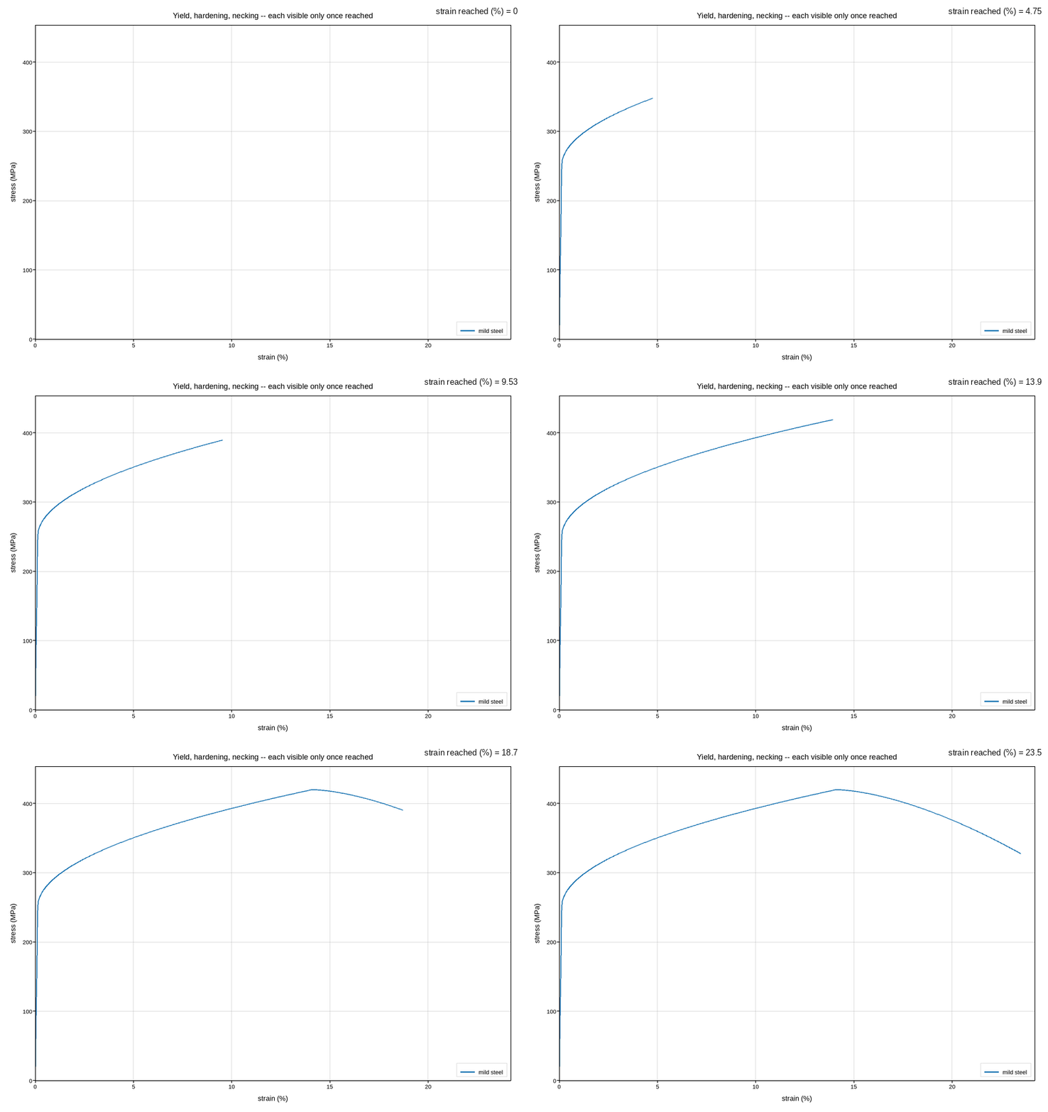
Diffraction, texture, grain structure, mechanical testing and hyperspectral mapping. Two themes run through the section: reciprocal-space and pole-figure data live on non-Cartesian grids that must be projected before plotting, and material properties are so often power laws that the fatigue and diffraction examples are naturally read on log axes.
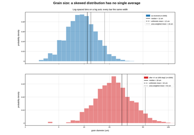
Grain size distribution: which mean is the right mean
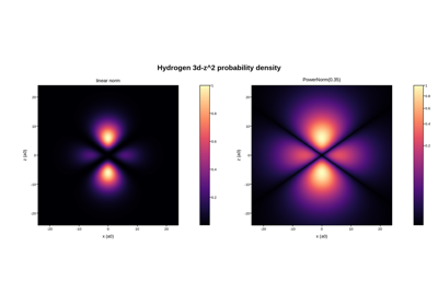
Spectroscopy and wavefunctions
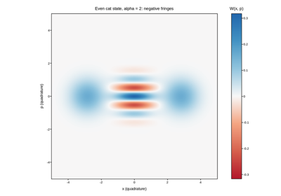
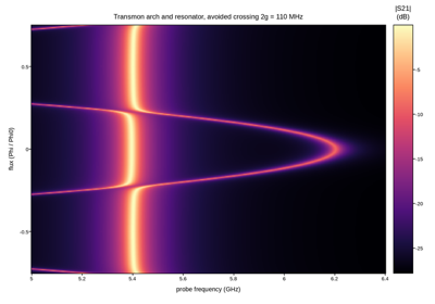
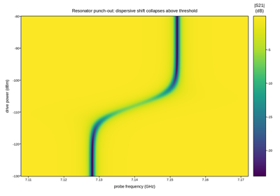
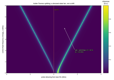
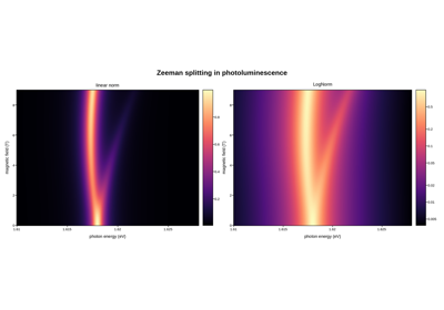
Two-tone and multi-photon spectroscopy, Floquet sidebands, avoided crossings, and the wavefunctions and quasiprobability distributions those spectra are signatures of. The shared shape: drive a frequency (or a photon number, or a drive strength) along one axis and read a response along another.
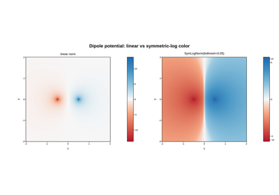
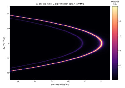
Anharmonicity from flux-swept 0-1 and two-photon 0-2 spectroscopy
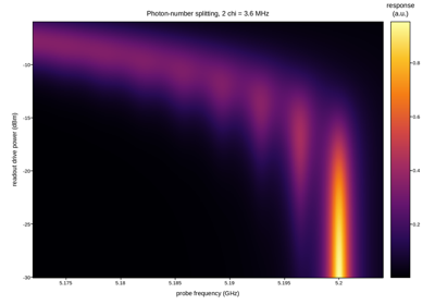
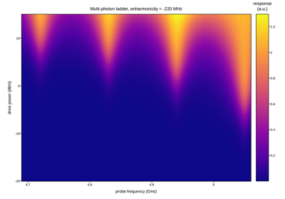
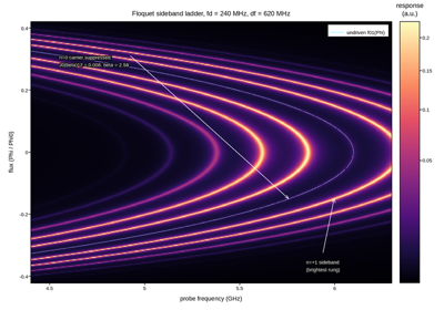
Floquet sideband spectroscopy of a flux-modulated qubit
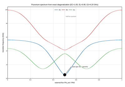
Fluxonium level spectrum from exact numerical diagonalization

Readout and device maps
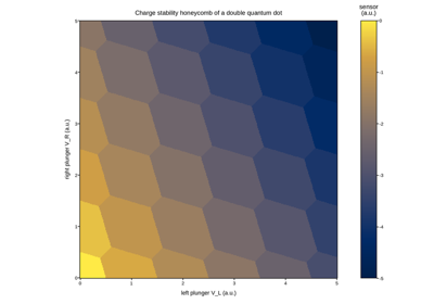
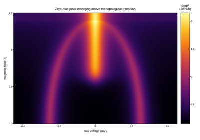
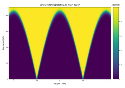
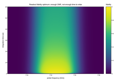
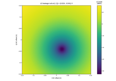
The signal chain a qubit is read out through, and the two-dimensional gate or bias maps that characterize a device before it is used: charge stability, conductance, switching probability, and the mixer and amplifier behavior that sets how much of that signal survives to the digitizer.
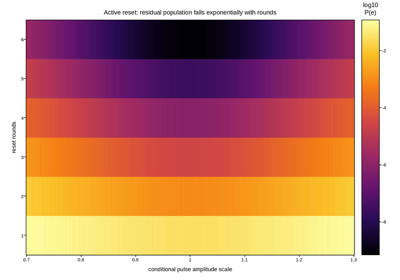
Active reset calibration: residual excitation vs rounds and pulse amplitude
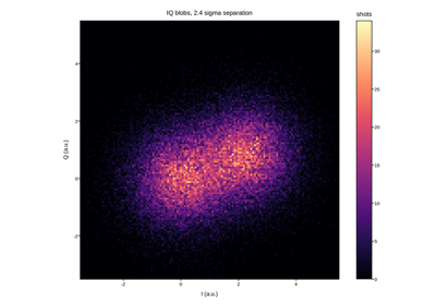
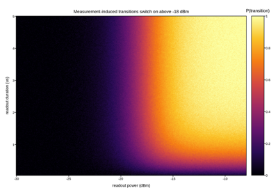
Measurement-induced state transitions vs readout power and duration
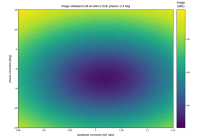
IQ mixer calibration: suppressing the image sideband
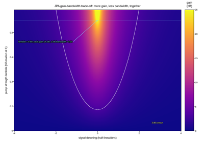
Josephson parametric amplifier: gain versus pump power and bandwidth
Coherence and noise
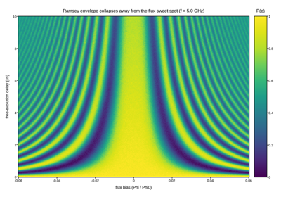
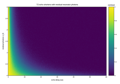
How a qubit loses information, and to what: T1/T2 decay, Ramsey dephasing against a wandering environment, a two-level-system defect drifting through resonance, and the noise-bias engineering (dynamical decoupling, a Kerr-cat’s protected subspace) built to outlast it.
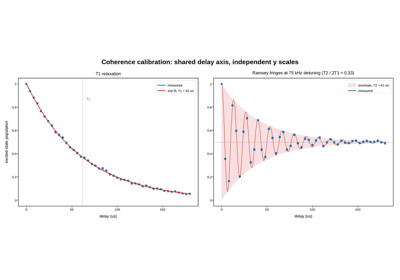
Qubit coherence: T1 relaxation and T2 Ramsey fringes
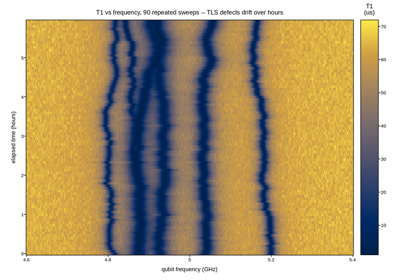
T1 relaxation vs frequency and time: wandering TLS defects
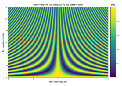
Ramsey chevron: frequency calibration from a fringe pattern
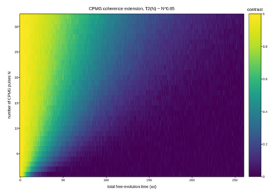
CPMG dynamical decoupling: coherence extension vs number of pulses
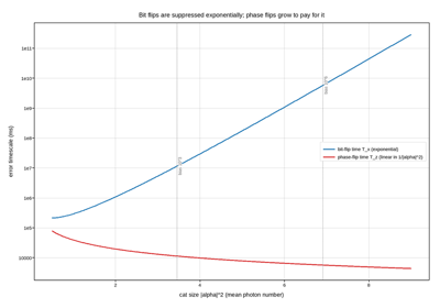
Kerr-cat qubit: exponential bit-flip protection, linear phase-flip cost
Gate calibration
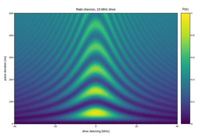
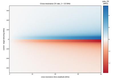
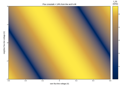
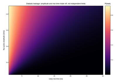
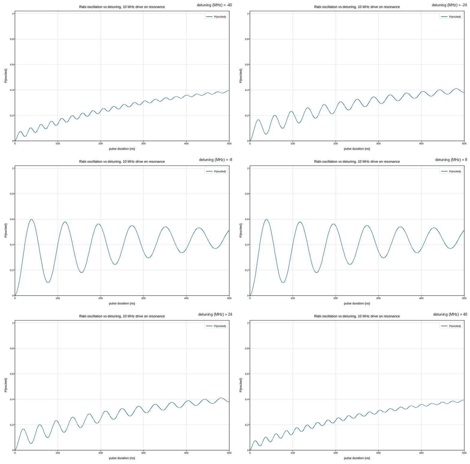
Tuning up the control itself: Rabi chevrons, DRAG and AllXY amplitude calibration, two-qubit CZ and cross-resonance characterization, crosstalk nulling, and the amplitude/duration limits a gate runs into before it starts leaking out of the computational subspace.
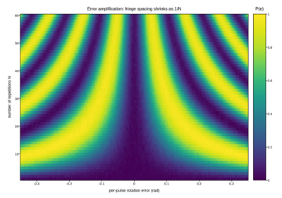
Error-amplification gate calibration: pulse-angle error vs repetitions
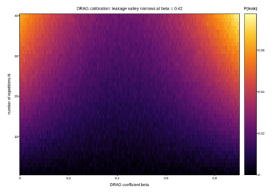
DRAG coefficient calibration from amplified leakage
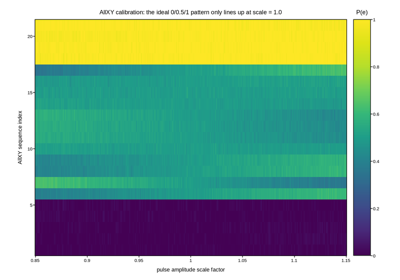
AllXY calibration sweep: amplitude scaling error across 21 sequences
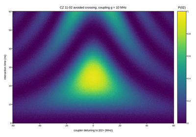
CZ gate calibration: the 11-02 avoided crossing chevron
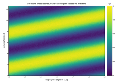
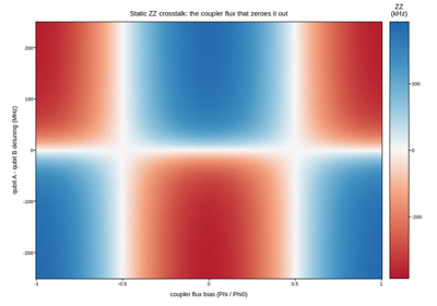
Static ZZ crosstalk vs tunable-coupler flux and qubit detuning

Single-qubit gate speed limit: Rabi map with a leakage threshold overlaid
Benchmarking and multi-qubit
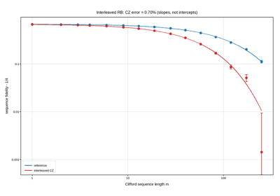
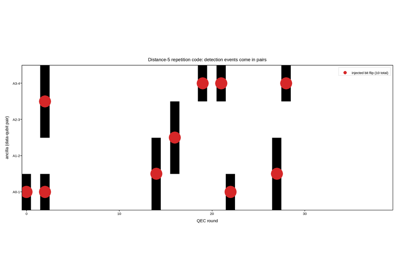
System-level validation once individual gates are calibrated: randomized, purity and cross-entropy benchmarking, leakage-aware variants, and the multi-qubit signatures – GHZ parity, a Bell/CHSH correlation map, a process’s full Pauli transfer matrix, a repetition-code syndrome – that only show up once several qubits act together.
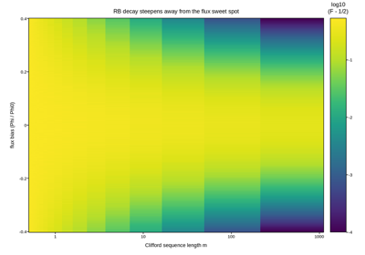
Single-qubit RB fidelity across the flux-tuning range
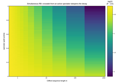
Simultaneous RB: crosstalk-limited fidelity vs spectator activity
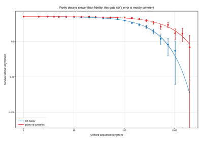
Purity RB: separating coherent from incoherent gate error
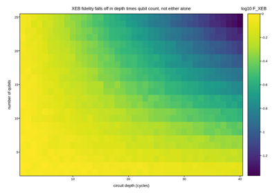
Cross-entropy benchmarking fidelity vs circuit depth and qubit count
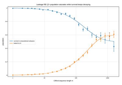
Leakage RB: population escaping the computational subspace
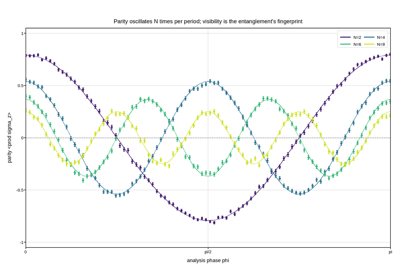
GHZ parity oscillation: N-fold fringes and their fading visibility
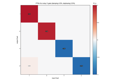
Quantum process tomography: the Pauli transfer matrix of a noisy gate
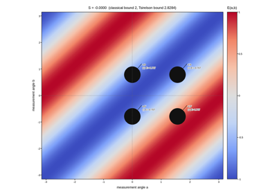
CHSH correlation map: where quantum mechanics beats any local theory
Semiconductors and electronic test
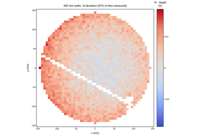
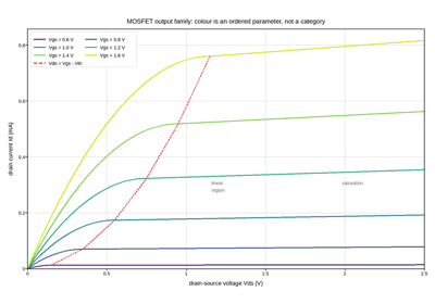
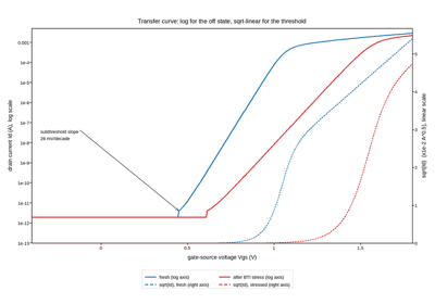
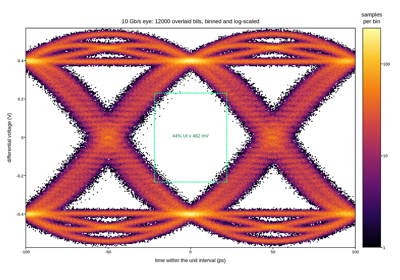
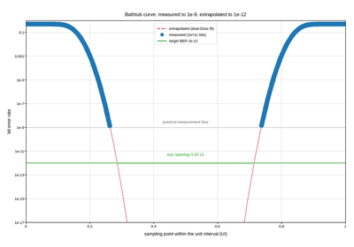
Wafer-level maps, device I-V and C-V characterisation, and the link-margin plots that qualify a serial interface. Semiconductor data mixes scales aggressively: the same transistor sweep spans picoamps to milliamps, and a bit-error rate is only interpretable over ten decades, so a linear axis is usually the wrong default.
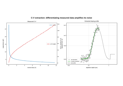
C-V measurement and the doping profile extracted from it
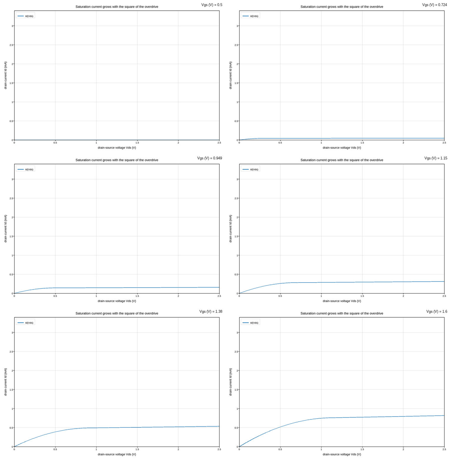
MOSFET output characteristics, swept smoothly in gate voltage
Fluids, heat transfer and mechanical engineering
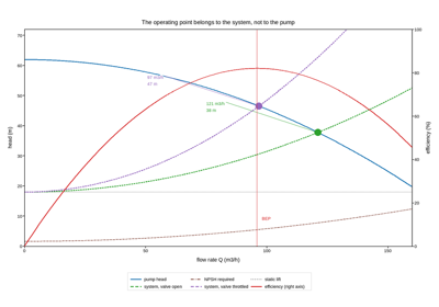
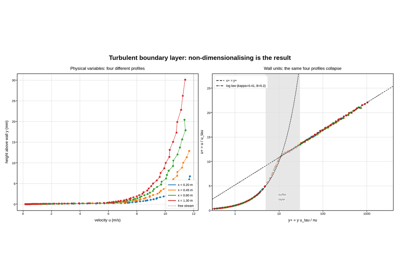
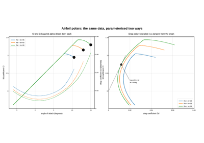
Conduction and convection fields, vortex dynamics, velocimetry, turbomachinery and the design charts engineers still size equipment from. Vector fields need thinning before they are legible, conjugate heat problems need a colour scale that is honest about sign, and the classical design charts – Moody, pump curves, airfoil polars – are log-log or twin-axis figures by construction.
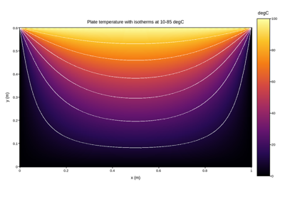
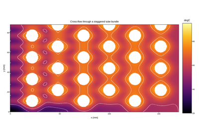
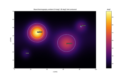
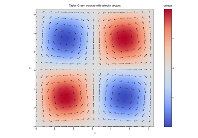
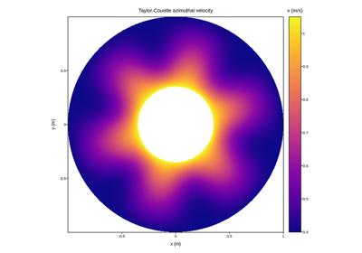
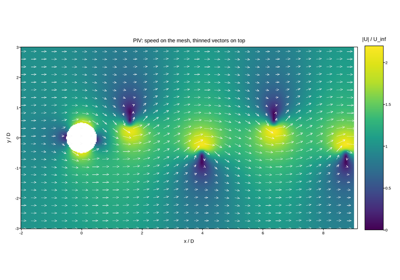
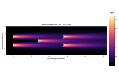
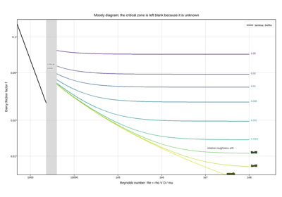
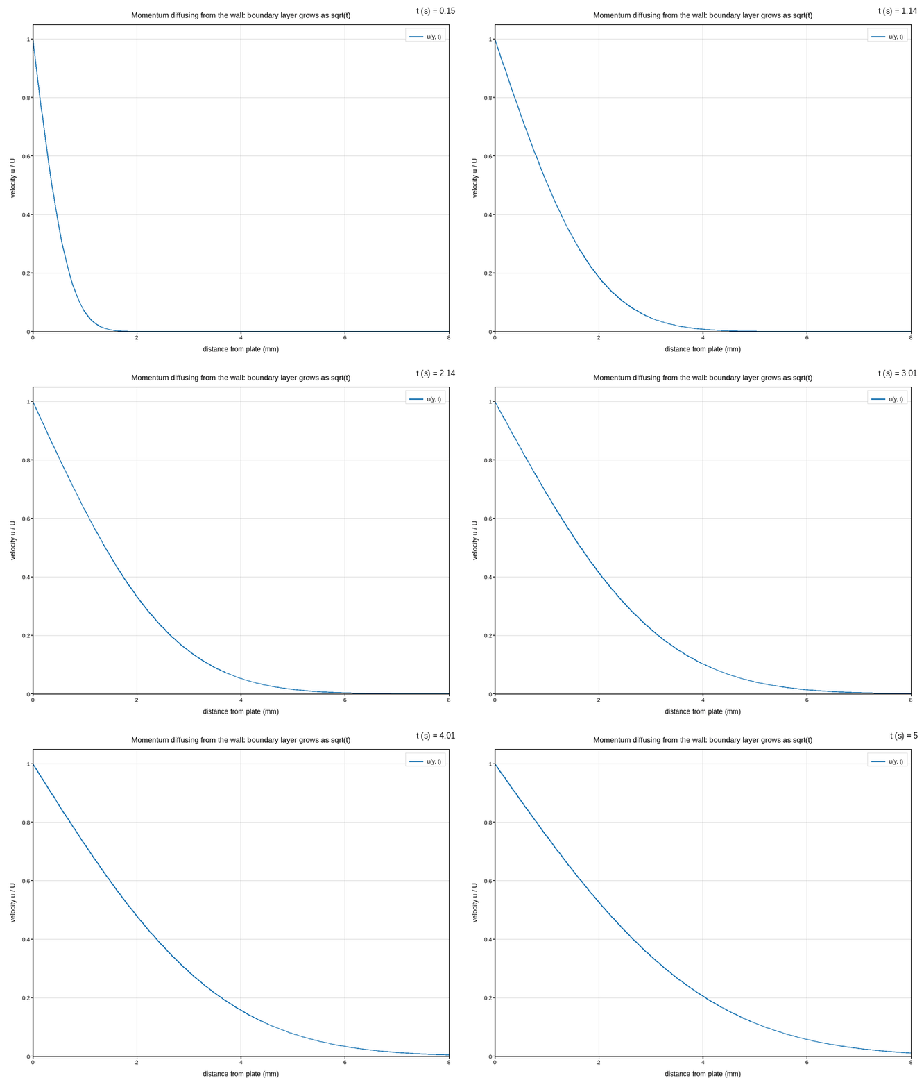
Stokes’ first problem: viscous diffusion from an impulsively started plate
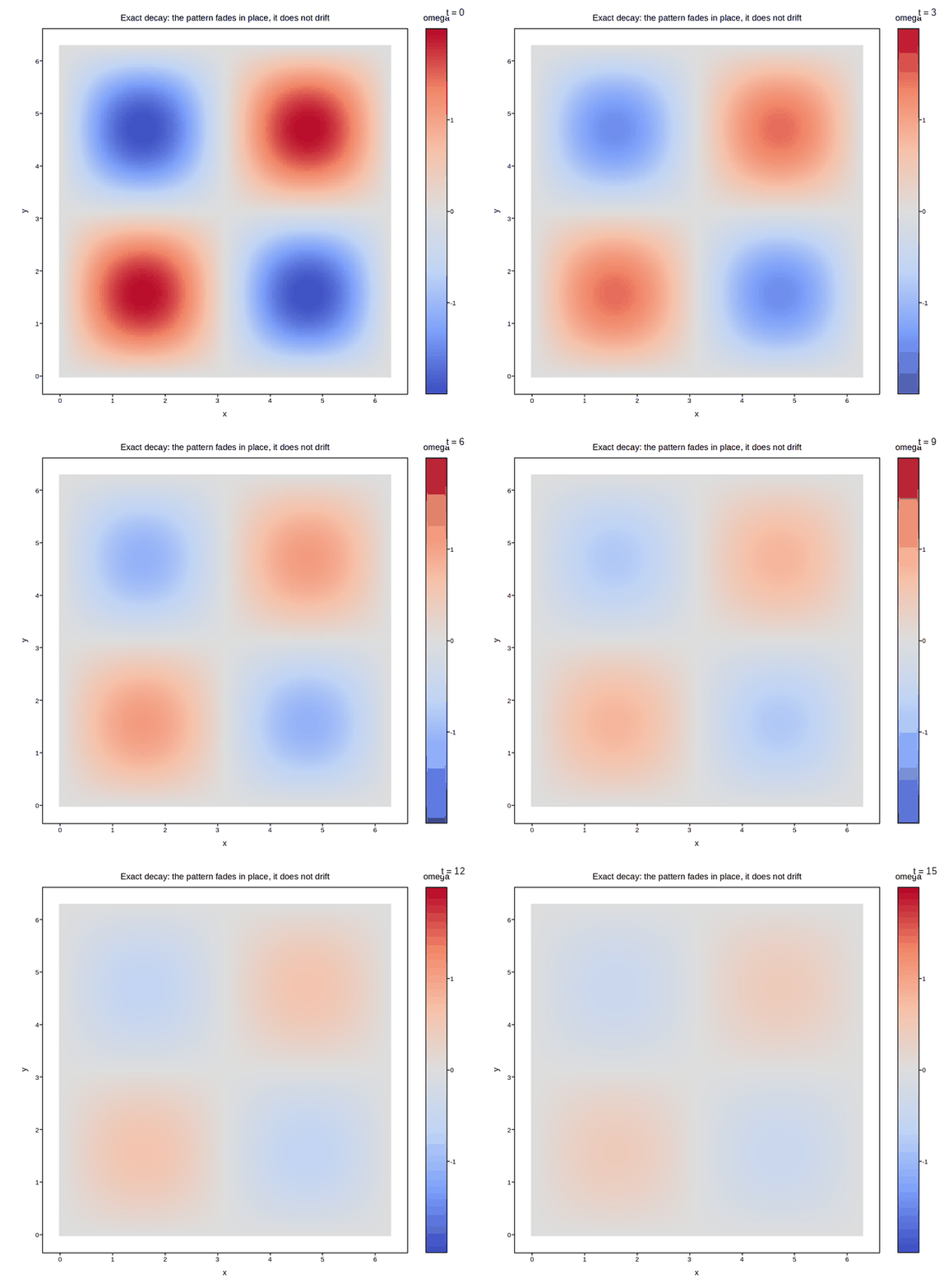
The decaying Taylor-Green vortex: an exact solution, animated
Acoustics, vibration and sonar
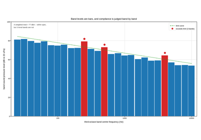
Room modes, decay curves, loudspeaker response, machinery vibration and passive sonar. Acoustics is a decibel discipline: nearly every quantity here is already logarithmic, so the axis choice is about frequency spacing and dynamic-range floors rather than about whether to take a log at all.
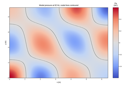
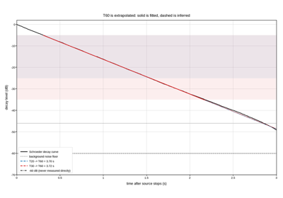
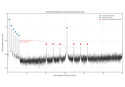
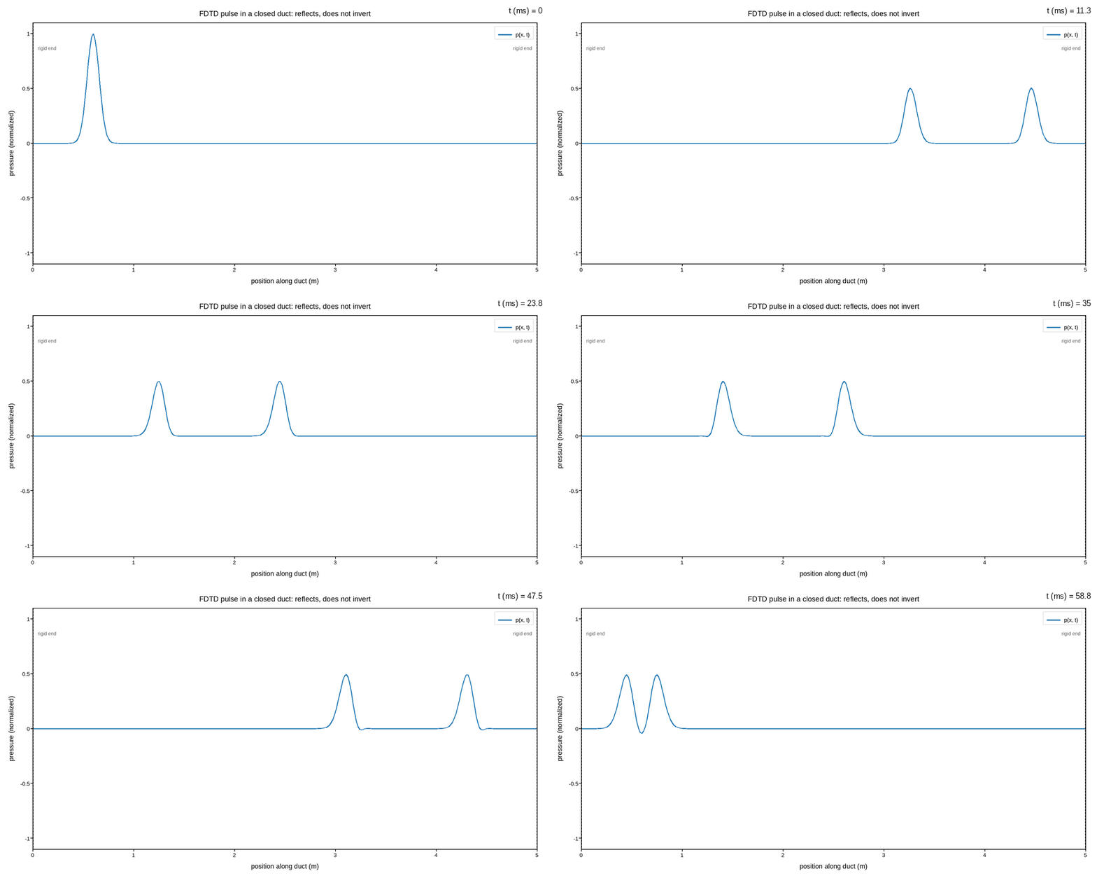
A pressure pulse bouncing down a rigid duct, animated
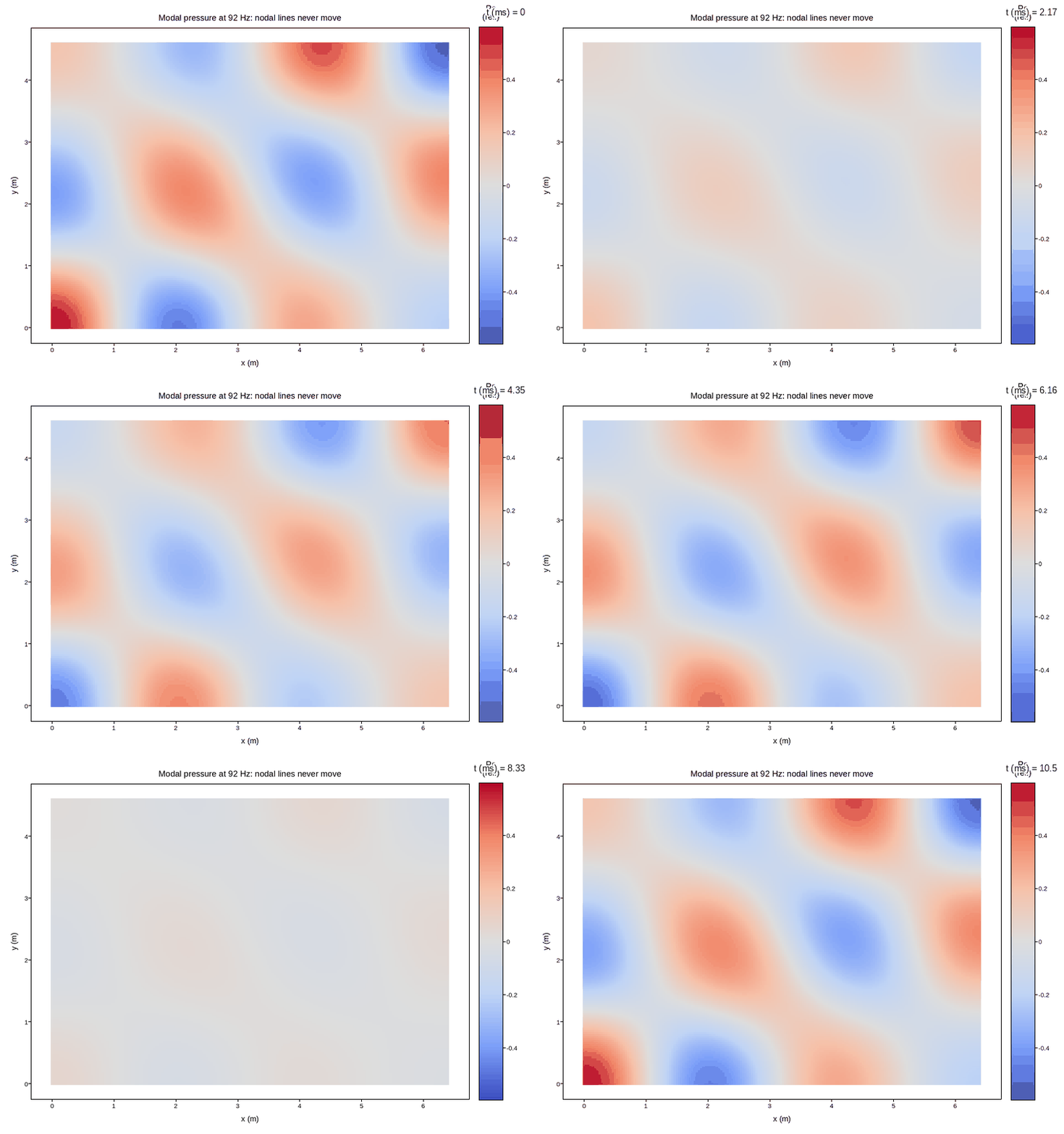
A standing wave, actually standing: room modes in time
Energy and power systems
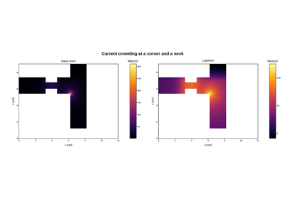
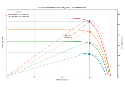
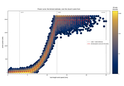
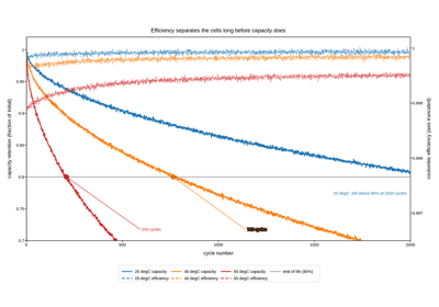
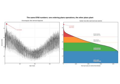
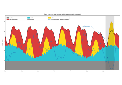
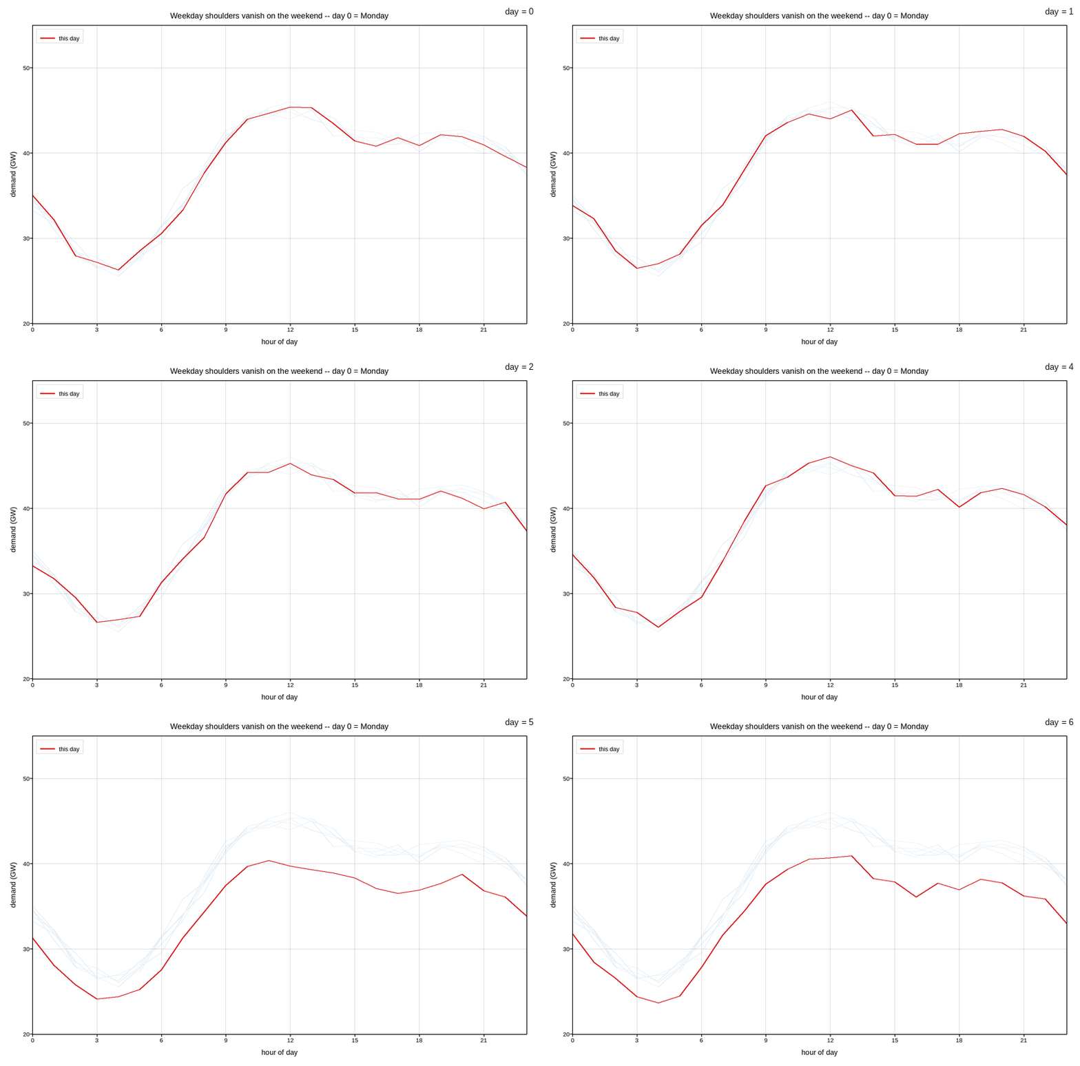
Photovoltaic and wind characterisation, battery ageing, and the load and generation curves a grid operator plans against. The distinctive plotting need is showing two quantities that share an x axis but nothing else – current and power, capacity and efficiency – and showing composition over time without losing the total.
Transport, robotics and navigation
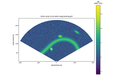
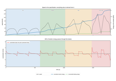
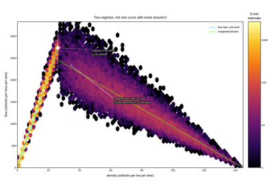
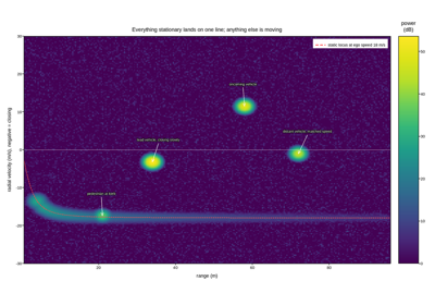
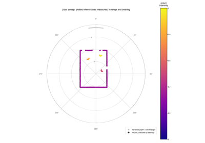
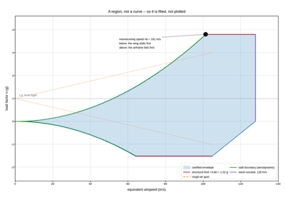
Drive cycles, traffic flow, automotive radar, lidar scans and flight envelopes. Vehicle data is where a plot’s native coordinate system most often is not Cartesian – a lidar returns range against bearing, a radar returns range against Doppler – and where an operating envelope rather than a curve is the thing being drawn.
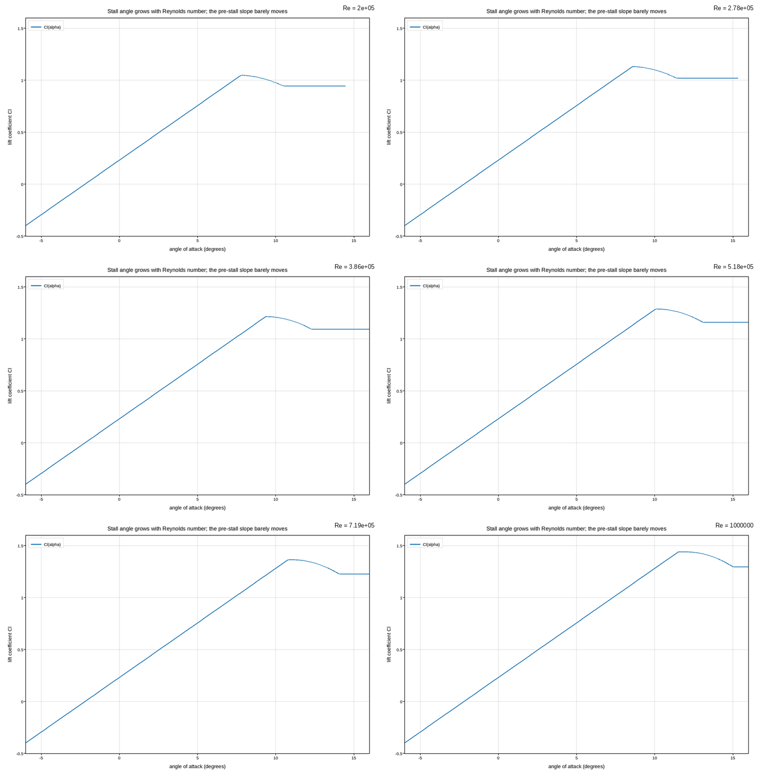
Stall creeping outward as Reynolds number climbs, animated
Manufacturing, reliability and quality
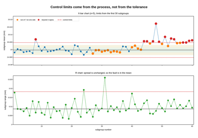
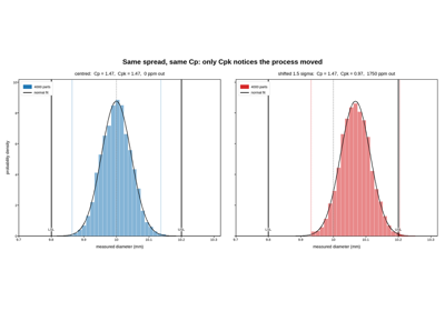
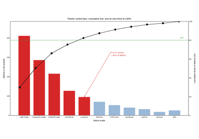
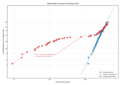
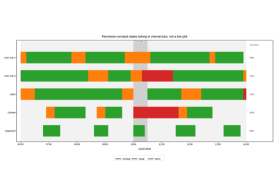
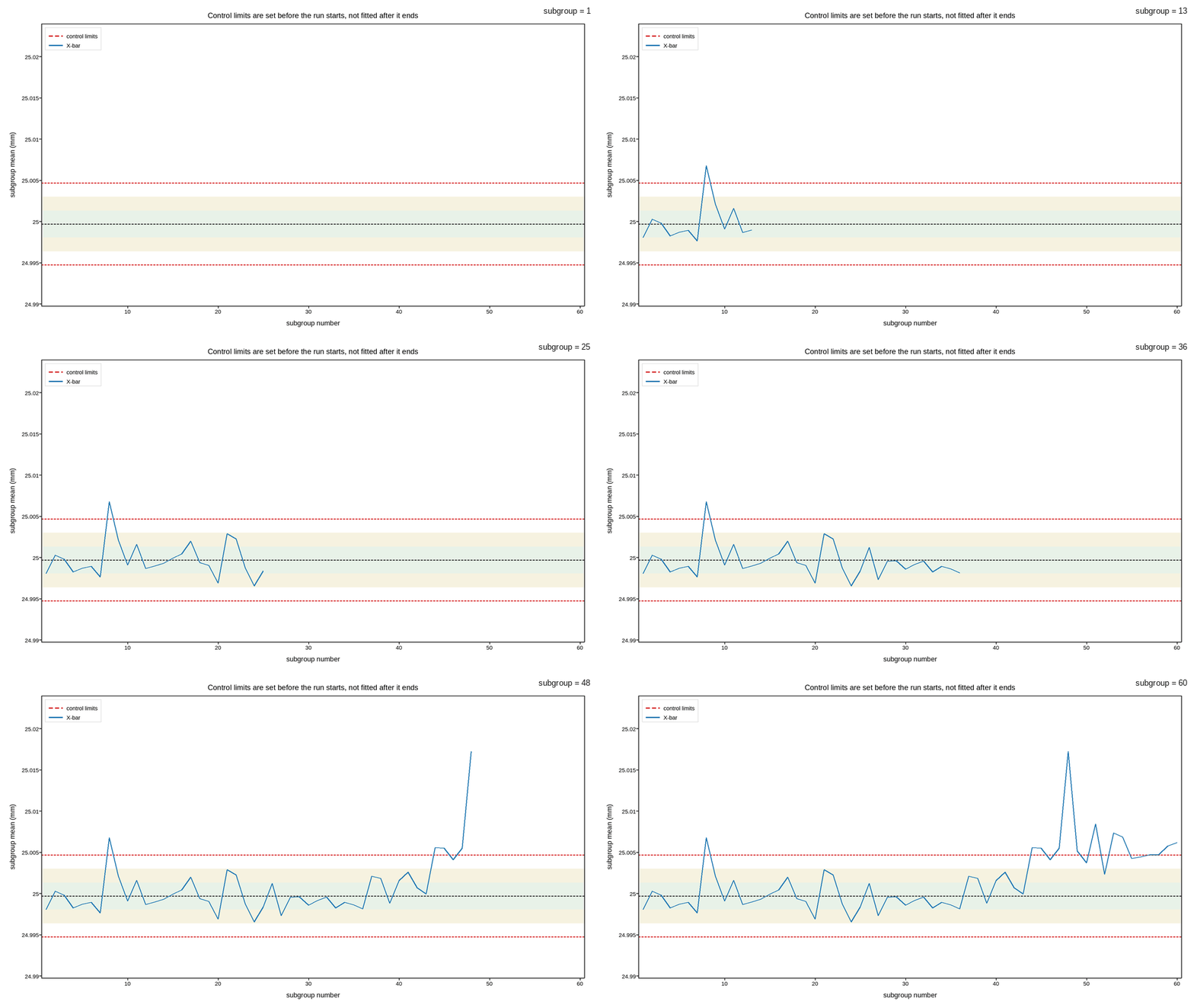
Control charts, capability studies, Pareto analysis, life-test fitting and production scheduling. These are the figures where the reference lines carry the decision – control limits, specification limits, a cumulative 80% cut – so most of the work is making the limits unmistakable against the data rather than drawing the data itself.
Computing, networks and machine learning
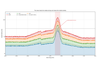
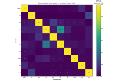
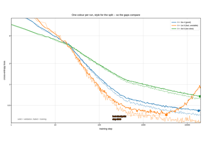
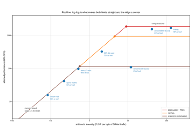
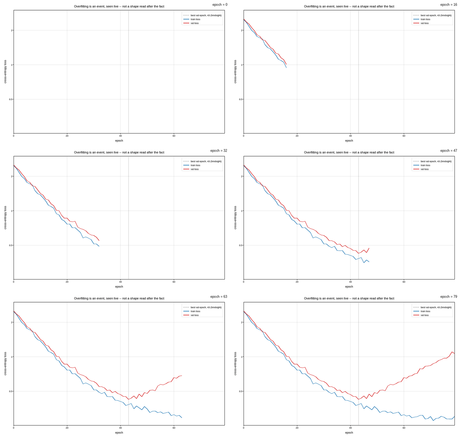
Service latency, classifier evaluation, training diagnostics and hardware performance models. Systems data is heavy-tailed almost by definition, which is why the tail percentile rather than the mean is plotted, and why the roofline and scaling charts are log-log: the interesting behaviour is a change of slope, and only a log axis makes a slope change visible.
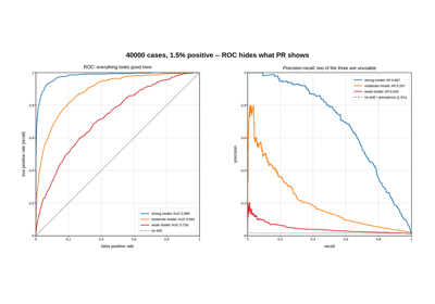
ROC and precision-recall for an imbalanced problem
Finance, economics and risk
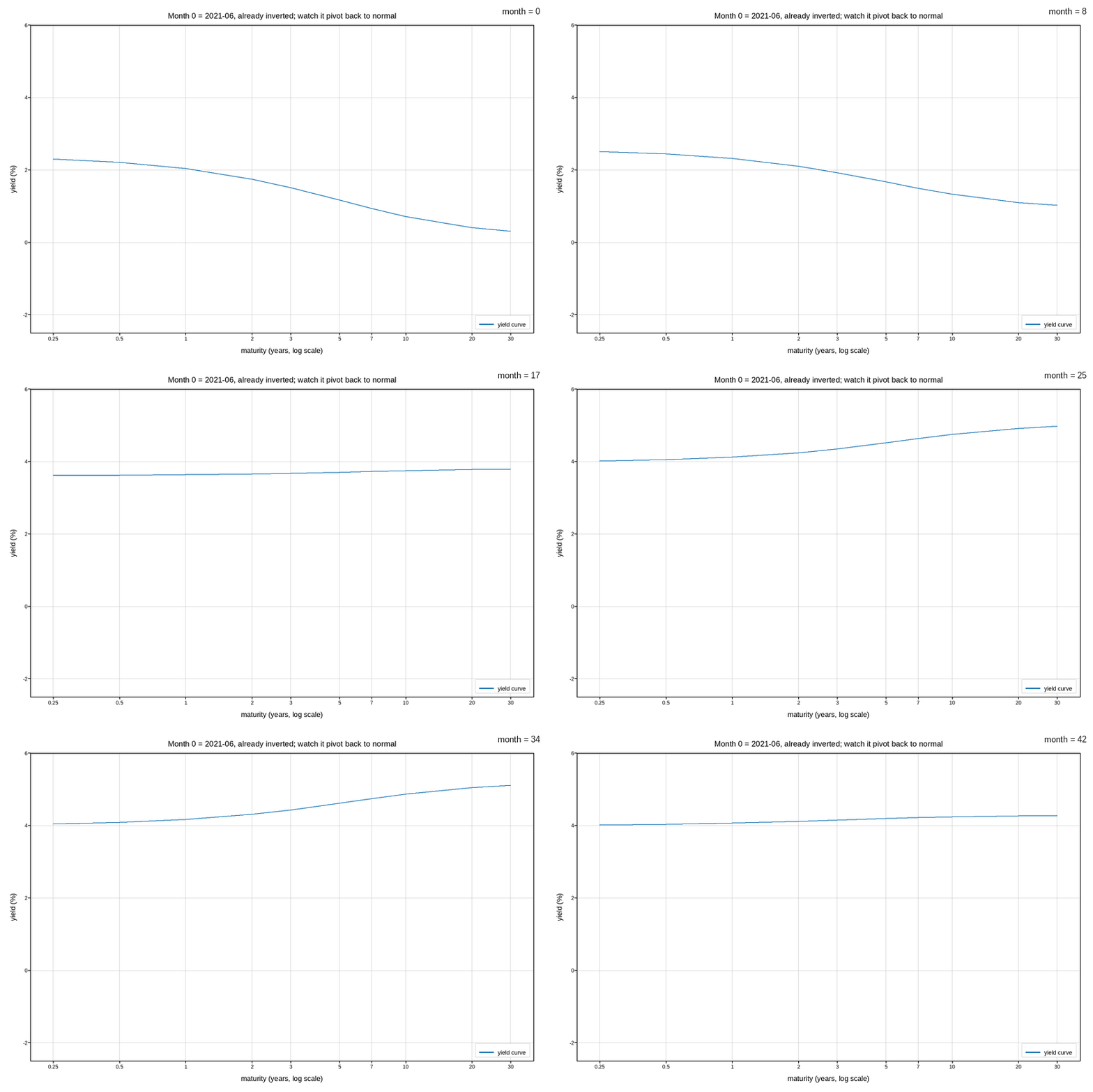
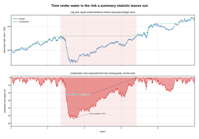
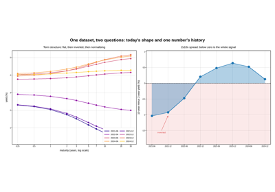
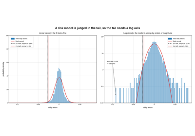
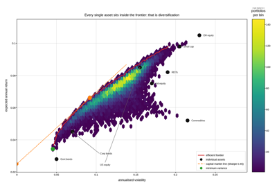
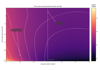
Drawdowns, term structures, return distributions, portfolio frontiers and option surfaces. Financial series are cumulative and multiplicative, so levels belong on a log axis and losses belong measured from the running peak; and the tail of the return distribution – not its centre – is the part a risk figure exists to show.
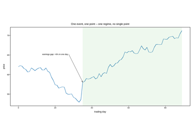
Annotating a price series: a single event vs. a whole regime