Note
Go to the end to download the full example code.
Weibull probability plot of a life test
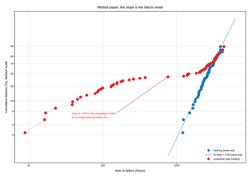
Failure times from a life test, plotted on the coordinates that turn a Weibull distribution into a straight line: the log of time against the log-log of the reciprocal survival probability. On these axes the shape parameter is the slope, and its value is the diagnosis – below one means infant mortality, one means random failures, above one means wear-out. Estimating it from a fitted straight line is the whole method.
The linearisation is the reason both axes are transformed. The y axis carries the double-log quantity but is labelled with the cumulative failure percentages it corresponds to, via explicit ticks – so the transform stays in the arithmetic and the reader still sees “10% failed” rather than a number with no interpretation.
Two populations are shown. One is a clean wear-out mode: a straight line with slope well above one, and it gets a fit. The other bends, which is the signature of two competing failure mechanisms rather than of a bad fit, and it gets no line at all – because there is no honest one to draw. A single Weibull through a mixture returns a shape parameter near one and the comforting, wrong conclusion that failures are random; fitting the two halves separately is no better, since the median ranks belong to the mixture rather than to either mode. Refusing to draw the fit, and marking the knee instead, is the result.
Median ranks are used for the plotting positions rather than a naive i/n, because i/n puts the last failure at 100%, which is off the axis at infinity.
Live figure — pick a tool, then zoom, pan, point-pick or annotate. Nothing is active until a tool is selected.
View this figure’s Vega export ↗ — the raw JSON spec, rendered live by a real Vega engine.
View this figure’s Vega-Lite export ↗ — the raw JSON spec(s), rendered live by a real Vega-Lite engine.
import numpy as np
import polars as pl
import plotpress

rng = np.random.default_rng(1951)


def weibull_y(fraction):
    """Linearising transform: ln(-ln(1 - F))."""
    return np.log(-np.log(1.0 - fraction))


POPULATIONS = [
    # name, beta, eta, second mode as (share, beta, eta) or None, colour
    ("bearing (wear-out)", 4.5, 3000.0, None, "#1f77b4"),
    ("connector (two modes)", 4.5, 3000.0, (0.35, 0.9, 90.0), "#d62728"),
]
N = 60

fig, ax = plotpress.subplots(figsize=(8.8, 6.2))

for name, beta, eta, second, color in POPULATIONS:
    times = eta * rng.weibull(beta, N)
    knee = None
    if second is not None:
        # A *mixture*, not a minimum: a share of the units carry a defect and
        # die early, the rest wear out normally. Taking the elementwise minimum
        # of the two instead lets the early mode's long tail dominate the whole
        # range, and the plot comes out as one straight line -- the opposite of
        # what the example is meant to show.
        share, beta_early, eta_early = second
        early = rng.random(N) < share
        times = np.where(early, eta_early * rng.weibull(beta_early, N), times)
        knee = int(early.sum())

    # One row per unit on test -- the shape a life-test rig's own failure log
    # is in, before the units are ranked by time to failure.
    times = pl.DataFrame({"time": times}).sort("time")["time"].to_numpy()

    # Median ranks (Bernard's approximation): keeps the last point off infinity.
    i = np.arange(1, N + 1)
    fraction = (i - 0.3) / (N + 0.4)

    ax.scatter(times, weibull_y(fraction), s=7.0, color=color, label=name)

    if second is None:
        coeffs = np.polyfit(np.log(times), weibull_y(fraction), 1)
        grid = np.logspace(np.log10(times.min()) - 0.2,
                           np.log10(times.max()) + 0.2, 50)
        ax.plot(grid, np.polyval(coeffs, np.log(grid)), color=color,
                linewidth=1.7, linestyle="--",
                label=f"fit: beta = {coeffs[0]:.2f} (wear-out)")
    else:
        # No fit is drawn through these points, and that is the finding. A
        # single line through a bent plot returns a beta near one -- "failures
        # are random" -- which is the comforting, wrong conclusion. Fitting the
        # two halves separately against the *combined* median ranks is no better:
        # the ranks belong to the mixture, so neither slope is either mode's
        # beta. The modes have to be separated before any beta means anything.
        ax.plot(times[:knee], weibull_y(fraction[:knee]), color=color,
                linewidth=1.2, linestyle=":", alpha=0.8)
        ax.plot(times[knee:], weibull_y(fraction[knee:]), color=color,
                linewidth=1.2, linestyle=":", alpha=0.8)
        ax.annotate(f"knee at ~{times[knee - 1]:.0f} h: two competing modes,\n"
                    "so no single beta describes this",
                    xy=(times[knee], weibull_y(fraction[knee])),
                    xytext=(times[knee] * 0.05, weibull_y(fraction[knee]) - 2.6),
                    arrowprops={"color": color}, color=color, fontsize=9)

percentiles = np.array([0.01, 0.02, 0.05, 0.10, 0.25, 0.50, 0.75, 0.90, 0.99])
ax.set_yticks(weibull_y(percentiles), [f"{p * 100:g}" for p in percentiles])
ax.set_xscale("log")
ax.set_xlabel("time to failure (hours)")
ax.set_ylabel("cumulative failures (%), Weibull scale")
ax.set_title("Weibull paper: the slope is the failure mode")
ax.legend(loc="lower right")
ax.grid(True)
fig.tight_layout()
Total running time of the script: (0 minutes 0.148 seconds)