Usage
Figures, not globals
Everything hangs off a Figure. plotpress.subplots()
returns (fig, axes) just like matplotlib’s plt.subplots() – but there is
no global “current figure/axes” and no global rcParams.
import plotpress
import numpy as np

fig, axes = plotpress.subplots(1, 2, figsize=(10, 4))
x = np.linspace(0, 10, 200)
axes[0].plot(x, np.sin(x)); axes[0].set_title("sin")
axes[1].scatter(x, np.cos(x), s=8); axes[1].set_title("cos")
fig.tight_layout()
How close is the matplotlib API?
The object-oriented core is deliberately matplotlib-shaped: Figure /
Axes with plot, scatter, bar, hist, pcolormesh,
set_xlabel / set_ylabel / set_title, set_xlim / set_ylim,
grid, legend, colorbar, twinx / twiny, log scales and the
"C0"..``”CN”`` colour cycle all behave as you would expect. Code written
against fig, ax = plt.subplots() usually ports by changing the import.
It is a shaped API, not a drop-in one. There is no pyplot state machine
(plt.plot / plt.gca / plt.savefig), no rcParams, and the long
tail of matplotlib keyword arguments and plot types is not all present. Treat
the gallery as the compatibility surface: if a call appears
there, it works the same way; if it doesn’t, assume it needs adapting rather
than a straight copy. Known gaps and trade-offs are catalogued under
Limitations.
Output surfaces
One scene, many targets:
Call |
Result |
|---|---|
|
static vector SVG |
|
raster PNG |
|
vector PDF |
|
looping GIF (plot_frames()) |
|
interactive HTML (JS toolbar) |
|
inline SVG in Jupyter |
|
native pop-up window ( |
Interactive figures
Interactive HTML and pop-up output carry a self-contained JavaScript toolbar (no external requests – works under strict CSPs like Jupyter). Nothing is active until a tool is selected:
The toolbar is a single menu bar. Pan/Zoom, Home, and Fit Width sit standalone at the far left – the whole-figure tool reached for most, and the two resets that undo it; everything else groups into four menus by what its buttons do: Axes, Point Picking, Annotate, and File.
Pan/Zoom, Home, and Fit Width:
Pan/Zoom – a plain wheel zooms the whole figure, centered on the cursor, regardless of which axes (if any) is under it – the gesture that actually helps on a figure with many small axes, where the cursor is only ever over one tiny panel at a time. Drag pans that same whole-figure view. A plain wheel with no tool selected is left alone to scroll the page, exactly as it would over any other content:
It works just as directly on a single-axes figure:
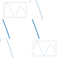
Home – restores whole-figure magnification to its natural size; leaves every axes’ own pan/zoom and every pin/annotation untouched.
Fit Width – a one-shot snap to whatever magnification makes the figure exactly as wide as the current browser window – worth reaching for on a large
figsizeopened as standalone HTML, which otherwise opens at its natural (often much larger than any window) pixel size, with only a portion visible until you zoom out or scroll. An embedded figure (e.g. inside aReport) already CSS-scales to its container, so this only matters for standalone HTML/pop-up output. Doesn’t keep re-fitting on a later window resize, the same as Home.
Axis Span to pan, Axis Zoom to zoom (ctrl+wheel or box-drag), Point Picking to read a value -- the scatter series also carries a phase value, surfaced when a marker is picked.
Axes menu:
Axis Span – drag to pan a single plot’s data window.
Axis Zoom – two distinct gestures. Box-drag zooms one axes in data space (ticks recompute). Ctrl+wheel (or a trackpad pinch) zooms the whole figure instead, the same gesture Pan/Zoom’s plain wheel does.
Reset All Axes – restores every axes’ own pan/zoom to its original view; leaves whole-figure magnification and every pin/annotation untouched.
Point Picking menu:
Point Picking – click to read the nearest data value; arrow keys step along the series; right-click deletes. Reports extra dims (
z,c, …).Hide Points – a standalone toggle, not a mode: hides every Point Picking pin without deleting any of them. Toggling it back to “Show Points” restores them exactly as they were, text included.
Clear Points – removes every Point Picking pin at once, leaving any annotation notes untouched.
Extract – copy/download every Point Picking pin as CSV/JSON (or hand them back to the kernel with
fig.show(wait_for_extract=True)).
Annotate Arrow drops a user-written note anywhere on the figure, including outside the axes -- try the peak, or the margin.
Annotate menu:
Annotate – drop a plain text box anywhere on the figure: a caption, not a callout. No dot, no leader arrow, always pinned to a fixed figure position.
Annotate Arrow – drop a user-written note anywhere on the figure, not locked to any datum but pointing at wherever it was dropped (a dot, a leader arrow) – including the margins or the gap between subplots.
Annotate Point – like Point Picking, but prompts for text and locks a note to that datum instead of the auto-generated readout; never appears in Extract’s output.
Hide Annotations – the mirror of Hide Points: hides every annotation note, plus every boxed callout the figure itself drew, without deleting any of them.
Clear Annotations – the mirror of Clear Points: removes every annotation note at once, leaving any Point Picking pins untouched.
A note dropped by any of the three Annotate tools can be dragged to reposition it under any of the three – not just the one that created it.
Point Picking a few values along the curve, then click Hide All -- every pin disappears without being deleted; click it again (now labeled Show All) to bring them all back exactly as they were.
File menu:
Save/Save As – downloads the current page – pan/zoom, every pin/annotation, hidden-legend-series toggles, and Hide Points/Hide Annotations – as a new, equally self-contained HTML file; Save tries to overwrite the file the page was opened from instead, where the browser allows it.
3-D data via ax.plot_frames(...) adds a play/pause/step slider over the
extra dimension.
plot_frames adds a play/pause/step slider over an extra dimension.
Every picked/extracted record carries axes and axes_title – the
axes’ own title, or a generated "axes N" when it has none, so a
multi-panel export always names its source panel.
set_pick_context() attaches further per-axes
key/value context (e.g. a panel’s own color) that rides along on every record
picked from it, and set_pickable() excludes an
axes from Point Picking entirely (Annotate Point resolves the same way, so
it respects this too) – Axis Span, Axis Zoom, Pan/Zoom, Annotate, and
Annotate Arrow are unaffected. See Interactive figures for the
full picture, and
A different spine color per axes for
set_pick_context used to surface a per-panel spine color.
Point Picking the left panel: its axes_title ("Sensor A") and set_pick_context() keys (edge_color, unit) ride along on the marker. The right panel has set_pickable(False), so clicking it does nothing -- and were it pickable, its axes_title would fall back to a generated "axes 1" since it has no title of its own.
Combining figures into a report
Report combines several figures into one self-contained
HTML file. Each figure keeps its own independent interactivity – its own
toolbar, pan/zoom, point-picking, annotations – because it is embedded in its
own <iframe> rather than spliced directly into the page: an interactive
figure’s JS assumes it owns the page (fixed element ids, a document-level
toolbar), so several sharing one page directly would collide. Add figures
with add(), in the order they should appear, with an
optional title and details for each:
report = plotpress.Report(title="Weekly QA sweep",
                          description="Four sensor batches, one figure each.")
report.add(fig_a, title="Batch A", details="Baseline run, no anomalies.")
report.add(fig_b, title="Batch B", details="Elevated noise floor after 14:00.")
report.save("qa_sweep.html")
Every entry is collapsible – click its “Figure N”/title header to hide
just that figure, or the Collapse All/Expand All button above the
first entry to do the same for all of them at once – so a report with many
figures still reads as a scannable outline, not a wall of plots.
report.save("qa_sweep.html", collapsed=True) starts every entry
collapsed instead of open, worth it once a report has enough figures that
opening it fully expanded would be slow: a collapsed figure’s document
isn’t parsed or rendered at all until a reader actually expands it.
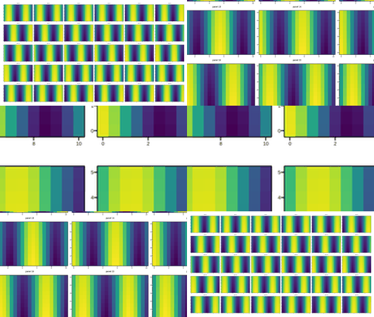
Below: four figures, each its own 5x10 grid of independent pcolormesh
panels – every panel keeping its own title, axes, ticks, labels, and
colorbar – combined into a single scrollable report. Try collapsing one,
then Collapse All.
Four figures, each a 5x10 grid of independent pcolormesh panels, combined into one file with plotpress.Report -- every panel in every figure keeps its own toolbar-driven interactivity.
Reading data back out of a saved HTML
load_data() reads the plotted data straight back out of an
interactive=True HTML file – the original Python objects that built it
don’t need to still be around. It returns a dict keyed by each figure’s own
title (one entry for a bare figure’s HTML, one per embedded figure for a
Report’s – a generated "Figure N" for one with no
title of its own), each mapping its own axes’ titles to that panel’s
series/mesh data plus its labels, limits, and scale:
data = plotpress.load_data("qa_sweep.html")
mesh = data["Batch A"]["axes"]["axes 0"]["meshes"][0]
mesh["x"], mesh["y"]   # 1-D cell-center coordinates
mesh["z"]              # 2-D array, shape (ny, nx)
Title keys are convenient but not guaranteed unique – pass by_index=True
when two figures or two axes share a title, or a positional key is simply
more useful: this returns a plain list of per-figure dicts instead, each
with its axes keyed by integer index rather than title.
See Reload a mesh grid and replot one slice per panel as a line and
Reload a mesh grid and FFT every panel for two
worked examples: reloading a 30-panel pcolormesh grid and replotting one
x-slice per panel as a line, and reloading the same grid to run a 2-D FFT
over every panel.
Log scales, aspect, layout
ax.set_xscale("log"); ax.set_yscale("log")   # or ax.loglog(x, y)
ax.set_aspect("equal")                        # circles look circular
fig.tight_layout()                            # auto-margins, no overflow
ax.annotate("peak", xy=(x0, y0), xytext=(x1, y1), arrowprops={})
fig.suptitle("Overview")