Example gallery
Plots recreating matplotlib’s “Plot types” reference and common gallery examples, using plotpress. Click any thumbnail to see the code that generates it, the full-size image, and a downloadable script.
Pairwise data
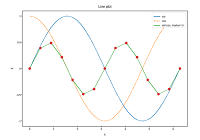
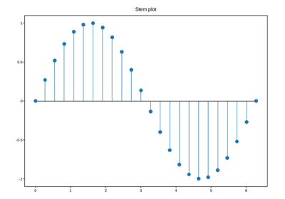
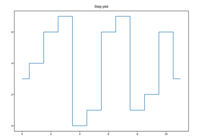
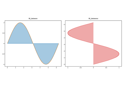
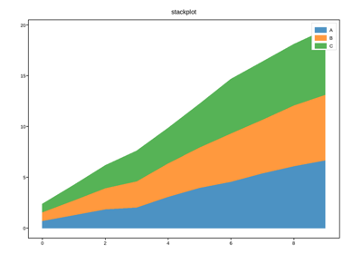
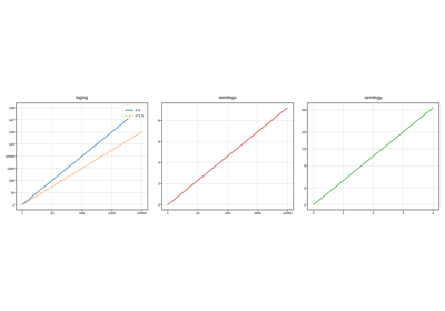
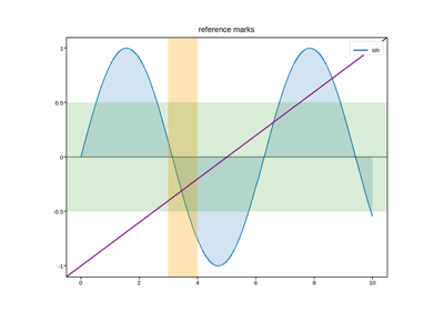
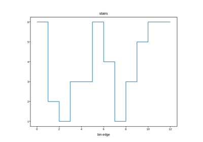
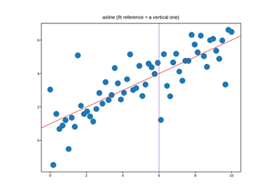
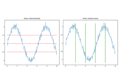
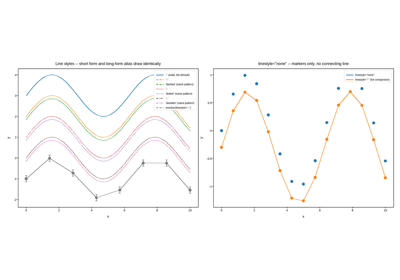
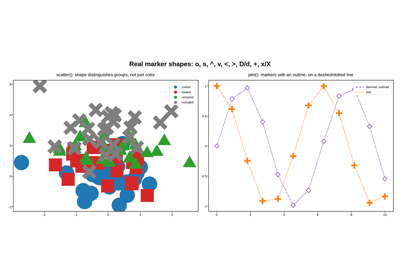
An x series against a y series, drawn as a line, points, bars, a
filled band, or a step – the shape most data starts in. Includes the
reference-line family (axhline/axvline/axline) and the log-scale
variant of the basic line plot.
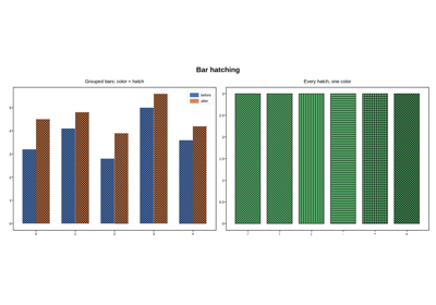
Statistical distributions
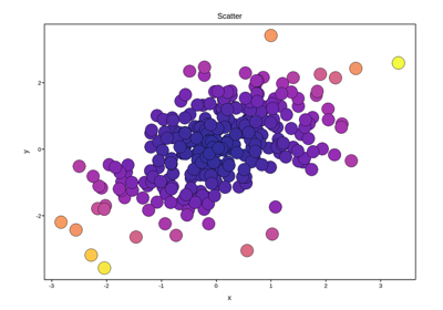
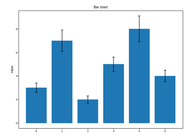
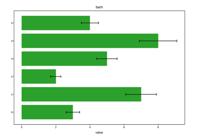
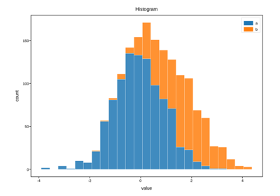
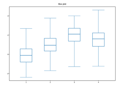
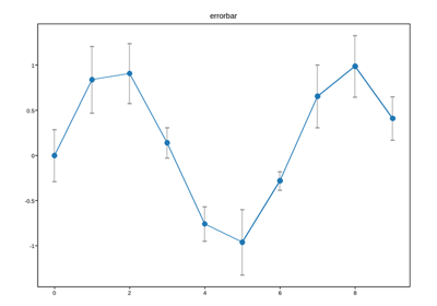
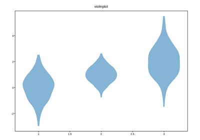
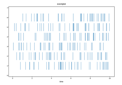
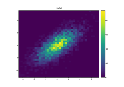
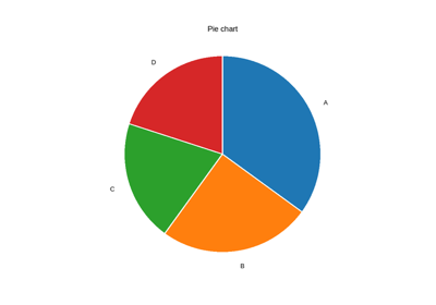
Summarizing a batch of values rather than plotting them one by one: histograms in one and two dimensions, box and violin plots, error bars, event rasters, and a pie chart for simple composition.
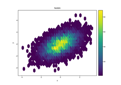
Gridded data
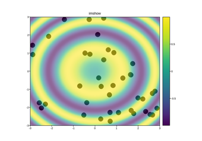
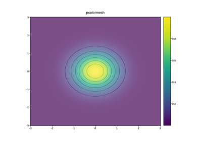
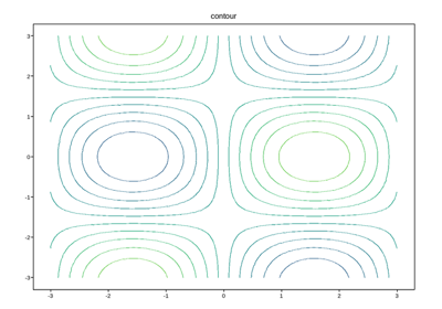
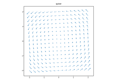
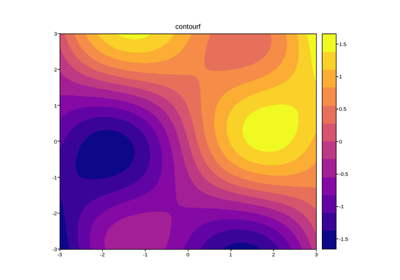
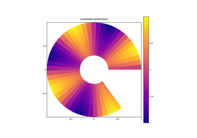
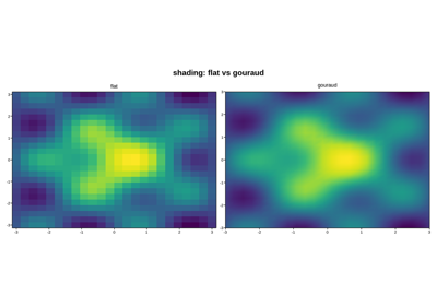
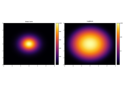
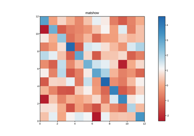
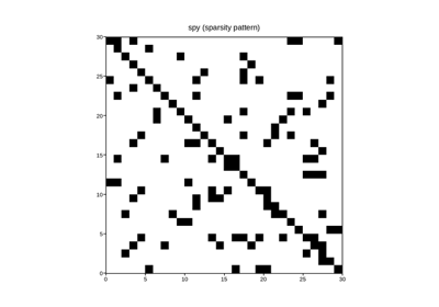
A value defined over a 2-D grid rather than at a set of points: images,
meshes (regular, curvilinear and Gouraud-shaded), contours, vector fields,
and the matrix-specific matshow/spy views, plus the logarithmic
colour norm that dense grids often need.
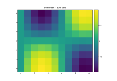
Small mesh: real data in the Vega/Vega-Lite export
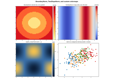
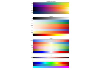
Discrete bins, a centered diverging scale, and custom colormaps
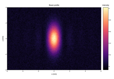
Slice: columns, and the profile in the heatmap’s place
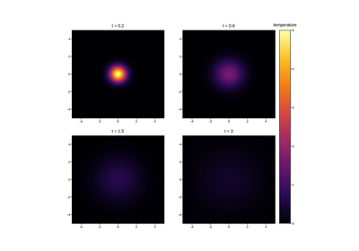
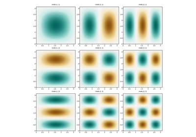
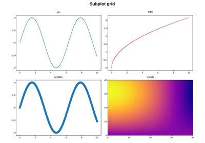
Multi-axes layout and annotation
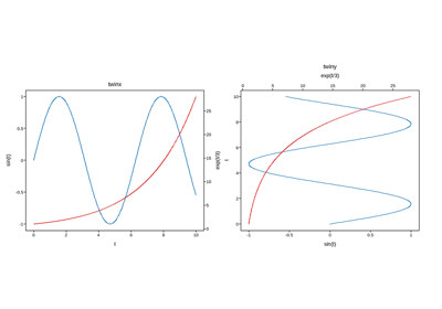
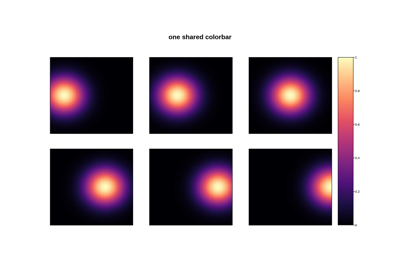
Techniques that sit on top of a plot type rather than being one: arranging several axes on one figure, a second y-axis sharing the same x-axis, a colorbar shared across axes, and annotating a point on the data.
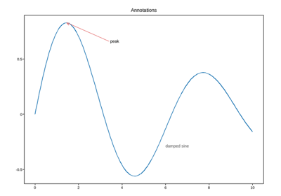
Animation
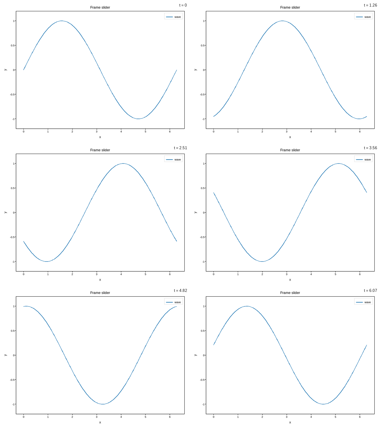
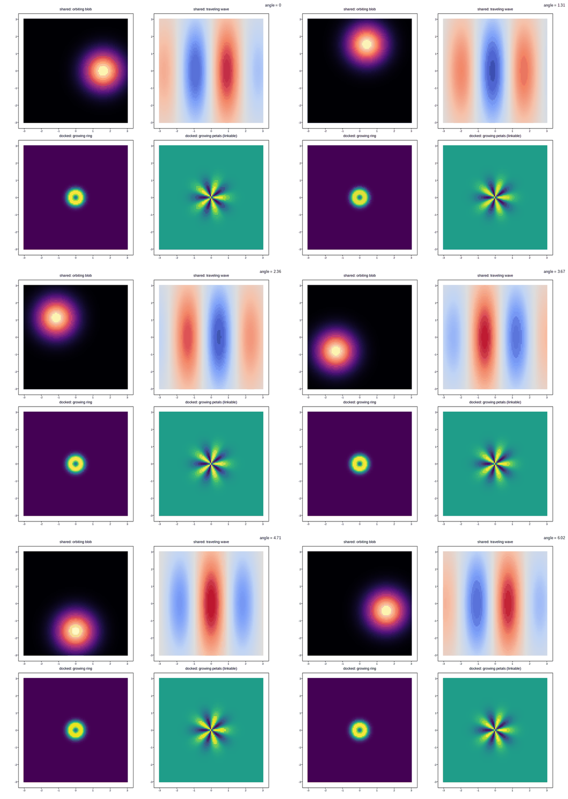
A series with an extra frame dimension, scrubbed by a slider in interactive
HTML and exportable to a self-contained looping GIF: plot_frames() for
lines, pcolormesh_frames() for meshes.
Axes & figure manipulation
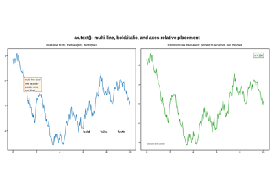
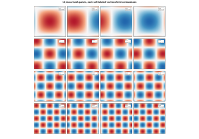
Post-creation manipulation of axes and figures – spines, per-axes cosmetics,
tick placement, axes lifecycle, and the small matplotlib-compatibility
conveniences (axis(), persistent margins(), per-axes prop cycles)
that sit alongside the plotting methods themselves.
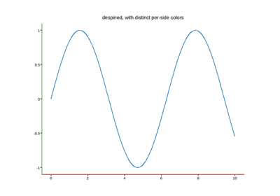
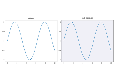
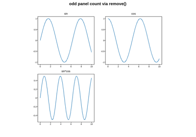
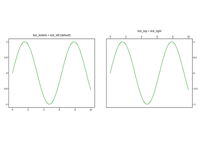
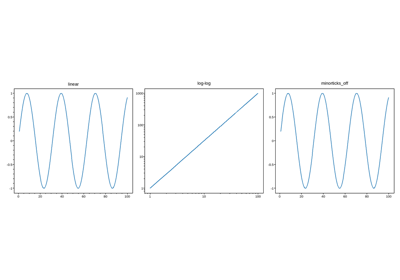
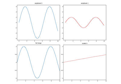
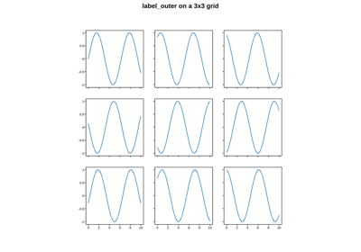
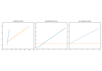
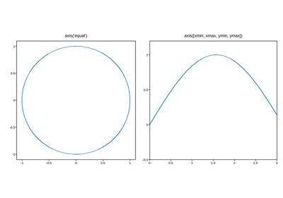
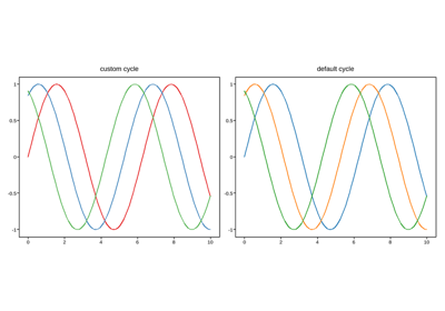
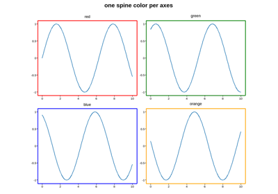
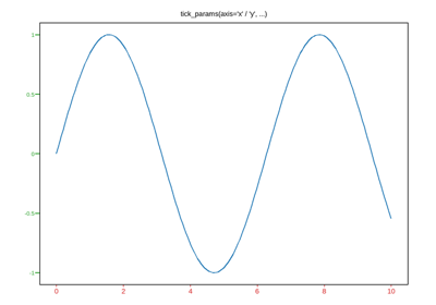
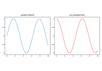

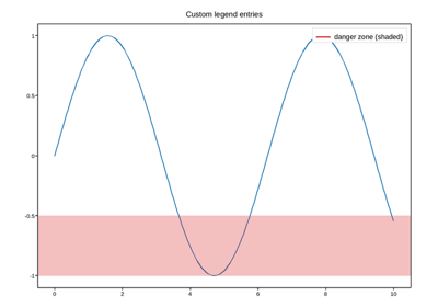
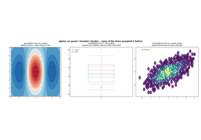
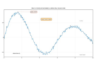
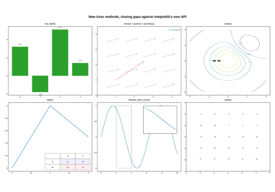
Six methods closing gaps against matplotlib’s Axes API
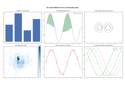
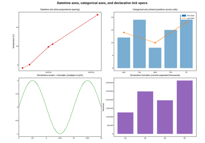
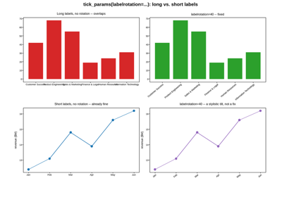
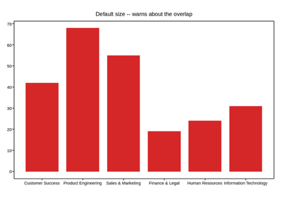
Datetime axes, categorical axes, and declarative tick specs
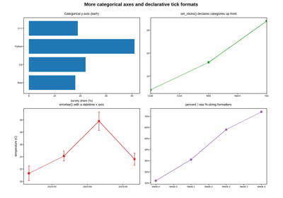
More categorical axes and declarative tick formats
Secondary and inset axes
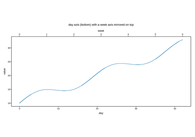
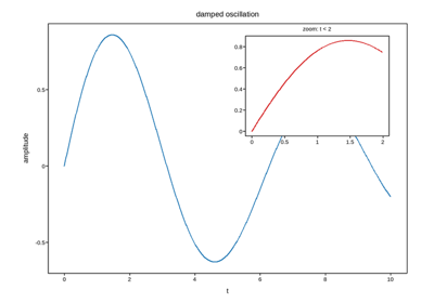
Axes layered on top of or positioned relative to another axes:
secondary_xaxis/secondary_yaxis (a same-units second scale),
inset_axes (a small axes nested inside another’s box), and
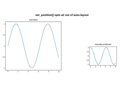
set_position (manual, un-managed placement).
Building a figure across processes
A Figure isn’t itself something a joblib/multiprocessing worker
can share with the process that owns it – pickling one to hand it to a
worker (or back) always produces a copy, never a live reference, so
mutating an axes inside a worker never touches the original. fig.adopt_axes()
is the fix: it merges an axes built standalone – most often a worker’s
returned copy – into the real figure, in place of whichever of its own
axes shares that grid position.
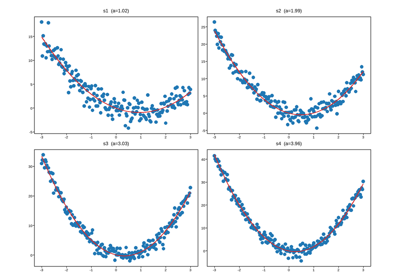
Fitting and plotting across processes, from a lazy parquet scan
Custom interactive JS
fig.save(..., extra_js=...)/fig.to_html(..., extra_js=...) inline a
caller-supplied JS string into the page – to add to plotpress’s own
toolbar (include_default_js left at its default True:
window.plotpressAddTool(...) registers a real button in its own row,
joining the same single-selection group as Axis Span/Axis Zoom/Point
Picking if given a mode), or to replace it entirely
(include_default_js=False drops
plotpress’s own JS – extra_js becomes the only interactivity this page
gets, built from the raw #plotpress-meta/#plotpress-pick JSON
payloads and #plotpress-svg directly). Nothing about either fetches
anything external on its own – extra_js is inlined the same as
plotpress’s own JS, same as every other interactive HTML plotpress writes.
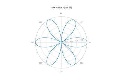
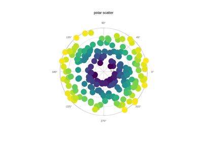
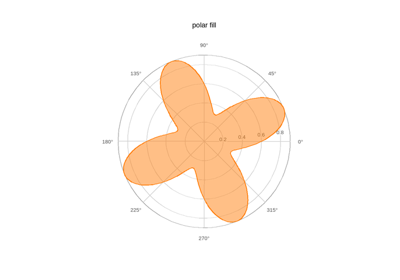
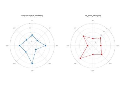
Polar
Polar axes (projection="polar"): (theta, r) data projected onto the 2-D core
with a circular grid built from ordinary artists.
Signal processing
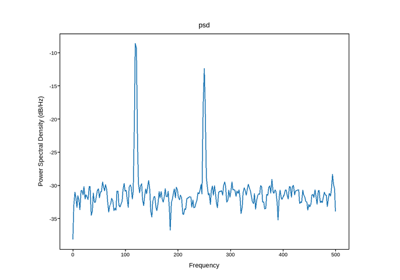
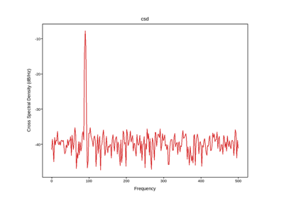
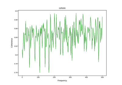
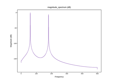
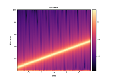
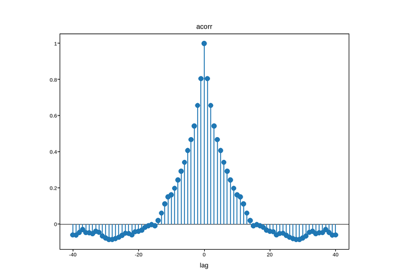
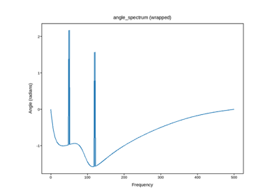
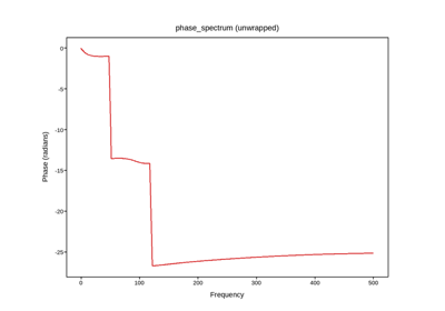
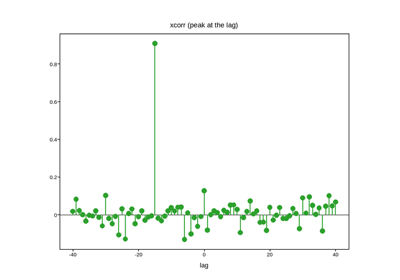
Welch-averaged spectral estimators and lagged correlation – pure NumPy, drawn through the ordinary line/image artists.
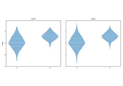
Seaborn-style distribution plots
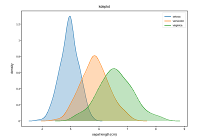
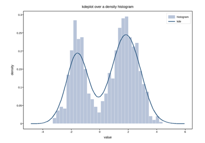
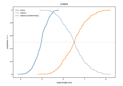
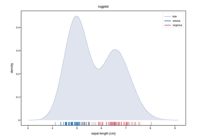
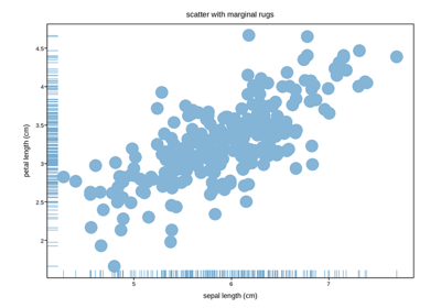
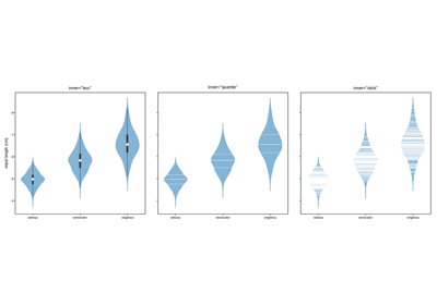
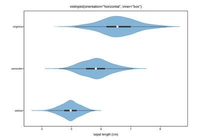
Distribution plots in the style of seaborn’s example gallery, drawn with
plotpress’s own methods – kdeplot, ecdfplot, rugplot and the
inner/cut options on violinplot. These take plain arrays rather
than a tidy dataframe, so there is no pandas or seaborn dependency; the
semantic-mapping API (hue=, FacetGrid) is deliberately not replicated.
Reloading data from a saved HTML
plotpress.load_data() reads the plotted data straight back out of a
saved interactive HTML file – no need for the original Python objects
that built it to still be around. These examples round-trip through it:
reload a figure’s data, transform it, and rebuild a new figure in a
similar layout.
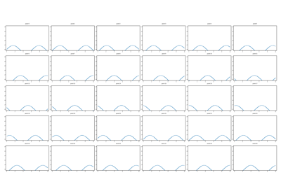
Reload a mesh grid and replot one slice per panel as a line
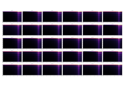
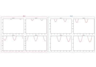
Reload a grouped dashboard, preserving its group boxes
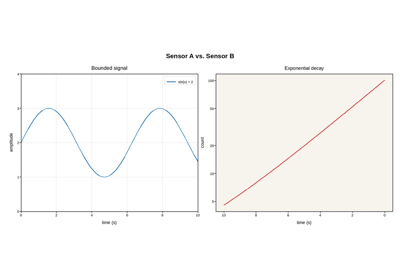
Reload a figure’s titles, labels, and axis settings, not just its data
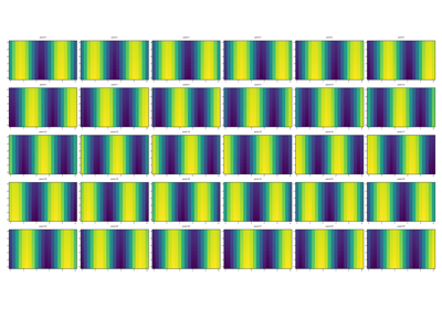
Reload a mesh grid as one labeled xarray.Dataset, analyze, and replot
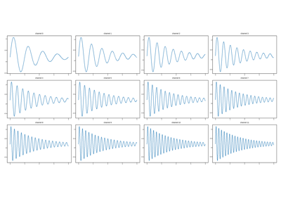
Reload a grid of line traces as one labeled xarray.Dataset, analyze, and replot
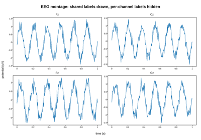
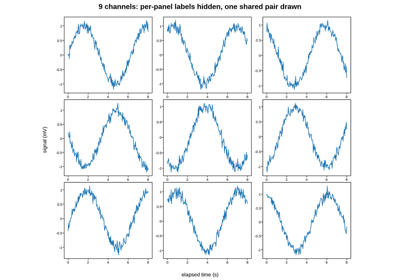
Hidden per-panel labels survive the round trip (and the Extract)
Reusable, data-free figure templates
Figure.to_template()/save_template() snapshot a figure’s own
structure and styling – grid shape, group boxes, spine colors, tick
overrides, ids, twin/secondary/inset overlays, and its Style – with no
plotted data in it at all. plotpress.load_template()/
figure_from_template() rebuild a blank, identically styled figure from
that snapshot. These examples build a template once and reuse it, unmodified,
across unrelated datasets.
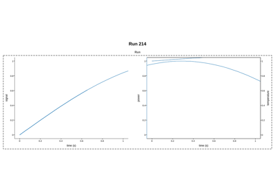
Build a template once, reuse it across two different datasets
Limitations
Worked examples of plotpress’s known limitations – what causes each one, how large the effect is, and when it matters. These are deliberate trade-offs rather than bugs; Limitations explains the reasoning behind them.
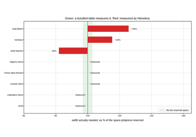
Font metrics: which families plotpress can measure
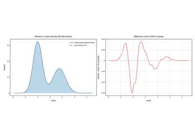
Density estimates: binned above a few thousand points
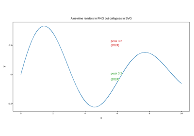
Text is single-line, and PNG is a separate renderer
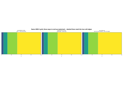
Non-uniform meshes: vector cells by default, and when raster comes back
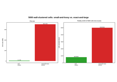
The vector/raster trade at real scale: forcing it past the limit