Note
Go to the end to download the full example code.
Datetime axes, categorical axes, and declarative tick specs
Three complementary ways to feed an axis something other than plain numbers.
A datetime-like x/y (numpy.datetime64, datetime.date, or a
list of either) plots proportionally to real elapsed time – irregular gaps
between timestamps stay irregular, the same way matplotlib’s own date axes
work. A plain list of strings plots as a categorical axis instead: each
distinct value gets an integer position in the order it’s first seen, shared
across every plotting call on that axis. And set_xlocator()/
set_xformat() take a small, JSON-serializable spec – not a
matplotlib-style Locator/Formatter object – naming a tick-placement
or label-formatting rule, so the exact same rule replays correctly when an
interactive figure is panned or zoomed in the browser.
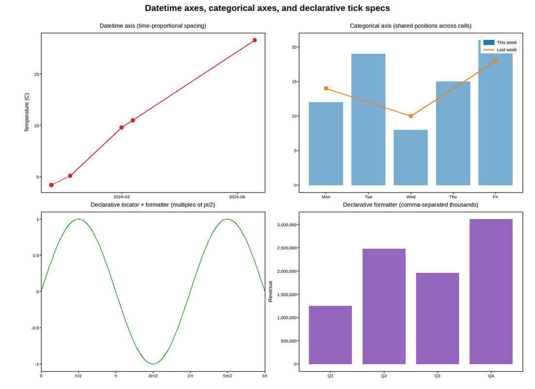
Live figure — pick a tool, then zoom, pan, point-pick or annotate. Nothing is active until a tool is selected.
View this figure’s Vega export ↗ — the raw JSON spec, rendered live by a real Vega engine.
View this figure’s Vega-Lite export ↗ — the raw JSON spec(s), rendered live by a real Vega-Lite engine.
import numpy as np
import plotpress

fig, axes = plotpress.subplots(2, 2, figsize=(11.0, 8.0))

# -- Datetime axis: irregular timestamps, spaced by real elapsed time -------
ax = axes[0, 0]
dates = np.array(
    ["2024-01-05", "2024-01-20", "2024-03-01", "2024-03-10", "2024-06-15"],
    dtype="datetime64[D]",
)
temps = [4.2, 5.1, 9.8, 10.5, 18.3]
ax.plot(dates, temps, marker="o", color="#d62728")
# The Jan 5 -> Jan 20 gap (15 days) is visibly narrower than Mar 10 -> Jun 15
# (97 days) -- a categorical axis would have space these five points evenly.
ax.set_title("Datetime axis (time-proportional spacing)")
ax.set_ylabel("Temperature (C)")

# -- Categorical axis: strings shared across two series on one axis ---------
ax = axes[0, 1]
ax.bar(["Mon", "Tue", "Wed", "Thu", "Fri"], [12, 19, 8, 15, 21],
      color="#1f77b4", label="This week", alpha=0.6, zorder=1)
# A second call naming an overlapping category set lands on the same
# positions instead of appending duplicate slots.
ax.plot(["Mon", "Wed", "Fri"], [14, 10, 18], color="#ff7f0e",
        marker="s", label="Last week", linewidth=2, zorder=2)
ax.legend()
ax.set_title("Categorical axis (shared positions across calls)")

# -- Declarative locator: ticks at every multiple of pi/2 --------------------
ax = axes[1, 0]
x = np.linspace(0, 3 * np.pi, 300)
ax.plot(x, np.sin(x), color="#2ca02c")
ax.set_xlim(0, 3 * np.pi)
ax.set_xlocator({"kind": "multiple", "base": np.pi / 2})
ax.set_xformat("pi")   # 0, pi/2, pi, 3pi/2, ...
ax.set_title("Declarative locator + formatter (multiples of pi/2)")

# -- Declarative formatter: comma-separated thousands on the y-axis ---------
ax = axes[1, 1]
ax.bar(["Q1", "Q2", "Q3", "Q4"], [1_250_000, 2_480_000, 1_960_000, 3_120_000],
      color="#9467bd")
ax.set_yformat("comma")           # "1,250,000" instead of "1.25e6"
ax.set_title("Declarative formatter (comma-separated thousands)")
ax.set_ylabel("Revenue")

fig.suptitle("Datetime axes, categorical axes, and declarative tick specs")
fig.tight_layout()
Total running time of the script: (0 minutes 0.226 seconds)