Note
Go to the end to download the full example code.
Reload a mesh grid as one labeled xarray.Dataset, analyze, and replot
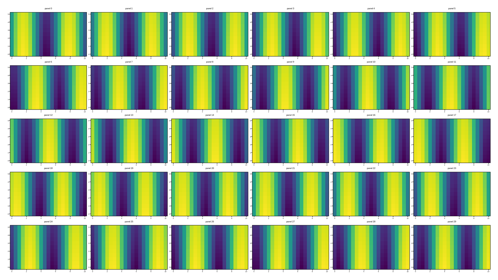
load_data()’s title-keyed dict of dicts is the wrong tool for a
uniform grid of same-shaped scientific measurements – the exact case the
other reload examples in this gallery already work with (a 30-panel
pcolormesh grid). Pulling a value out at “row 2, column 3” means
already knowing that panel’s title, and stacking every panel into one
array for a bulk NumPy operation means looping over the dict by hand.
plotpress.load_data_xarray() (the xarray extra: pip install
plotpress[xarray]) reads the same saved file back as a single
xarray.Dataset instead, dimensioned by the figure’s own row/col
grid – every panel’s z grid stacked into one (row, col, y, x)
array, with each panel’s own title/labels riding along as (row, col)
coordinates. No panel-by-panel loop, and no risk of two panels sharing a
title silently colliding the way a plain dict key could (xarray indexes
by row/column position, never by name).
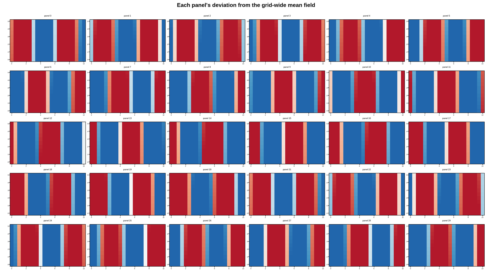
This example loads a saved grid back this way, computes each panel’s
deviation from the grid-wide mean field – one broadcast subtraction
across all 30 panels at once – and replots the whole grid of anomalies
into a figure rebuilt from ds.attrs["template"] (the same dict
load_data() returns under "template", reachable straight off the
Dataset – no second, separate load_data() call just to get it),
so every panel’s title/labels/limits come back already applied, not
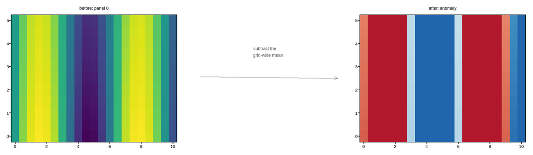
re-typed by hand. A small before/after figure in the middle pictures that
same transformation on one panel, with an arrow from the original field to
its anomaly.
This figure has 30 panels — too many to usefully embed at a fixed size.
Open the full interactive example in a new page to pick a tool, then zoom, pan, point-pick or annotate any panel.
View this figure’s Vega export ↗ — the raw JSON spec, rendered live by a real Vega engine.
View this figure’s Vega-Lite export ↗ — the raw JSON spec(s), rendered live by a real Vega-Lite engine.
Live figure — pick a tool, then zoom, pan, point-pick or annotate. Nothing is active until a tool is selected.
View this figure’s Vega export ↗ — the raw JSON spec, rendered live by a real Vega engine.
View this figure’s Vega-Lite export ↗ — the raw JSON spec(s), rendered live by a real Vega-Lite engine.
This figure has 30 panels — too many to usefully embed at a fixed size.
Open the full interactive example in a new page to pick a tool, then zoom, pan, point-pick or annotate any panel.
View this figure’s Vega export ↗ — the raw JSON spec, rendered live by a real Vega engine.
View this figure’s Vega-Lite export ↗ — the raw JSON spec(s), rendered live by a real Vega-Lite engine.
<xarray.Dataset> Size: 56kB
Dimensions:   (row: 5, col: 6, y: 11, x: 21)
Coordinates:
    title     (row, col) object 240B 'panel 0' 'panel 1' ... 'panel 29'
    xlabel    (row, col) object 240B '' '' '' '' '' '' '' ... '' '' '' '' '' ''
    ylabel    (row, col) object 240B '' '' '' '' '' '' '' ... '' '' '' '' '' ''
    has_data  (row, col) bool 30B True True True True ... True True True True
  * y         (y) float64 88B 0.0 0.5 1.0 1.5 2.0 2.5 3.0 3.5 4.0 4.5 5.0
  * x         (x) float64 168B 0.0 0.5 1.0 1.5 2.0 2.5 ... 8.0 8.5 9.0 9.5 10.0
Dimensions without coordinates: row, col
Data variables:
    z         (row, col, y, x) float64 55kB 0.0 0.4794 0.8415 ... 0.5587 0.7504
Attributes:
    figsize:   [16.0, 9.0]
    title:     None
    template:  {'style': {'facecolor': '#ffffff', 'dpi': 100.0, 'axes_facecol...
import os
import tempfile

import numpy as np
import plotpress

fig, axes = plotpress.subplots(5, 6, figsize=(16, 9))
x = np.linspace(0, 10, 21)
y = np.linspace(0, 5, 11)
X, Y = np.meshgrid(x, y)
for i, ax in enumerate(np.asarray(axes).ravel()):
    # A travelling-wave-like field, phase-offset per panel.
    Z = np.sin(X - 0.3 * i) * np.exp(-0.05 * Y)
    ax.pcolormesh(x, y, Z, cmap="viridis", vmin=-1, vmax=1)
    ax.set_title(f"panel {i}", fontsize=7)
    ax.tick_params(labelsize=5)
fig.tight_layout()
path = os.path.join(tempfile.gettempdir(), "plotpress_gallery_xarray_reload.html")
fig.save(path, interactive=True)

# ---------------------------------------------------------------------------
# Load: the whole 5x6 grid comes back as one Dataset -- ds["z"] is already a
# (row, col, y, x) array, ready for a bulk xarray/NumPy reduction across
# every panel at once, not a 30-iteration Python loop.
# ---------------------------------------------------------------------------
ds = plotpress.load_data_xarray(path)
print(ds)

# Analyze: each panel's own deviation from the grid-wide mean field, in one
# broadcast subtraction -- the kind of operation a title-keyed dict of
# dicts has no native way to express at all. `anomaly` keeps the full
# (row, col, y, x) shape, so it can be replotted panel-for-panel below.
anomaly = ds["z"] - ds["z"].mean(dim=("row", "col"))

# ---------------------------------------------------------------------------
# Picture the transformation on one panel before replotting the whole grid
# below: panel (0, 0)'s own field on the left, its anomaly (the exact same
# subtraction applied to and replotted for every panel) on the right, an
# arrow between them standing in for "load_data_xarray() -> subtract the
# grid-wide mean".
# ---------------------------------------------------------------------------
fig_arrow, (ax_before, ax_arrow, ax_after) = plotpress.subplots(1, 3, figsize=(11, 3.2))
ax_before.pcolormesh(ds["x"].values, ds["y"].values, ds["z"].values[0, 0],
                     cmap="viridis", vmin=-1, vmax=1)
ax_before.set_title(f"before: {ds['title'].values[0, 0]}", fontsize=9)

ax_arrow.set_xlim(0, 1); ax_arrow.set_ylim(0, 1)
ax_arrow.set_axis_off()
ax_arrow.annotate("", xy=(0.92, 0.5), xytext=(0.08, 0.5), arrowprops={"color": "#555"})
ax_arrow.text(0.5, 0.72, "subtract the\ngrid-wide mean", ha="center", fontsize=9, color="#555")

ax_after.pcolormesh(ds["x"].values, ds["y"].values, anomaly.values[0, 0],
                    cmap="RdBu_r", vmin=-0.3, vmax=0.3)
ax_after.set_title("after: anomaly", fontsize=9)
fig_arrow.tight_layout()

# Replot: rebuild the same 5x6 grid, groups, and every axes' own title/
# labels/limits from ds.attrs["template"] -- only the mesh data itself (and
# tick_params, one of the few things a template deliberately doesn't carry --
# see figure_from_template()'s own docstring) needs setting by hand below.
nrows, ncols = ds.sizes["row"], ds.sizes["col"]
fig2, axes2 = plotpress.figure_from_template(ds.attrs["template"], figsize=(16, 9))
for r in range(nrows):
    for c in range(ncols):
        ax = axes2[r, c]
        ax.pcolormesh(ds["x"].values, ds["y"].values, anomaly.values[r, c],
                      cmap="RdBu_r", vmin=-0.3, vmax=0.3)
        ax.tick_params(labelsize=5)
fig2.suptitle("Each panel's deviation from the grid-wide mean field")
fig2.tight_layout()
Total running time of the script: (0 minutes 1.391 seconds)