Note
Go to the end to download the full example code.
Machine utilisation over a shift
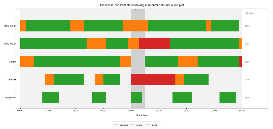
A Gantt-style timeline of a small machine shop: one row per machine, one bar per
activity, drawn with broken_barh. This is the plot type for a resource whose
state is piecewise constant over intervals – a machine is running, or setting
up, or down, and there is nothing meaningful between those states, so a line
plot of “status” would be an invention.
broken_barh takes a list of (start, duration) spans and one (y,
height) row, which matches how the data actually arrives from a shop-floor
system: an event log of start times and durations, not a sampled series. One
call per category per machine keeps the colour meaning consistent across rows,
which is what lets the eye scan down a column of time and see that the two
downtime blocks on different machines overlap.
The y axis is categorical, so it is built with set_yticks from the machine
names, and inverted so the first machine is at the top – reading order for a
schedule runs downward, unlike every other plot here.
Utilisation percentages are annotated at the right of each row, because the whole point of the picture is comparing rows, and a reader should not have to estimate the total run time of a row by adding bar widths by eye. The planned shift boundaries and the break are shaded, so idle time inside the shift is visually distinct from time the shop was never open.
Live figure — pick a tool, then zoom, pan, point-pick or annotate. Nothing is active until a tool is selected.
View this figure’s Vega export ↗ — the raw JSON spec, rendered live by a real Vega engine.
View this figure’s Vega-Lite export ↗ — the raw JSON spec(s), rendered live by a real Vega-Lite engine.
import numpy as np
import polars as pl
import plotpress

SHIFT = (6.0, 14.0)                                # hours, clock time
BREAK = (10.0, 10.5)

# machine -> {activity: [(start, duration), ...]}
SCHEDULE = {
    "CNC mill 1": {
        "running": [(6.2, 1.6), (8.3, 1.4), (10.6, 2.1), (12.9, 1.0)],
        "setup": [(6.0, 0.2), (7.8, 0.5), (9.7, 0.9), (12.7, 0.2)],
        "down": [],
    },
    "CNC mill 2": {
        "running": [(6.0, 2.4), (9.1, 0.8), (11.4, 2.5)],
        "setup": [(8.4, 0.7), (9.9, 0.4), (13.9, 0.1)],
        "down": [(10.3, 1.1)],
    },
    "Lathe": {
        "running": [(6.5, 3.1), (10.5, 1.2), (12.4, 1.5)],
        "setup": [(6.0, 0.5), (9.6, 0.4), (11.7, 0.7)],
        "down": [(13.9, 0.1)],
    },
    "Grinder": {
        "running": [(7.2, 1.1), (9.0, 0.6), (11.9, 0.9)],
        "setup": [(6.9, 0.3), (8.7, 0.3), (11.6, 0.3)],
        "down": [(10.0, 1.6)],
    },
    "Inspection": {
        "running": [(6.8, 0.6), (8.6, 0.5), (10.0, 0.4), (11.5, 0.7), (13.2, 0.6)],
        "setup": [],
        "down": [],
    },
}

STYLE = {"running": "#2ca02c", "setup": "#ff7f0e", "down": "#d62728"}
ROW_HEIGHT = 0.62

machines = list(SCHEDULE)
positions = np.arange(len(machines), dtype=float)

# One row per scheduled activity span -- the shape a shop-floor event log is
# actually recorded in, before it is grouped into per-machine, per-activity
# bars and utilisation percentages.
events = pl.concat([
    pl.DataFrame({"machine": machine, "activity": activity,
                  "start": [s for s, _ in spans], "duration": [d for _, d in spans]})
    for machine, activities in SCHEDULE.items()
    for activity, spans in activities.items() if spans
])

fig, ax = plotpress.subplots(figsize=(11.0, 5.2))

ax.axvspan(SHIFT[0], SHIFT[1], color="#f2f2f2", alpha=1.0)
ax.axvspan(BREAK[0], BREAK[1], color="#cccccc", alpha=0.9)

labelled = set()
for row, machine in zip(positions, machines):
    for activity, color in STYLE.items():
        rows = events.filter((pl.col("machine") == machine) & (pl.col("activity") == activity))
        if rows.height == 0:
            continue
        spans = list(zip(rows["start"].to_list(), rows["duration"].to_list()))
        # Label the first row that actually has this activity -- keying the
        # label off row 0 silently drops any category the top machine happens
        # not to have, which is exactly the downtime row a reader looks for.
        first = activity not in labelled
        labelled.add(activity)
        ax.broken_barh(spans, (row - ROW_HEIGHT / 2, ROW_HEIGHT), color=color,
                       label=activity if first else None)
    run_hours = events.filter((pl.col("machine") == machine)
                               & (pl.col("activity") == "running"))["duration"].sum()
    ax.text(SHIFT[1] + 0.12, row, f"{100 * run_hours / (SHIFT[1] - SHIFT[0]):.0f}%",
            va="center", fontsize=9, color="#333333")

ax.text(SHIFT[1] + 0.12, -0.7, "utilisation", va="center", fontsize=9,
        color="#666666")
ax.text(np.mean(BREAK), -0.85, "break", ha="center", fontsize=9, color="#555555")

ax.set_yticks(positions, machines)
ax.set_ylim(len(machines) - 0.4, -0.95)            # first machine at the top
ax.set_xlim(SHIFT[0] - 0.15, SHIFT[1] + 0.95)
ax.set_xticks(np.arange(6, 15, 1.0), [f"{h:02d}:00" for h in range(6, 15)])
ax.set_xlabel("clock time")
ax.set_title("Piecewise-constant states belong in interval bars, not a line plot")
fig.legend(loc="lower center", ncol=3)
fig.tight_layout()
Total running time of the script: (0 minutes 0.147 seconds)