Note
Go to the end to download the full example code.
Pareto chart of defect causes
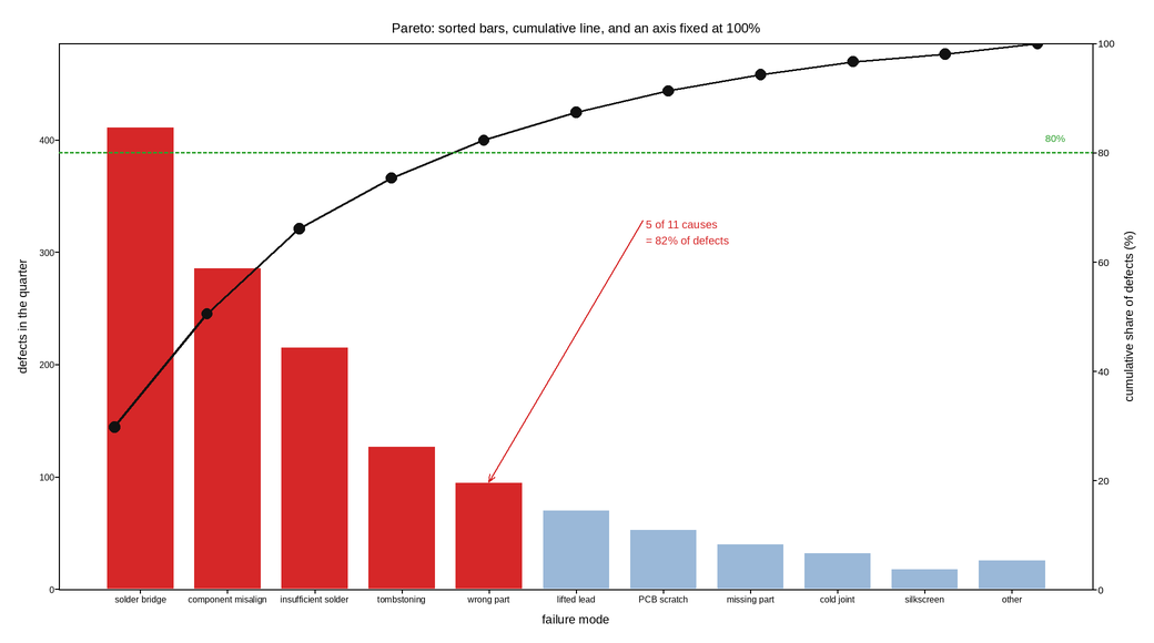
Defect counts by cause, sorted descending, with the cumulative percentage on a twin axis. Everything that makes this a Pareto chart rather than a bar chart is a constraint rather than a style: the bars must be sorted by count, the cumulative line must be plotted at the bar centres, and the right axis must run exactly 0 to 100 with the 80% line drawn.
The sort is what does the work. An alphabetical or process-order bar chart of the same numbers is far harder to act on, because finding the largest contributors becomes a scan instead of a glance, and the cumulative line becomes meaningless.
The right axis is pinned to 0-100 rather than autoscaled. An autoscaled cumulative axis would let the last point sit at the top of the panel whatever it is, and the 80% reference line would land at a different height in every chart made from different data – destroying the one thing this chart is compared across.
The cut-off is annotated: three of the eleven causes account for the majority of defects, which is the recommendation the chart exists to produce. Causes past the cut are still drawn rather than lumped into “other”, because a cause that is rare but expensive to fix should still be visible to whoever is deciding.
Live figure — pick a tool, then zoom, pan, point-pick or annotate. Nothing is active until a tool is selected.
View this figure’s Vega export ↗ — the raw JSON spec, rendered live by a real Vega engine.
View this figure’s Vega-Lite export ↗ — the raw JSON spec(s), rendered live by a real Vega-Lite engine.
import numpy as np
import polars as pl
import plotpress

CAUSES = {
    "solder bridge": 412,
    "component misalign": 287,
    "insufficient solder": 216,
    "tombstoning": 128,
    "wrong part": 96,
    "lifted lead": 71,
    "PCB scratch": 54,
    "missing part": 41,
    "cold joint": 33,
    "silkscreen": 19,
    "other": 27,
}
THRESHOLD = 0.80

# One row per failure mode -- the shape a quality log's own tally is in,
# before it is sorted for the Pareto ranking. "other" stays at the end
# however large it is: it is not a cause, so it cannot be a recommendation,
# and sorting it into the middle would imply it was.
named = pl.DataFrame({"cause": [k for k in CAUSES if k != "other"],
                       "count": [v for k, v in CAUSES.items() if k != "other"]}) \
    .sort("count", descending=True)
defects = pl.concat([named, pl.DataFrame({"cause": ["other"], "count": [CAUSES["other"]]})])
labels = defects["cause"].to_list()
counts = defects["count"].to_numpy().astype(float)

position = np.arange(len(labels), dtype=float)
cumulative = 100.0 * np.cumsum(counts) / counts.sum()
cut = int(np.argmax(cumulative >= THRESHOLD * 100.0))

colors = ["#d62728" if i <= cut else "#9ab8d8" for i in range(len(labels))]

fig, ax = plotpress.subplots(figsize=(10.4, 5.8))
ax.bar(position, counts, width=0.78, color=colors, edgecolor="#ffffff")
ax.set_xticks(position, labels)
ax.tick_params(labelsize=8)
ax.set_ylabel("defects in the quarter")
ax.set_xlabel("failure mode")
ax.set_ylim(0.0, counts.max() * 1.18)

ax2 = ax.twinx()
ax2.plot(position, cumulative, color="#111111", linewidth=1.8)
ax2.scatter(position, cumulative, s=7.0, color="#111111")
ax2.axhline(THRESHOLD * 100.0, color="#2ca02c", linestyle="--", linewidth=1.5)
ax2.set_ylabel("cumulative share of defects (%)")
ax2.set_ylim(0.0, 100.0)                           # fixed, so charts compare
ax2.set_xlim(-0.6, len(labels) - 0.4)
ax2.text(len(labels) - 0.7, THRESHOLD * 100.0 + 2.0, "80%", ha="right",
         fontsize=9, color="#2ca02c")

ax.annotate(f"{cut + 1} of {len(labels)} causes\n= {cumulative[cut]:.0f}% of defects",
            xy=(cut, counts[cut]), xytext=(cut + 1.8, counts.max() * 0.78),
            arrowprops={"color": "#d62728"}, color="#d62728", fontsize=10)

ax.set_title("Pareto: sorted bars, cumulative line, and an axis fixed at 100%")
fig.tight_layout()
Total running time of the script: (0 minutes 0.142 seconds)