Note
Go to the end to download the full example code.
Volcano plot of differential expression
Twelve thousand genes, each with an effect size and a p-value. The volcano plot exists because neither number is sufficient alone: a huge fold change measured on three noisy reads is meaningless, and a p-value of 1e-30 on a 3% change is statistically certain and biologically irrelevant. Plotting one against the other lets both thresholds be applied at once, visually.
Two transformations do the work. Fold change is plotted as log2, so
doubling and halving are symmetric distances from zero rather than the range
[1, inf) against (0, 1]. Significance is plotted as -log10(p), which turns
“smaller is better” into “higher is better” and spreads out the tail that
matters – the difference between p = 0.05 and p = 1e-12 is nine tick marks
instead of a fifth of a pixel.
Twelve thousand points would be an opaque blob at full opacity, so the non-significant majority is drawn small and translucent while the calls are drawn solid and coloured by direction. Only a handful of genes get labels: a volcano plot with two hundred annotations communicates less than one with eight.
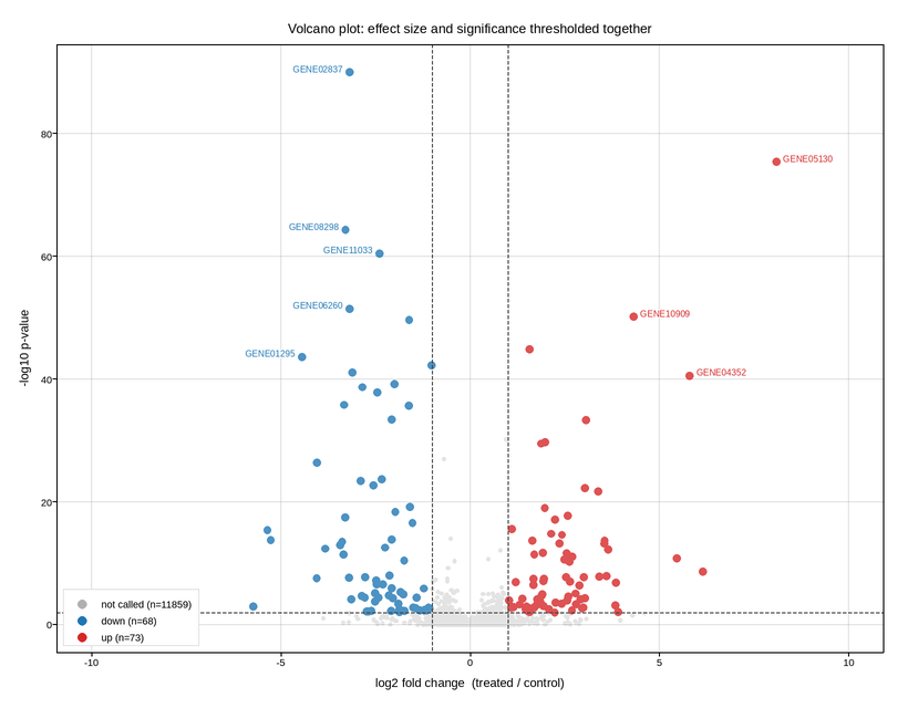
Live figure — pick a tool, then zoom, pan, point-pick or annotate. Nothing is active until a tool is selected.
View this figure’s Vega export ↗ — the raw JSON spec, rendered live by a real Vega engine.
View this figure’s Vega-Lite export ↗ — the raw JSON spec(s), rendered live by a real Vega-Lite engine.
import numpy as np
import polars as pl
import plotpress

rng = np.random.default_rng(77)

N = 12000
FC_CUT = 1.0                                       # |log2 fold change| >= 1  (2x)
P_CUT = 0.01

# Most genes are unchanged; a few hundred are genuinely regulated.
log2fc = rng.normal(0.0, 0.32, N)
regulated = rng.random(N) < 0.035
log2fc[regulated] += rng.normal(0.0, 1.9, regulated.sum())

# Larger true effects are easier to detect, and detection also improves with
# expression, which is why the cloud is a volcano rather than a rectangle.
depth = rng.lognormal(0.0, 0.7, N)
zstat = np.abs(log2fc) * depth * 1.5 + rng.normal(0.0, 0.6, N)
# Floor the p-value far below anything plotted: clipping it near the top of
# the axis piles dozens of genes onto one horizontal line, which reads as a
# real feature and is purely the clip.
pval = np.clip(2.0 * 0.5 * np.exp(-0.5 * np.clip(zstat, 0, None) ** 2), 1e-90, 1.0)
neglog_p = -np.log10(pval)

up = (log2fc >= FC_CUT) & (pval <= P_CUT)
down = (log2fc <= -FC_CUT) & (pval <= P_CUT)
rest = ~(up | down)
call = np.where(up, "up", np.where(down, "down", "rest"))

# One row per gene -- the shape a differential-expression results table
# actually comes in, before any significance call is drawn.
genes = pl.DataFrame({
    "gene_id": np.arange(N),
    "log2fc": log2fc,
    "neglog_p": neglog_p,
    "call": call,
})

rest_g = genes.filter(pl.col("call") == "rest")
down_g = genes.filter(pl.col("call") == "down")
up_g = genes.filter(pl.col("call") == "up")
called = genes.filter(pl.col("call") != "rest")

fig, ax = plotpress.subplots(figsize=(8.2, 6.4))
ax.scatter(rest_g["log2fc"].to_numpy(), rest_g["neglog_p"].to_numpy(), s=2.6,
           color="#b0b0b0", alpha=0.35, label=f"not called (n={rest_g.height})")
ax.scatter(down_g["log2fc"].to_numpy(), down_g["neglog_p"].to_numpy(), s=5.0,
           color="#1f77b4", alpha=0.8, label=f"down (n={down_g.height})")
ax.scatter(up_g["log2fc"].to_numpy(), up_g["neglog_p"].to_numpy(), s=5.0,
           color="#d62728", alpha=0.8, label=f"up (n={up_g.height})")

ax.axhline(-np.log10(P_CUT), color="#444444", linestyle="--", linewidth=1.1)
ax.axvline(FC_CUT, color="#444444", linestyle="--", linewidth=1.1)
ax.axvline(-FC_CUT, color="#444444", linestyle="--", linewidth=1.1)

# Label only the extreme calls -- rank by the product of both criteria.
top8 = called.with_columns(
    (pl.col("log2fc").abs() * pl.col("neglog_p")).alias("score")
).sort("score", descending=True).head(8)
for row in top8.iter_rows(named=True):
    fc, p, gene_id = row["log2fc"], row["neglog_p"], row["gene_id"]
    ax.text(fc + (0.18 if fc > 0 else -0.18), p,
            f"GENE{gene_id:05d}", fontsize=8,
            ha="left" if fc > 0 else "right",
            color="#d62728" if fc > 0 else "#1f77b4")

# Labels are placed after the data, so the limits have to leave room for them:
# the most extreme gene is exactly the one worth naming, and its label is the
# one that runs off the edge.
span = float(called["log2fc"].abs().max())
ax.set_xlim(-span * 1.35, span * 1.35)
ax.set_xlabel("log2 fold change  (treated / control)")
ax.set_ylabel("-log10 p-value")
ax.set_title("Volcano plot: effect size and significance thresholded together")
ax.legend(loc="lower left")
ax.grid(True)
fig.tight_layout()
Total running time of the script: (0 minutes 0.537 seconds)