Note
Go to the end to download the full example code.
Gene expression heatmap with clustered rows
Fifty genes by twenty-four samples of RNA-seq, the standard first figure of a differential-expression analysis. Two transformations happen before anything is drawn, and both are what make the figure interpretable.
Counts are log-transformed and then z-scored per gene: each row is centred on its own mean and scaled by its own standard deviation. Without that, the map shows only which genes are abundant – a handful of ribosomal genes saturate the scale and every regulated gene is a uniform dark row. After it, every row is on the same footing and the colour means “high or low for this gene”, which is the question being asked.
Because the values are now signed deviations, the colormap must be diverging and
centred on zero, with vmin=-lim, vmax=+lim so the neutral midpoint really is
zero rather than wherever the data happens to sit. The limits are clipped to the
99th percentile so a couple of extreme genes do not compress everyone else.
Rows are ordered by hierarchical-style correlation clustering rather than alphabetically – adjacency is the entire message of a heatmap, and an alphabetical row order is noise painted to look like structure.
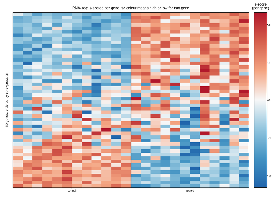
Live figure — pick a tool, then zoom, pan, point-pick or annotate. Nothing is active until a tool is selected.
View this figure’s Vega export ↗ — the raw JSON spec, rendered live by a real Vega engine.
View this figure’s Vega-Lite export ↗ — the raw JSON spec(s), rendered live by a real Vega-Lite engine.
import numpy as np
import polars as pl
import plotpress

rng = np.random.default_rng(3131)

N_GENES, N_CTRL, N_TREAT = 50, 12, 12
N_SAMPLES = N_CTRL + N_TREAT

# Three co-regulated modules plus unregulated background genes.
modules = [(0, 14, +1.9), (14, 26, -1.6), (26, 34, +0.9)]
baseline = rng.uniform(4.0, 11.0, N_GENES)        # log2 counts per million

expr = baseline[:, None] + rng.normal(0.0, 0.45, (N_GENES, N_SAMPLES))
for lo, hi, effect in modules:
    expr[lo:hi, N_CTRL:] += effect + rng.normal(0.0, 0.25, (hi - lo, N_TREAT))
# Batch effect: the second half of each group was run on a different day.
expr += np.tile(rng.normal(0.0, 0.30, N_SAMPLES), (N_GENES, 1)) * 0.5

z = (expr - expr.mean(axis=1, keepdims=True)) / expr.std(axis=1, keepdims=True)

# Order rows so correlated genes sit together: sort by the leading eigenvector
# of the gene-gene correlation matrix, a cheap stand-in for a full linkage tree.
corr = np.corrcoef(z)
_, vecs = np.linalg.eigh(corr)
order = np.argsort(vecs[:, -1])
z = z[order]

# One row per (gene, sample) cell of the final, clustered matrix -- sorted
# before the reshape below so the pivot back to a grid is correct
# regardless of row order.
GENE_ROW, SAMPLE_COL = np.meshgrid(np.arange(N_GENES), np.arange(N_SAMPLES), indexing="ij")
heatmap = pl.DataFrame({
    "gene_row": GENE_ROW.ravel(),
    "sample_col": SAMPLE_COL.ravel(),
    "z_score": z.ravel(),
}).sort(["gene_row", "sample_col"])

n_genes = heatmap["gene_row"].n_unique()
n_samples = heatmap["sample_col"].n_unique()
z = heatmap["z_score"].to_numpy().reshape(n_genes, n_samples)
lim = float(heatmap["z_score"].abs().quantile(0.99, interpolation="linear"))

fig, ax = plotpress.subplots(figsize=(9.0, 6.4))
mesh = ax.pcolormesh(np.arange(N_SAMPLES + 1), np.arange(N_GENES + 1), z,
                     cmap="RdBu_r", vmin=-lim, vmax=lim)
ax.axvline(N_CTRL, color="#000000", linewidth=1.8, linestyle="-")

fig.colorbar(mesh, ax=ax).set_title("z-score\n(per gene)")
ax.set_xticks([N_CTRL / 2.0, N_CTRL + N_TREAT / 2.0], ["control", "treated"])
ax.set_yticks([])
ax.set_ylabel(f"{N_GENES} genes, ordered by co-expression")
ax.set_title("RNA-seq: z-scored per gene, so colour means high or low for that gene")
fig.tight_layout()
Total running time of the script: (0 minutes 0.169 seconds)