Note
Go to the end to download the full example code.
Training curves for three learning rates
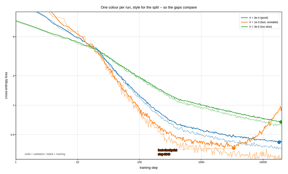
Loss against training step for three runs, with the training and validation curves of each drawn together. The comparison the figure has to support is between the gap of one run and the gap of another, which is why the two curves of a run share a colour and differ by line style rather than being coloured independently – six independently coloured lines is a puzzle, three colours and one convention is a figure.
Loss falls by more than an order of magnitude, so the y axis is logarithmic. That is not only about fitting it on the page: the interesting behaviour of a learning curve is its rate of decrease, and on a log axis a constant rate is a straight line, so the moment a run stops improving is visible as a bend rather than having to be inferred from a flattening curve that flattens anyway.
The x axis is logarithmic too, which is less common and worth the space it takes to justify: almost everything interesting – warmup, the initial rapid descent, the first divergence – happens in the first few percent of the run, and a linear step axis compresses all of it against the origin.
The best validation loss of each run is marked, since that is the checkpoint that would actually be shipped, and the overfitting run’s minimum is hundreds of steps before its training loss stops falling.
Live figure — pick a tool, then zoom, pan, point-pick or annotate. Nothing is active until a tool is selected.
View this figure’s Vega export ↗ — the raw JSON spec, rendered live by a real Vega engine.
View this figure’s Vega-Lite export ↗ — the raw JSON spec(s), rendered live by a real Vega-Lite engine.
import numpy as np
import polars as pl
import plotpress

rng = np.random.default_rng(42)

steps = np.unique(np.round(np.logspace(0, np.log10(20000), 400)).astype(int))

RUNS = [
    # label,             floor, rate,  overfit onset, noise, colour
    ("lr = 3e-4 (good)",  0.31, 0.42, None,   0.020, "#1f77b4"),
    ("lr = 1e-3 (fast, unstable)", 0.28, 0.55, 3000, 0.055, "#ff7f0e"),
    ("lr = 3e-5 (too slow)", 0.30, 0.24, None, 0.014, "#2ca02c"),
]

fig, ax = plotpress.subplots(figsize=(9.6, 5.8))

# One row per (run, step) logged metric pair -- the shape a training run's
# own metrics export is in, before the best checkpoint is picked out of it.
logs = []
for label, floor, rate, overfit, noise, color in RUNS:
    warm = np.clip(steps / 400.0, 0.05, 1.0)       # learning-rate warmup
    train = floor + 3.4 * (steps * warm) ** -rate
    train *= np.exp(rng.normal(0.0, noise, steps.size))

    val = floor + 0.06 + 3.4 * (steps * warm) ** -rate
    if overfit is not None:
        val = val + 0.16 * np.clip((steps - overfit) / 6000.0, 0.0, None) ** 1.3
    val *= np.exp(rng.normal(0.0, noise * 0.6, steps.size))

    logs.append(pl.DataFrame({"run": label, "step": steps,
                              "train_loss": train, "val_loss": val}))
logs = pl.concat(logs)

for label, floor, rate, overfit, noise, color in RUNS:
    run_log = logs.filter(pl.col("run") == label)
    ax.plot(run_log["step"].to_numpy(), run_log["train_loss"].to_numpy(),
            color=color, linewidth=1.5, alpha=0.55)
    ax.plot(run_log["step"].to_numpy(), run_log["val_loss"].to_numpy(),
            color=color, linewidth=1.9, label=label)

    best = run_log.sort("val_loss").row(0, named=True)
    ax.scatter([best["step"]], [best["val_loss"]], s=8.0, color=color)
    if overfit is not None:
        ax.annotate(f"best checkpoint\nstep {best['step']}",
                    xy=(best["step"], best["val_loss"]),
                    xytext=(best["step"] * 0.06, 0.34),
                    arrowprops={"color": color}, color=color, fontsize=9)

ax.text(1.4, 0.31, "solid = validation, faded = training", fontsize=9,
        color="#555555")

ax.set_xscale("log")
ax.set_yscale("log")
ax.set_xlim(1.0, 20000.0)
ax.set_ylim(0.28, 9.0)
ax.set_xlabel("training step")
ax.set_ylabel("cross-entropy loss")
ax.set_title("One colour per run, style for the split -- so the gaps compare")
ax.legend(loc="upper right")
ax.grid(True)
fig.tight_layout()
Total running time of the script: (0 minutes 0.202 seconds)