Note
Go to the end to download the full example code.
Roofline model of kernel performance
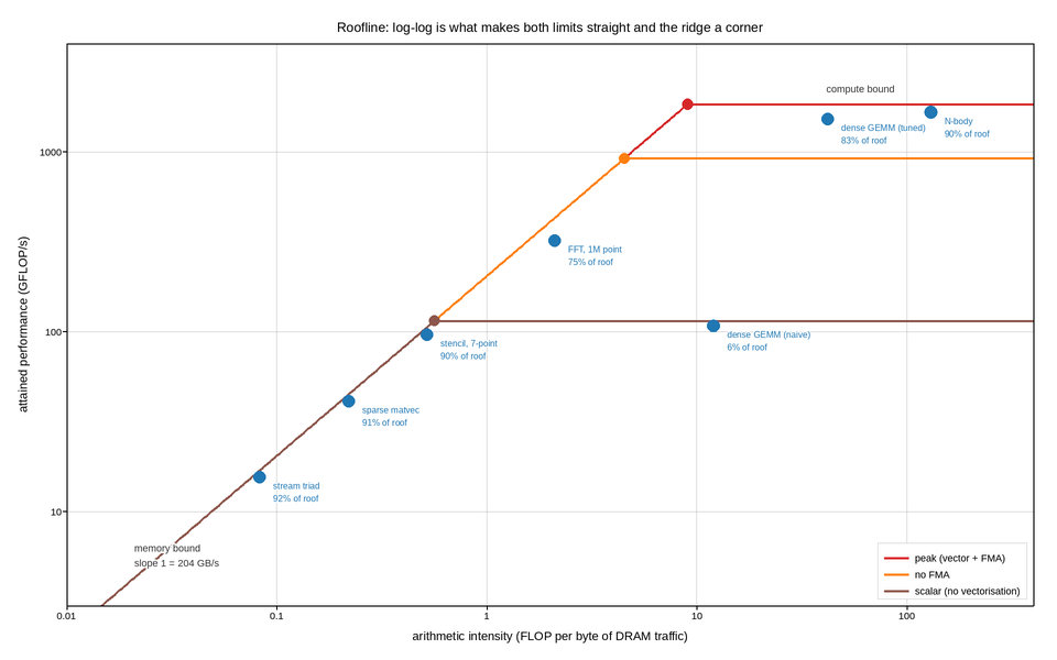
Achieved floating-point throughput against arithmetic intensity, with the hardware’s limits drawn as the roof above. It is the standard way to answer the only question that matters when a kernel is slow: is it short of compute, or short of memory bandwidth?
The whole model is two straight lines on log-log axes, which is why those axes
are non-negotiable. The bandwidth limit is performance = intensity x
bandwidth, a line of slope one; the compute limit is a horizontal ceiling. The
ridge point where they meet is the intensity a kernel must reach before it can
possibly become compute-bound. On linear axes neither limit is straight, the
ridge is not a corner, and the diagnosis has to be computed instead of seen.
The rooflines are stacked: peak, then the ceiling reachable without vector instructions, then without fused multiply-add. The gap a kernel sits below is its diagnosis – a point under the scalar ceiling is not bandwidth-limited, it is un-vectorised, and no amount of cache tuning will help it.
Each measured kernel is annotated with the fraction of the attainable roof it reached, computed against whichever limit binds at its intensity. That is the number worth optimising, and it is not the same as the fraction of peak, which is what a naive summary would report for the memory-bound kernels.
Live figure — pick a tool, then zoom, pan, point-pick or annotate. Nothing is active until a tool is selected.
View this figure’s Vega export ↗ — the raw JSON spec, rendered live by a real Vega engine.
View this figure’s Vega-Lite export ↗ — the raw JSON spec(s), rendered live by a real Vega-Lite engine.
import numpy as np
import polars as pl
import plotpress

PEAK_GFLOPS = 1840.0                               # vectorised, with FMA
BANDWIDTH_GBS = 204.0                              # measured stream bandwidth

CEILINGS = [
    (PEAK_GFLOPS, "peak (vector + FMA)", "#d62728"),
    (PEAK_GFLOPS / 2, "no FMA", "#ff7f0e"),
    (PEAK_GFLOPS / 16, "scalar (no vectorisation)", "#8c564b"),
]

KERNELS = [
    # name,                intensity (FLOP/byte), achieved GFLOP/s
    ("stream triad", 0.083, 15.5),
    ("sparse matvec", 0.22, 41.0),
    ("stencil, 7-point", 0.52, 96.0),
    ("FFT, 1M point", 2.1, 320.0),
    ("dense GEMM (naive)", 12.0, 108.0),
    ("dense GEMM (tuned)", 42.0, 1520.0),
    ("N-body", 130.0, 1660.0),
]

intensity = np.logspace(-2, 2.6, 400)

fig, ax = plotpress.subplots(figsize=(9.6, 6.0))

for ceiling, name, color in CEILINGS:
    roof = np.minimum(intensity * BANDWIDTH_GBS, ceiling)
    ax.plot(intensity, roof, color=color, linewidth=1.9, label=name)
    ridge = ceiling / BANDWIDTH_GBS
    ax.scatter([ridge], [ceiling], s=7.0, color=color)

ax.text(0.021, 6.0, f"memory bound\nslope 1 = {BANDWIDTH_GBS:.0f} GB/s",
        fontsize=9, color="#333333", rotation=0.0)
ax.text(60.0, PEAK_GFLOPS * 1.16, "compute bound", fontsize=9, color="#333333",
        ha="center")

# One row per profiled kernel -- exactly the shape a profiler's own summary
# table comes in.
kernels = pl.DataFrame(KERNELS, schema=["name", "intensity", "achieved"],
                       orient="row").with_columns(
    pl.min_horizontal(pl.col("intensity") * BANDWIDTH_GBS, PEAK_GFLOPS).alias("attainable")
)
for row in kernels.iter_rows(named=True):
    ax.scatter([row["intensity"]], [row["achieved"]], s=8.0, color="#1f77b4")
    ax.text(row["intensity"] * 1.16, row["achieved"] * 0.86,
            f"{row['name']}\n{100 * row['achieved'] / row['attainable']:.0f}% of roof",
            fontsize=8, color="#1f77b4")

ax.set_xscale("log")
ax.set_yscale("log")
ax.set_xlim(0.01, 400.0)
ax.set_ylim(3.0, 4000.0)
ax.set_xlabel("arithmetic intensity (FLOP per byte of DRAM traffic)")
ax.set_ylabel("attained performance (GFLOP/s)")
ax.set_title("Roofline: log-log is what makes both limits straight and the ridge a corner")
ax.legend(loc="lower right")
ax.grid(True)
fig.tight_layout()
Total running time of the script: (0 minutes 0.143 seconds)