Note
Go to the end to download the full example code.
Serial-link eye diagram
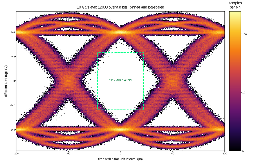
Twelve thousand unit intervals of a 10 Gb/s serial link, all folded onto the same two-bit window. The eye diagram is a persistence display: it is not a plot of a signal but a plot of every signal transition superimposed, and what matters is the size of the hole in the middle, because that hole is the margin the receiver has to sample in.
Overlaying twelve thousand traces as lines would be both slow and wrong – the result saturates to a solid block long before the statistics have converged, and the density information, which is the entire content, is thrown away. Binning the samples into a 2-D histogram keeps it: bright regions are where the waveform spends most of its time, and the faint haze at the crossings is the jitter distribution.
The counts span several decades between the rails and the rare worst-case
excursions, so the histogram is coloured through a LogNorm. On a linear
ramp the two rails saturate and everything else – transitions, jitter tails,
the occasional runt bit that actually causes errors – disappears into the
background.
The measured eye opening is marked as a box: the horizontal extent is the timing margin and the vertical extent the voltage margin, which together are what a compliance mask is checked against.
Live figure — pick a tool, then zoom, pan, point-pick or annotate. Nothing is active until a tool is selected.
View this figure’s Vega export ↗ — the raw JSON spec, rendered live by a real Vega engine.
View this figure’s Vega-Lite export ↗ — the raw JSON spec(s), rendered live by a real Vega-Lite engine.
import numpy as np
import polars as pl
import plotpress

rng = np.random.default_rng(1010)

UI = 100.0                                         # unit interval (ps) at 10 Gb/s
SPS = 40                                           # samples per unit interval
N_BITS = 12000
SWING = 0.40                                       # V, differential
RJ = 0.030                                         # random jitter, UI rms

bits = rng.integers(0, 2, N_BITS).astype(float) * 2.0 - 1.0

# One impulse per bit, then the channel's pulse response. The response is
# wider than a unit interval, so each bit smears into its neighbours -- that
# inter-symbol interference is what closes the eye horizontally.
impulses = np.zeros(N_BITS * SPS)
impulses[::SPS] = bits
span = np.arange(-2 * SPS, 2 * SPS + 1) / SPS      # in UI
beta = 0.6
with np.errstate(divide="ignore", invalid="ignore"):
    pulse = np.sinc(span) * np.cos(np.pi * beta * span) / (1.0 - (2 * beta * span) ** 2)
pulse = np.nan_to_num(pulse, nan=np.pi / 4.0)
wave = np.convolve(impulses, pulse, mode="same") * SWING
wave += rng.normal(0.0, 0.008, wave.size)          # receiver noise

# Fold every bit onto the same two-UI window.
centres = np.arange(3, N_BITS - 3) * SPS
offsets = np.arange(-SPS, SPS)
v_all = wave[centres[:, None] + offsets[None, :]]

# Random jitter is a *time* shift, so it displaces the whole trace along x.
# Applying it to the sample values instead would leave every trace sampled at
# the same handful of phases -- and a histogram binned finer than that spacing
# then shows vertical stripes of empty bins rather than a continuous eye.
phase = offsets / SPS * UI
t_all = phase[None, :] + rng.normal(0.0, RJ * UI, (centres.size, 1))

# One row per folded sample -- the shape a scope's own eye-diagram acquisition
# is in, before it is binned into the persistence histogram.
samples = pl.DataFrame({"t": t_all.ravel(), "v": v_all.ravel()})
t_all = samples["t"].to_numpy()
v_all = samples["v"].to_numpy()

fig, ax = plotpress.subplots(figsize=(8.6, 5.6))
counts, im = ax.hist2d(t_all, v_all, bins=(360, 260), cmap="inferno",
                       norm=plotpress.LogNorm(vmin=1.0))
bar = fig.colorbar(im, ax=ax)
bar.set_title("samples\nper bin")

# Eye opening at the sampling instant: the gap between the 1% worst high sample
# and the 1% worst low one, over the window where that gap stays open.
HALF_WINDOW = 22.0                                 # ps either side of centre
mid = np.abs(t_all) < HALF_WINDOW
upper = np.percentile(v_all[mid & (v_all > 0)], 1.0)
lower = np.percentile(v_all[mid & (v_all < 0)], 99.0)
ax.plot([-HALF_WINDOW, HALF_WINDOW, HALF_WINDOW, -HALF_WINDOW, -HALF_WINDOW],
        [lower, lower, upper, upper, lower],
        color="#00ff88", linewidth=1.8, linestyle="--")
ax.text(0.0, 0.0,
        f"{2 * HALF_WINDOW / UI * 100:.0f}% UI x {1e3 * (upper - lower):.0f} mV",
        ha="center", color="#0a7d3f", fontsize=10)

ax.set_xlim(-UI, UI)
ax.set_xlabel("time within the unit interval (ps)")
ax.set_ylabel("differential voltage (V)")
ax.set_title(f"10 Gb/s eye: {N_BITS} overlaid bits, binned and log-scaled")
fig.tight_layout()
Total running time of the script: (0 minutes 0.325 seconds)