Note
Go to the end to download the full example code.
Arrhenius plot and a change of mechanism
Reaction rate against temperature, plotted the way chemical kinetics requires: the logarithm of the rate constant against the reciprocal of absolute temperature. On those coordinates the Arrhenius law is a straight line whose slope is the activation energy divided by the gas constant, and that linearisation is the entire reason the plot exists.
Two things follow. The x axis carries reciprocal kelvin, which nobody thinks in,
so a second axis on top is labelled in degrees Celsius – twiny with ticks
placed at chosen temperatures and converted, so the tick positions stay
correct on the reciprocal scale while the labels read in the units a chemist
works in. This is the case twin axes are genuinely for: one quantity, two
parameterisations, not two quantities sharing a frame.
Second, curvature is meaningful. This dataset is straight over the high temperature range and breaks to a shallower slope below about 40 degC, which is a change of rate-limiting step – the reaction becomes diffusion-limited, and diffusion has a much smaller activation energy. Fitting one line through everything would report an activation energy that describes neither regime, so the two are fitted separately and the crossover marked.
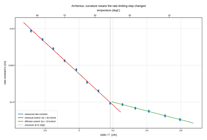
Live figure — pick a tool, then zoom, pan, point-pick or annotate. Nothing is active until a tool is selected.
View this figure’s Vega export ↗ — the raw JSON spec, rendered live by a real Vega engine.
View this figure’s Vega-Lite export ↗ — the raw JSON spec(s), rendered live by a real Vega-Lite engine.
import numpy as np
import polars as pl
import plotpress

rng = np.random.default_rng(1889)

R = 8.314                                          # J/(mol K)
EA_CHEMICAL = 82_000.0                             # J/mol, high-temperature regime
EA_DIFFUSION = 21_000.0                            # J/mol, low-temperature regime
T_BREAK = 273.15 + 41.0                            # K

temp_c = np.array([5, 12, 20, 27, 34, 41, 48, 55, 62, 70, 78, 86, 95], float)
T = temp_c + 273.15
inv_T = 1000.0 / T                                 # 1000/K keeps the axis readable


def rate(T):
    """Two Arrhenius branches meeting continuously at the break temperature."""
    fast = 4.2e9 * np.exp(-EA_CHEMICAL / (R * T))
    slow_prefactor = 4.2e9 * np.exp(-EA_CHEMICAL / (R * T_BREAK)) \
        / np.exp(-EA_DIFFUSION / (R * T_BREAK))
    slow = slow_prefactor * np.exp(-EA_DIFFUSION / (R * T))
    return np.where(T >= T_BREAK, fast, slow)


k = rate(T) * np.exp(rng.normal(0.0, 0.06, T.size))
sigma = k * 0.07                                   # 7% relative uncertainty

# One row per temperature run -- the shape a kinetics run log is actually
# recorded in, before it is split into the two Arrhenius regimes.
runs = pl.DataFrame({
    "temp_k": T, "inv_temp_k": inv_T, "rate_k": k, "sigma": sigma,
    "regime": np.where(T >= T_BREAK, "chemical control", "diffusion control"),
})

fits = {}
for name in ("chemical control", "diffusion control"):
    branch = runs.filter(pl.col("regime") == name)
    coeffs = np.polyfit(1.0 / branch["temp_k"].to_numpy(),
                        np.log(branch["rate_k"].to_numpy()), 1)
    fits[name] = (coeffs, -coeffs[0] * R / 1e3)    # slope -> Ea in kJ/mol

fig, ax = plotpress.subplots(figsize=(8.6, 5.8))
ax.errorbar(runs["inv_temp_k"].to_numpy(), runs["rate_k"].to_numpy(),
            yerr=runs["sigma"].to_numpy(), color="#1f77b4", marker="o",
            markersize=5.0, linestyle="none", capsize=3.0,
            label="measured rate constant")

for (name, (coeffs, ea_kj)), color in zip(fits.items(), ["#d62728", "#2ca02c"]):
    span = runs.filter(pl.col("regime") == name)["temp_k"].to_numpy()
    grid = np.linspace(span.min() - 6.0, span.max() + 6.0, 50)
    ax.plot(1000.0 / grid, np.exp(np.polyval(coeffs, 1.0 / grid)), color=color,
            linewidth=1.8, label=f"{name}: Ea = {ea_kj:.0f} kJ/mol")

ax.axvline(1000.0 / T_BREAK, color="#888888", linestyle=":", linewidth=1.3,
           label=f"crossover at {T_BREAK - 273.15:.0f} degC")

ax.set_yscale("log")
ax.set_xlabel("1000 / T  (1/K)")
ax.set_ylabel("rate constant k (1/s)")
ax.legend(loc="lower left")
ax.grid(True)

# The same axis, labelled in the units a chemist reads. A twiny keeps its own
# x range -- that is the point of it -- so with no artists of its own it would
# autoscale to 0..1 and put every tick outside the box. Copy the parent's limits
# explicitly; only the tick *labels* differ.
ax_c = ax.twiny()
ax_c.set_xlim(ax.get_xlim())
ticks_c = np.array([90, 70, 50, 30, 10], float)
ax_c.set_xticks(1000.0 / (ticks_c + 273.15), [f"{v:.0f}" for v in ticks_c])
ax_c.set_xlabel("temperature (degC)")

ax.set_title("Arrhenius: curvature means the rate-limiting step changed")
fig.tight_layout()
Total running time of the script: (0 minutes 0.159 seconds)