Note
Go to the end to download the full example code.
Implied volatility surface
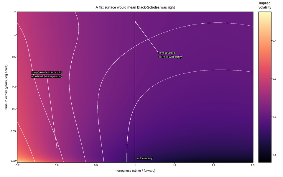
Option-implied volatility across strike and expiry, as a mesh. If the Black-Scholes model held, this surface would be flat – one volatility per underlying, independent of which option you look at. It is not flat, and the two ways it deviates each have a name and a cause, which is why the surface is drawn rather than a single number quoted.
The strike axis is moneyness, the strike divided by the forward price, not the strike itself. That normalisation is what makes options on different expiries comparable: an option 10% out of the money is the same kind of contract whether it expires in a week or a year, while a fixed strike is nearly at the money for one and far out for the other.
The expiry axis is logarithmic, because listed maturities are spaced roughly geometrically – a week, a month, three months, a year, two years – and on a linear axis the short-dated options, where the skew is steepest and where most of the trading happens, would be crushed into a stripe.
The two features are annotated. The smile, steepest at short expiry, is the market pricing crash risk that a lognormal model does not contain. The term structure – volatility rising with expiry here – is the market pricing a calm present and an uncertain future. A contour at the at-the-money level makes the term structure legible as a line rather than as a colour gradient.
Live figure — pick a tool, then zoom, pan, point-pick or annotate. Nothing is active until a tool is selected.
View this figure’s Vega export ↗ — the raw JSON spec, rendered live by a real Vega engine.
View this figure’s Vega-Lite export ↗ — the raw JSON spec(s), rendered live by a real Vega-Lite engine.
/home/runner/work/plotpress/plotpress/docs/applications/finance/plot_05_volatility_surface.py:62: UserWarning: pcolormesh(): 24 cells along y (e.g. cell 0, y=0.01898..0.01948) narrower than one output pixel and will not appear in the raster. This mesh has 39600 cells, past the ~2000-cell auto threshold, so rasterized=False will draw every cell exactly but produce a much larger SVG (see pcolormesh_vector_cell_limit.py) -- or use a log scale if this axis spans decades.
  mesh = ax.pcolormesh(moneyness_axis, expiry_axis, iv, cmap="magma")
import numpy as np
import polars as pl
import plotpress

moneyness = np.linspace(0.70, 1.30, 220)          # strike / forward
expiry = np.logspace(np.log10(1.0 / 52), np.log10(2.0), 180)   # years
M, T = np.meshgrid(moneyness, expiry)

ATM_SHORT = 0.145                                  # at-the-money vol, 1 week
ATM_LONG = 0.215                                   # at-the-money vol, 2 years

# Term structure: vol rises with expiry toward a long-run level.
atm = ATM_LONG + (ATM_SHORT - ATM_LONG) * np.exp(-T / 0.45)

# Skew: steep at short expiry, flattening as the square root of time -- the
# standard empirical decay, and the reason the surface looks twisted.
log_moneyness = np.log(M)
skew = -0.72 / np.sqrt(T + 0.02)
curvature = 1.9 / np.sqrt(T + 0.05)

iv = atm * (1.0 + skew * log_moneyness + curvature * log_moneyness ** 2)
iv = np.clip(iv, 0.06, 0.75)

# One row per (expiry, moneyness) quote -- the shape a vol-surface data feed
# is actually published in, before it is gridded for the mesh.
quotes = pl.DataFrame({
    "moneyness": M.ravel(), "expiry": T.ravel(),
    "implied_vol": iv.ravel(),
}).sort(["expiry", "moneyness"])
moneyness_axis = quotes["moneyness"].unique().sort().to_numpy()
expiry_axis = quotes["expiry"].unique().sort().to_numpy()
iv = quotes["implied_vol"].to_numpy().reshape(expiry_axis.size, moneyness_axis.size)

fig, ax = plotpress.subplots(figsize=(9.6, 6.0))
mesh = ax.pcolormesh(moneyness_axis, expiry_axis, iv, cmap="magma")
bar = fig.colorbar(mesh, ax=ax)
bar.set_title("implied\nvolatility")

ax.contour(moneyness_axis, expiry_axis, iv, levels=[0.16, 0.20, 0.24, 0.30, 0.40],
           colors="#ffffff")
ax.axvline(1.0, color="#ffffff", linestyle="--", linewidth=1.4)

ax.annotate("steep skew at short expiry\n(crash risk, not lognormal)",
            xy=(0.80, 0.03), xytext=(0.735, 0.30),
            arrowprops={"color": "#ffffff"}, color="#ffffff", fontsize=9)
ax.annotate("term structure:\nvol rises with expiry",
            xy=(1.0, 1.5), xytext=(1.06, 0.55),
            arrowprops={"color": "#ffffff"}, color="#ffffff", fontsize=9)
ax.text(1.005, 0.021, "at the money", color="#ffffff", fontsize=9)

ax.set_yscale("log")
ax.set_xlabel("moneyness (strike / forward)")
ax.set_ylabel("time to expiry (years, log scale)")
ax.set_title("A flat surface would mean Black-Scholes was right")
fig.tight_layout()
Total running time of the script: (0 minutes 1.454 seconds)