Note
Go to the end to download the full example code.
S-N fatigue curve with run-outs
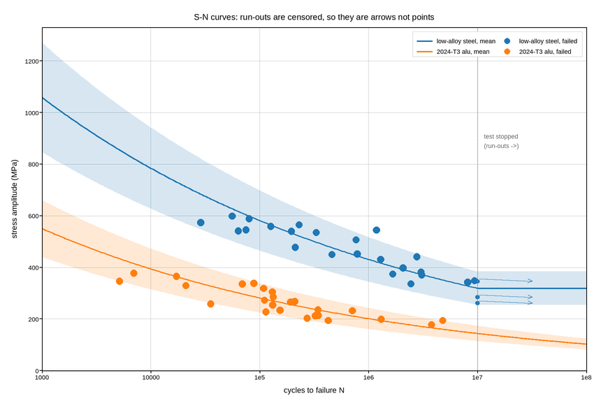
Stress amplitude against cycles to failure for two alloys. Fatigue life spans from a thousand cycles to a hundred million, so the x axis is logarithmic – without it the entire low-cycle regime, where most structural design actually happens, is compressed against the axis.
Two features of fatigue data need explicit handling, and both are about what the data does not say.
Run-outs are specimens that survived the test and were stopped without failing. Their true life is unknown and greater than what was recorded, so plotting them as though they had failed at the stopping point systematically underestimates life. They are drawn as right-pointing arrows at the stopping point instead – the standard convention, and the reason the fitted line ignores them.
Scatter in fatigue is enormous: an order of magnitude in life at fixed stress is normal, not a sign of a bad experiment. A single fitted line through the middle would be read as a design curve, which it is not, so the mean line is shown with the band containing 90% of specimens around it. The design curve engineers actually use is the lower bound, not the mean, and the gap between them is the point of the figure.
Live figure — pick a tool, then zoom, pan, point-pick or annotate. Nothing is active until a tool is selected.
View this figure’s Vega export ↗ — the raw JSON spec, rendered live by a real Vega engine.
View this figure’s Vega-Lite export ↗ — the raw JSON spec(s), rendered live by a real Vega-Lite engine.
import numpy as np
import polars as pl
import plotpress

rng = np.random.default_rng(1954)

RUN_OUT = 1e7                                      # cycles at which testing stops

MATERIALS = [
    # name,          Basquin coefficient, exponent, endurance limit, colour
    ("low-alloy steel", 2600.0, -0.13, 320.0, "#1f77b4"),
    ("2024-T3 alu",     1500.0, -0.145, None, "#ff7f0e"),   # no endurance limit
]

cycles_line = np.logspace(3, 8, 300)

fig, ax = plotpress.subplots(figsize=(8.6, 5.8))

for name, A, b, endurance, color in MATERIALS:
    # Basquin's law, flattening to the endurance limit where one exists.
    mean = A * cycles_line ** b
    if endurance is not None:
        mean = np.maximum(mean, endurance)
    ax.plot(cycles_line, mean, color=color, linewidth=1.9, label=f"{name}, mean")
    # 90% scatter band: fatigue life at fixed stress varies by ~an order.
    ax.fill_between(cycles_line, mean * 0.80, mean * 1.20, color=color, alpha=0.18)

    # Specimens: pick a stress, draw a life from it with realistic scatter.
    stress = rng.uniform(0.75, 1.9, 26) * (endurance or 200.0)
    life = (stress / A) ** (1.0 / b) * np.exp(rng.normal(0.0, 0.85, stress.size))
    if endurance is not None:
        life = np.where(stress < endurance, RUN_OUT * 3.0, life)

    # One row per test specimen -- the shape a fatigue lab's own test log is
    # in, before it is split into failures and censored run-outs.
    specimens = pl.DataFrame({"stress": stress, "life": life}) \
        .with_columns((pl.col("life") < RUN_OUT).alias("failed"))
    failed_rows = specimens.filter(pl.col("failed"))
    ax.scatter(failed_rows["life"].to_numpy(), failed_rows["stress"].to_numpy(),
               s=7.0, color=color, label=f"{name}, failed")
    # Run-outs: censored at the stopping point, with an arrow saying so.
    for s in specimens.filter(~pl.col("failed"))["stress"].to_numpy():
        ax.annotate("", xy=(RUN_OUT * 3.2, s), xytext=(RUN_OUT, s),
                    arrowprops={"color": color})
        ax.scatter([RUN_OUT], [s], s=4.0, color=color)

ax.axvline(RUN_OUT, color="#888888", linestyle=":", linewidth=1.2)
ax.text(RUN_OUT * 1.15, 900.0, "test stopped\n(run-outs ->)", fontsize=9,
        color="#666666")

ax.set_xscale("log")
ax.set_xlim(1e3, 1e8)
ax.set_ylim(0.0, None)
ax.set_xlabel("cycles to failure N")
ax.set_ylabel("stress amplitude (MPa)")
ax.set_title("S-N curves: run-outs are censored, so they are arrows not points")
ax.legend(loc="upper right", ncol=2)
ax.grid(True)
fig.tight_layout()
Total running time of the script: (0 minutes 0.193 seconds)