Note
Go to the end to download the full example code.
Return distribution against a normal fit
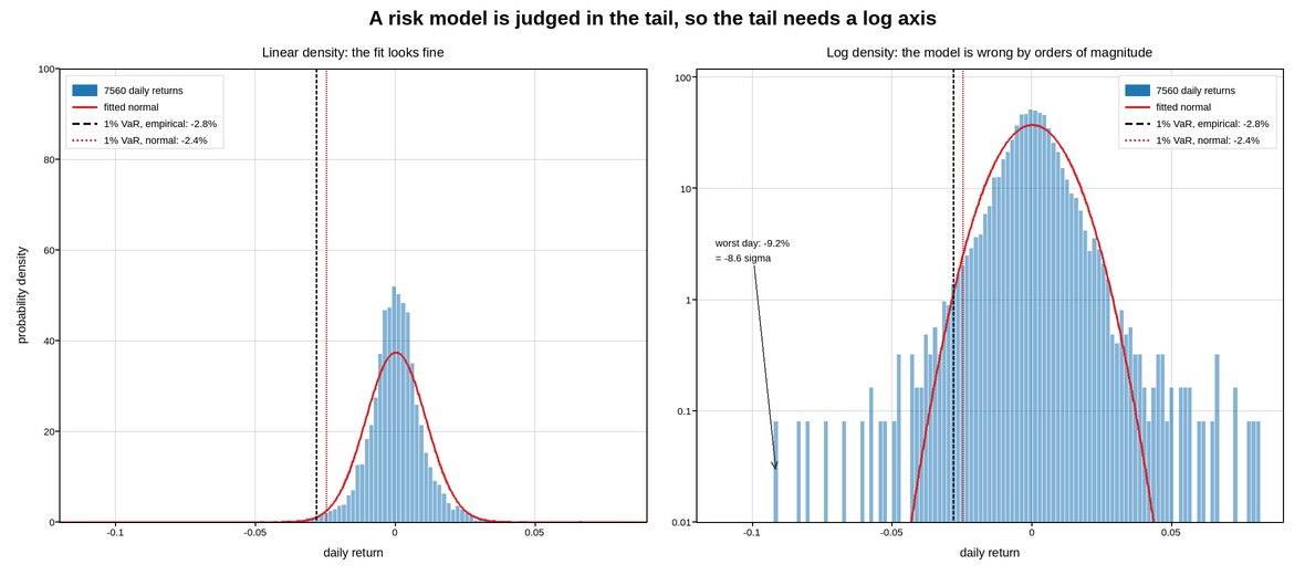
Daily returns of an equity index, compared with the normal distribution fitted to them. The two panels show the same comparison on a linear and a logarithmic density axis, and the difference between them is the entire argument.
On the linear axis the fit looks good. The histogram and the fitted curve agree through the body of the distribution, which is where 99% of the observations are, and the disagreement in the tails involves so few days that it is invisible.
On the log axis the same tails are unmistakable. The normal curve falls away quadratically while the observed returns fall away roughly linearly, so by the five-sigma mark the model is wrong by orders of magnitude – it says a day like that happens once every few thousand years, and the sample contains several.
That is why a risk figure is drawn on a log density axis. The quantity a risk model is for is the tail, and a linear axis is a display that hides exactly the region being modelled. The largest observed loss is marked in both panels with how many standard deviations it was, which is the compact way to state the mismatch.
Value at risk is drawn as the empirical quantile rather than the fitted one, and the two are labelled separately, because the gap between them is what the log panel is showing.
Live figure — pick a tool, then zoom, pan, point-pick or annotate. Nothing is active until a tool is selected.
View this figure’s Vega export ↗ — the raw JSON spec, rendered live by a real Vega engine.
View this figure’s Vega-Lite export ↗ — the raw JSON spec(s), rendered live by a real Vega-Lite engine.
import numpy as np
import polars as pl
import plotpress

rng = np.random.default_rng(1987)

N = 252 * 30
# Student-t returns: the standard stand-in for the fat tails equity returns have.
df = 3.6

# One row per trading day -- the shape a returns series is actually recorded
# in, before its mean, quantiles, and worst day are computed from it.
daily = pl.DataFrame({"day": np.arange(N), "return": rng.standard_t(df, N) * 0.0072 + 0.0003})
returns = daily["return"].to_numpy()

mu, sigma = returns.mean(), returns.std()
grid = np.linspace(-0.12, 0.09, 900)
normal = np.exp(-0.5 * ((grid - mu) / sigma) ** 2) / (sigma * np.sqrt(2 * np.pi))

var_empirical = float(daily["return"].quantile(0.01, interpolation="linear"))
var_normal = float(mu - 2.3263 * sigma)
worst = float(daily["return"].min())

bins = np.linspace(-0.12, 0.09, 130)

fig, axes = plotpress.subplots(1, 2, figsize=(11.8, 5.2), sharex=True)

for ax, log_axis in zip(axes, (False, True)):
    ax.hist(returns, bins=bins, density=True, color="#1f77b4", alpha=0.55,
            edgecolor="#ffffff", label=f"{N} daily returns")
    ax.plot(grid, normal, color="#d62728", linewidth=1.9,
            label="fitted normal")
    ax.axvline(var_empirical, color="#111111", linestyle="--", linewidth=1.4,
               label=f"1% VaR, empirical: {var_empirical:.1%}")
    ax.axvline(var_normal, color="#d62728", linestyle=":", linewidth=1.4,
               label=f"1% VaR, normal: {var_normal:.1%}")
    ax.set_xlabel("daily return")
    ax.grid(True)

    if log_axis:
        ax.set_yscale("log")
        ax.set_ylim(1e-2, 120.0)
        ax.set_title("Log density: the model is wrong by orders of magnitude")
        ax.annotate(f"worst day: {worst:.1%}\n= {(worst - mu) / sigma:.1f} sigma",
                    xy=(worst, 0.03), xytext=(-0.113, 3.0),
                    arrowprops={"color": "#333333"}, fontsize=9)
        ax.legend(loc="upper right")
    else:
        ax.set_ylim(0.0, 100.0)
        ax.set_ylabel("probability density")
        ax.set_title("Linear density: the fit looks fine")
        ax.legend(loc="upper left")

axes[0].set_xlim(-0.12, 0.09)
fig.suptitle("A risk model is judged in the tail, so the tail needs a log axis")
fig.tight_layout()
Total running time of the script: (0 minutes 0.237 seconds)