Note
Go to the end to download the full example code.
Storm hydrograph with rating-curve uncertainty
River discharge through a storm, as a gauging station actually reports it. A stream gauge does not measure discharge; it measures stage – water level – and converts it through a rating curve fitted to a handful of manual gaugings. That conversion is the dominant error, it is multiplicative rather than additive, and it gets worse at high flow where nobody wades out to calibrate.
Two consequences shape the figure. Discharge spans two and a half decades
between recession and peak, so a linear y axis would compress the entire dry
period into the axis line and show nothing but the storm – set_yscale("log")
keeps the recession limb readable, and on a log axis exponential recession is a
straight line, which is exactly the behaviour a hydrologist is checking for.
And because the uncertainty is a percentage of flow, it is drawn as a band
around the trace rather than as error bars: fill_between on the multiplied
bounds, which on a log axis renders as a constant-width ribbon. The band widens
visibly above the highest gauged flow, where the rating is extrapolated.
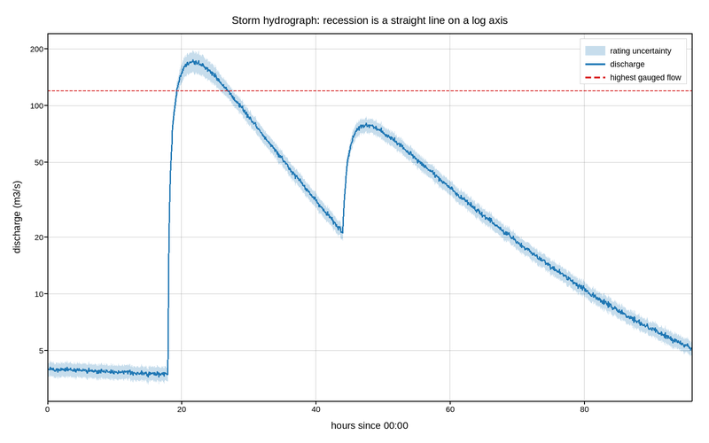
Live figure — pick a tool, then zoom, pan, point-pick or annotate. Nothing is active until a tool is selected.
View this figure’s Vega export ↗ — the raw JSON spec, rendered live by a real Vega engine.
View this figure’s Vega-Lite export ↗ — the raw JSON spec(s), rendered live by a real Vega-Lite engine.
import numpy as np
import polars as pl
import plotpress

rng = np.random.default_rng(7)

t = np.linspace(0.0, 96.0, 1600)                  # hours from the start of record

# Baseflow: slow exponential recession from an earlier event.
q = 4.0 * np.exp(-t / 260.0)

# Two storm pulses. Each is a rapid rising limb and a slower recession -- the
# classic asymmetric hydrograph shape, here a gamma-like pulse.
for onset, peak, rise, fall in [(18.0, 320.0, 2.4, 9.0), (44.0, 95.0, 1.8, 14.0)]:
    lag = np.clip(t - onset, 0.0, None)
    q += peak * (1.0 - np.exp(-lag / rise)) * np.exp(-lag / fall)

# Sensor noise is proportional too: a stage sensor resolves a fixed depth, which
# is a shrinking fraction of a rising discharge.
q *= np.exp(rng.normal(0.0, 0.015, t.size))

# Rating-curve uncertainty: +/-8% within the gauged range, growing to +/-35%
# where the rating is extrapolated past the highest manual gauging.
HIGHEST_GAUGED = 120.0                             # m3/s
frac = 0.08 + 0.27 * np.clip(np.log10(q / HIGHEST_GAUGED), 0.0, None)

# One row per gauge reading -- the shape the station's own record is
# logged in, before the rating-curve uncertainty band is drawn around it.
record = pl.DataFrame({
    "hour": t, "discharge": q,
    "discharge_lo": q * (1.0 - frac), "discharge_hi": q * (1.0 + frac),
})

fig, ax = plotpress.subplots(figsize=(8.0, 5.0))
ax.fill_between(record["hour"].to_numpy(), record["discharge_lo"].to_numpy(),
                record["discharge_hi"].to_numpy(), color="#1f77b4",
                alpha=0.25, label="rating uncertainty")
ax.plot(record["hour"].to_numpy(), record["discharge"].to_numpy(),
        color="#1f77b4", linewidth=1.4, label="discharge")
ax.axhline(HIGHEST_GAUGED, color="#d62728", linestyle="--", linewidth=1.0,
           label="highest gauged flow")

ax.set_yscale("log")
ax.set_xlim(0.0, 96.0)
ax.set_xlabel("hours since 00:00")
ax.set_ylabel("discharge (m3/s)")
ax.set_title("Storm hydrograph: recession is a straight line on a log axis")
ax.legend(loc="upper right")
ax.grid(True)
fig.tight_layout()
Total running time of the script: (0 minutes 0.210 seconds)