Note
Go to the end to download the full example code.
Equity curve and underwater drawdown
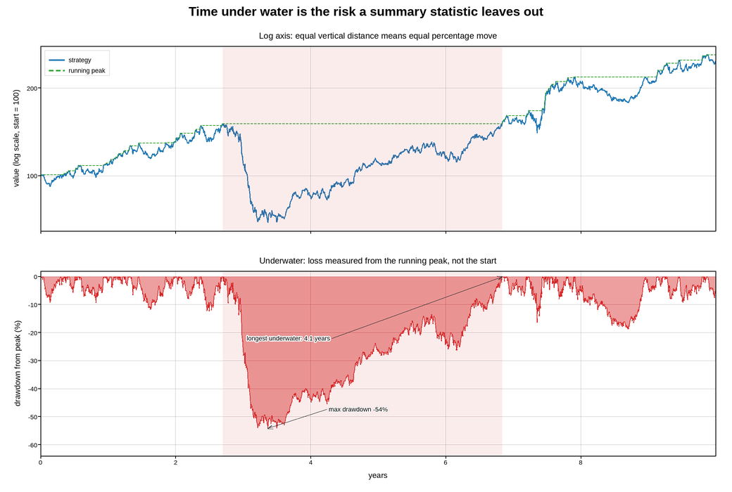
Ten years of a strategy’s cumulative value, with the drawdown – the loss from the running peak – underneath. The pair is the standard risk presentation, and each panel is arranged around one specific way this data misleads.
The equity curve is on a logarithmic axis. A cumulative return series is multiplicative, so equal vertical distances should mean equal percentage moves; on a linear axis a 20% fall late in the series looks catastrophic next to a 20% fall at the start, purely because the level is higher. On the log axis the two have the same height, which is what a reader means by “the same drawdown”.
The lower panel is the drawdown, which is defined against the running maximum rather than against the start. It is always negative or zero, so it is filled downward from zero – the “underwater” convention – and needs no legend, since the shape says what it is. Measuring loss from the running peak rather than from the start is the difference between how far the strategy fell and how far it happens to be below where it began.
The longest drawdown is annotated with its duration rather than only its depth, because time under water is what investors actually leave over, and it is invisible in any summary statistic that reports only the maximum.
Live figure — pick a tool, then zoom, pan, point-pick or annotate. Nothing is active until a tool is selected.
View this figure’s Vega export ↗ — the raw JSON spec, rendered live by a real Vega engine.
View this figure’s Vega-Lite export ↗ — the raw JSON spec(s), rendered live by a real Vega-Lite engine.
import numpy as np
import polars as pl
import plotpress

rng = np.random.default_rng(2015)

DAYS = 252 * 10
t = np.arange(DAYS) / 252.0

# Daily log returns: a positive drift, volatility clustering, and two crises.
# The drift is additive rather than a multiple of the volatility -- scaling the
# mean by the same factor as the noise makes the crises eat the whole series.
DRIFT = 0.00065                                    # ~17%/yr before crises
vol = 0.0068 * (1.0 + 0.5 * np.abs(np.sin(2 * np.pi * t / 3.4)))
for onset, width, scale in [(3.1, 0.20, 1.6), (7.4, 0.13, 1.3)]:
    vol *= 1.0 + scale * np.exp(-((t - onset) ** 2) / (2 * width ** 2))

shock = np.zeros_like(t)
for onset, width, depth in [(3.1, 0.16, 0.0026), (7.4, 0.11, 0.0018)]:
    shock -= depth * np.exp(-((t - onset) ** 2) / (2 * width ** 2))

returns = DRIFT + rng.normal(0.0, 1.0, DAYS) * vol + shock

equity = 100.0 * np.exp(np.cumsum(returns))
peak = np.maximum.accumulate(equity)
drawdown = equity / peak - 1.0

# One row per trading day -- the shape a backtest's own equity-curve export
# is in, before the longest drawdown is picked out of it.
curve = pl.DataFrame({"year": t, "equity": equity, "peak": peak, "drawdown": drawdown})
t = curve["year"].to_numpy()
equity = curve["equity"].to_numpy()
peak = curve["peak"].to_numpy()
drawdown = curve["drawdown"].to_numpy()

# Longest stretch below the previous peak.
underwater = drawdown < -1e-9
best_len, best_end, run = 0, 0, 0
for i, wet in enumerate(underwater):
    run = run + 1 if wet else 0
    if run > best_len:
        best_len, best_end = run, i
best_start = best_end - best_len + 1

fig, axes = plotpress.subplots(2, 1, figsize=(10.4, 7.0), sharex=True)
ax_eq, ax_dd = axes

ax_eq.plot(t, equity, color="#1f77b4", linewidth=1.3, label="strategy")
ax_eq.plot(t, peak, color="#2ca02c", linewidth=1.0, linestyle="--",
           label="running peak")
ax_eq.axvspan(t[best_start], t[best_end], color="#d62728", alpha=0.09)
ax_eq.set_yscale("log")
ax_eq.set_ylabel("value (log scale, start = 100)")
ax_eq.set_title("Log axis: equal vertical distance means equal percentage move")
ax_eq.legend(loc="upper left")
ax_eq.grid(True)

ax_dd.fill_between(t, drawdown * 100.0, 0.0, color="#d62728", alpha=0.45)
ax_dd.plot(t, drawdown * 100.0, color="#d62728", linewidth=1.0)
ax_dd.axvspan(t[best_start], t[best_end], color="#d62728", alpha=0.09)

worst = int(np.argmin(drawdown))
floor = drawdown.min() * 100.0
ax_dd.annotate(f"max drawdown {drawdown[worst] * 100:.0f}%",
               xy=(t[worst], drawdown[worst] * 100.0),
               xytext=(t[worst] + 0.9, drawdown[worst] * 100.0 + 6.0),
               arrowprops={"color": "#333333"}, fontsize=9)
ax_dd.annotate(f"longest underwater: {best_len / 252.0:.1f} years",
               xy=(t[best_end], 0.0), xytext=(t[best_start] + 0.35, floor * 0.42),
               arrowprops={"color": "#333333"}, fontsize=9)

ax_dd.set_xlim(0.0, t[-1])
# Derived from the data rather than hard-coded: a fixed floor silently clips the
# one number this panel exists to report the moment the simulation changes.
ax_dd.set_ylim(floor * 1.18, 2.0)
ax_dd.set_xlabel("years")
ax_dd.set_ylabel("drawdown from peak (%)")
ax_dd.set_title("Underwater: loss measured from the running peak, not the start")
ax_dd.grid(True)

fig.suptitle("Time under water is the risk a summary statistic leaves out")
fig.tight_layout()
Total running time of the script: (0 minutes 0.396 seconds)