Note
Go to the end to download the full example code.
Wind turbine power curve from SCADA data
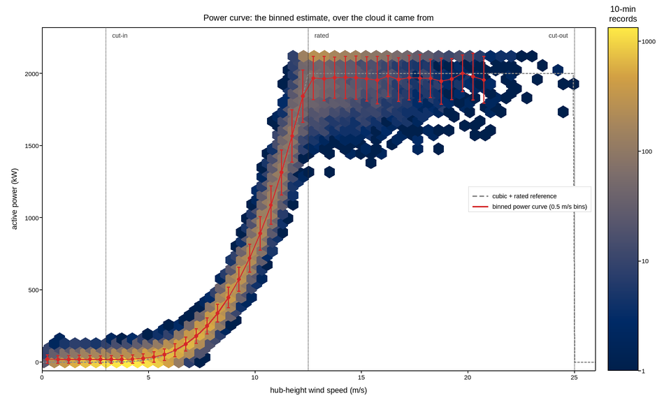
Fifty thousand ten-minute averages of wind speed against power output from one turbine, and the binned power curve fitted through them. This is the figure a performance warranty is settled with, and it needs to show both the cloud and the curve – the curve alone hides how much scatter the warranty is being claimed through.
Fifty thousand points cannot be drawn as markers, so the cloud is a hexbin with a logarithmic colour scale. The log matters: the turbine spends most of its life in a narrow band of ordinary wind speeds, and on a linear count scale that band saturates while the high-wind region – where the curve’s shape is being disputed – reads as empty.
The binned curve on top is the standard method: average the power within each 0.5 m/s wind-speed bin, which is a different estimate from a regression and is the one the standard specifies. It is drawn with the bin scatter as error bars, because a single point per bin implies a precision the data does not have.
Three operating regimes are marked. Below cut-in the turbine produces nothing; between cut-in and rated the power follows the cube of wind speed; above rated it is held flat by pitch control. The cubic reference is drawn so the reader can see where the real curve departs from it, which is where the blades stop being aerodynamically ideal.
Live figure — pick a tool, then zoom, pan, point-pick or annotate. Nothing is active until a tool is selected.
View this figure’s Vega export ↗ — the raw JSON spec, rendered live by a real Vega engine.
View this figure’s Vega-Lite export ↗ — the raw JSON spec(s), rendered live by a real Vega-Lite engine.
import numpy as np
import polars as pl
import plotpress

rng = np.random.default_rng(2011)

CUT_IN, RATED, CUT_OUT = 3.0, 12.5, 25.0
RATED_POWER = 2000.0                               # kW
N = 50000


def ideal_power(v):
    """Cubic below rated, flat to cut-out, zero outside."""
    cubic = RATED_POWER * ((np.clip(v, CUT_IN, RATED) - CUT_IN)
                           / (RATED - CUT_IN)) ** 3
    return np.where((v >= CUT_IN) & (v <= CUT_OUT), cubic, 0.0)


# Wind speeds follow a Weibull distribution -- the reason most of the data
# lands between 4 and 10 m/s however long the campaign runs.
speed = 8.4 * rng.weibull(2.1, N)
power = ideal_power(speed)
# Scatter: air density, turbulence, yaw error and wake effects, all largest
# in the steep part of the curve where a small speed error is a big power one.
slope = np.gradient(ideal_power(np.sort(speed)), np.sort(speed))
power = power * np.exp(rng.normal(0.0, 0.10, N)) + rng.normal(0.0, 45.0, N)
power = np.clip(power, 0.0, RATED_POWER * 1.06)
power[speed > CUT_OUT] = 0.0

# One row per ten-minute SCADA record -- exactly the shape the logger's own
# export is in, before it is ever binned into a power curve.
records = pl.DataFrame({"speed": speed, "power": power})

bins = np.arange(0.0, 26.0, 0.5)
bin_idx = np.digitize(records["speed"].to_numpy(), bins) - 1
binned = (records.with_columns(pl.Series("bin", bin_idx))
          .filter((pl.col("bin") >= 0) & (pl.col("bin") < bins.size - 1))
          .group_by("bin")
          .agg(pl.col("power").mean().alias("mean_power"),
               pl.col("power").std().alias("spread"),
               pl.len().alias("n"))
          .filter(pl.col("n") >= 20)
          .sort("bin")
          .with_columns((pl.col("bin") * 0.5 + 0.25).alias("centre")))

fig, ax = plotpress.subplots(figsize=(9.6, 5.8))
hb = ax.hexbin(records["speed"].to_numpy(), records["power"].to_numpy(),
               gridsize=58, cmap="cividis", mincnt=1, norm=plotpress.LogNorm())
fig.colorbar(hb, ax=ax).set_title("10-min\nrecords")

grid = np.linspace(0.0, 26.0, 400)
ax.plot(grid, ideal_power(grid), color="#888888", linestyle="--", linewidth=1.4,
        label="cubic + rated reference")
ax.errorbar(binned["centre"].to_numpy(), binned["mean_power"].to_numpy(),
            yerr=binned["spread"].to_numpy(), color="#d62728", marker="o",
            markersize=3.5, linestyle="-", linewidth=1.6, capsize=2.0,
            label="binned power curve (0.5 m/s bins)")

for v, name in [(CUT_IN, "cut-in"), (RATED, "rated"), (CUT_OUT, "cut-out")]:
    ax.axvline(v, color="#333333", linestyle=":", linewidth=1.1)
    # The last label is right-aligned: at cut-out the line is against the frame,
    # so a left-aligned name runs off the edge.
    inside = v < 0.9 * CUT_OUT
    ax.text(v + (0.3 if inside else -0.3), RATED_POWER * 1.145, name,
            fontsize=9, color="#333333", va="top",
            ha="left" if inside else "right")

ax.set_xlim(0.0, 26.0)
ax.set_ylim(-60.0, RATED_POWER * 1.16)
ax.set_xlabel("hub-height wind speed (m/s)")
ax.set_ylabel("active power (kW)")
ax.set_title("Power curve: the binned estimate, over the cloud it came from")
ax.legend(loc="center right")
fig.tight_layout()
Total running time of the script: (0 minutes 0.419 seconds)