Note
Go to the end to download the full example code.
Grouping related axes
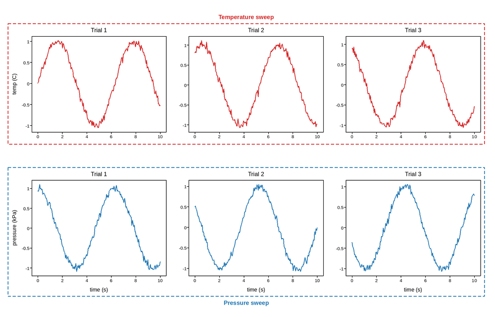
fig.group() draws a labeled box around a set of axes – useful for
calling out which panels of a larger grid belong together, without having
to lay them out as a separate sub-figure. The box is the tight bounding
rectangle of the given axes’ own positions, plus a little padding; the
title sits just outside whichever edge title_position names.
Six panels here split into two unrelated instrument runs – a temperature sweep (top row) and a pressure sweep (bottom row) – each grouped and labeled so that relationship reads at a glance instead of needing a caption.
The two groups sit right on top of each other, sharing the grid’s one
interior row boundary – neither box’s title touches that shared edge, so
tight_layout() never reserves any margin
there on its own. Without group_spacing(),
each box’s own padding would land exactly on that boundary and the two
dashed lines would sit flush against each other, reading as one box, not
two – call it whenever two groups face each other across an interior
boundary like this, not just when they visibly collide.
Live figure — pick a tool, then zoom, pan, point-pick or annotate. Nothing is active until a tool is selected.
View this figure’s Vega export ↗ — the raw JSON spec, rendered live by a real Vega engine.
View this figure’s Vega-Lite export ↗ — the raw JSON spec(s), rendered live by a real Vega-Lite engine.
import numpy as np
import plotpress

rng = np.random.default_rng(0)
t = np.linspace(0, 10, 200)

fig, axes = plotpress.subplots(2, 3, figsize=(10, 6))

for col, ax in enumerate(axes[0]):
    ax.plot(t, np.sin(t + col) + 0.05 * rng.standard_normal(t.size), color="#d62728")
    ax.set_title(f"Trial {col + 1}")
    ax.set_ylabel("temp (C)" if col == 0 else "")

for col, ax in enumerate(axes[1]):
    ax.plot(t, np.cos(t + col) + 0.05 * rng.standard_normal(t.size), color="#1f77b4")
    ax.set_title(f"Trial {col + 1}")
    ax.set_xlabel("time (s)")
    ax.set_ylabel("pressure (kPa)" if col == 0 else "")

fig.group("Temperature sweep", list(axes[0]), color="#d62728", title_position="top")
fig.group("Pressure sweep", list(axes[1]), color="#1f77b4", title_position="bottom")
fig.group_spacing(hspace=40)
fig.tight_layout()
Total running time of the script: (0 minutes 0.187 seconds)